Have you ever played one of those games where you have to guess the name of a brand based on their logo with the twist being that you’re purely looking at the visual design aspect of the brand, without any words or letters?
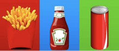
Like this one below. Can you determine what the three brands are?
So, how’d you go? Was the visual elements of each enough for you to ascertain the brand that they belong to?
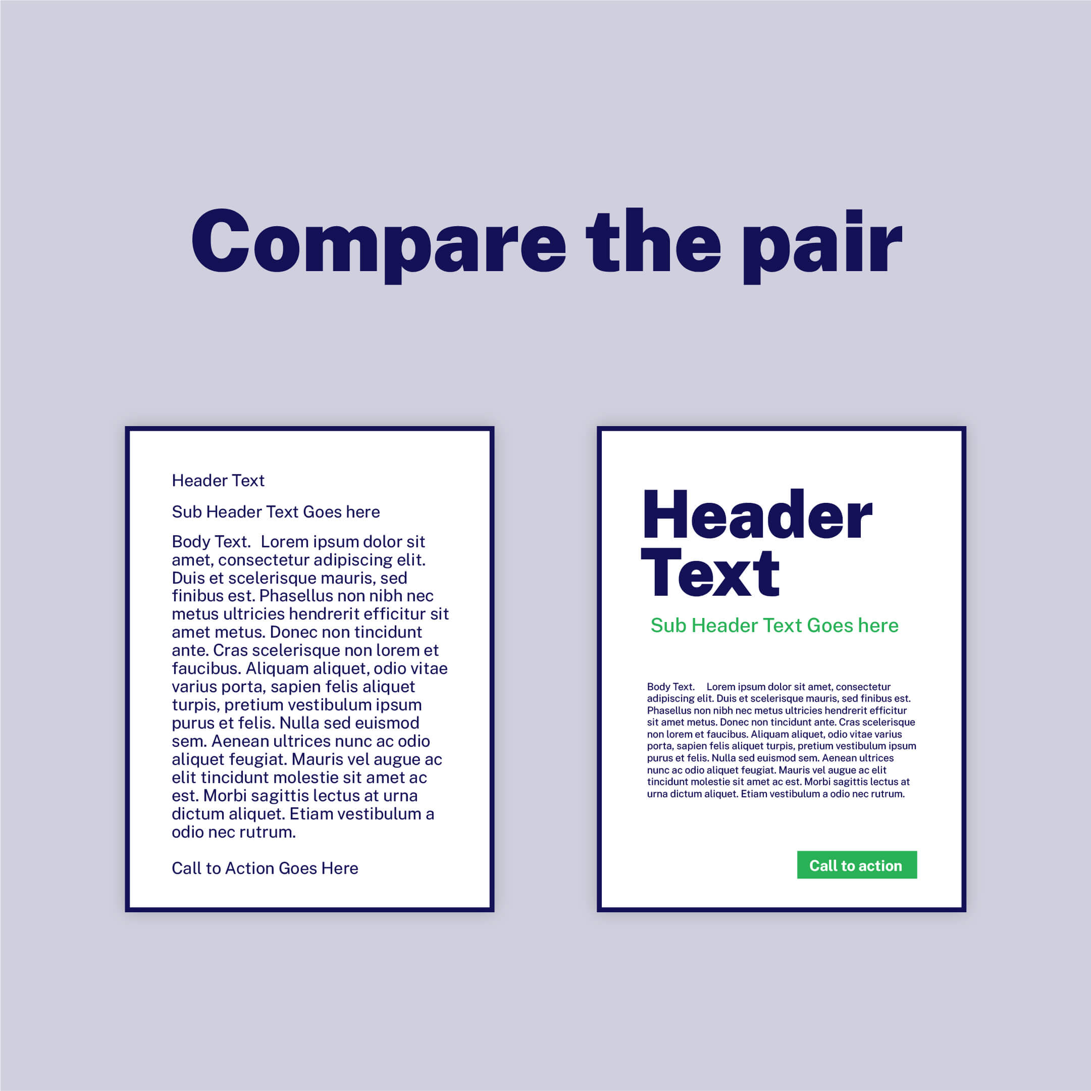
This is an example of visual hierarchy. What’s visual hierarchy you say? Visual hierarchy is an arrangement of graphic design elements with each important element having a unique order of importance. The weight of each visual element defines its importance in a design’s hierarchy, thereby visually communicating to a viewer’s eyes what to focus on and the order in which to perceive it.
When you looked at the three visuals above, what did you perceive first?
Was the famous fries and red fry carton a dead giveaway that it was McDonalds?
Did the unique bottle shape and label colours remind you of Heinz’s Ketchup?
Was the cherry red can and white ribbon spacing enough of a giveaway to be a can of Coke?
If you answered YES to these, then the three owners of these brands are clapping their hands in delight as they have nailed their visual hierarchy goals.
Now the great thing about visual hierarchy is that it can apply to different facets of marketing. Whether it be branding, packaging or content. The more difficult of the three, from an execution standpoint though, is content which is why we will predominantly be focusing on this in this blog. Afterall, content is King (or Queen) right?
In today’s digital world we have very little time to make an impact and get our message across. In fact, research has shown that brands have about eight seconds to capture an audience’s attention. That’s about a second and a half less than it takes Usain Bolt to run the 100 metres.
Therefore, implementing a brilliant content structure that is so visually appealing that it would even stop Mr. Bolt in his tracks is the surest way to grab the attention of your readers!
How then can you create content where its visual elements will engage with your audience?
Five Key Principles Of Visual Hierarchy
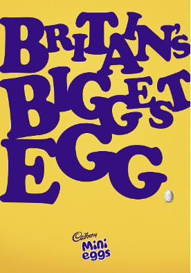
- Size Matters – When it comes to visually attractive content, BIGGER is BETTER! Content sizing is what helps guide the human eye around a landing page, giving readers a clear path to what aspects of your content needs to be read first and providing them with an understanding of the message you are trying to deliver. Not only that but from an eye-catching point of view, typography, logos or imagery that are sized bigger naturally become a focal point . Take this ad below.
Source: https://visme.co/blog/visual-advertising-techniques/
Cadbury does a brilliant job here of using huge, funky typeface to not only capture your attention but also direct your eyes towards the bottom of the page where the final message of the ad lies in its advert for mini eggs.
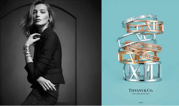
2. Colour – Just like that cherry red Ferrari that you see whizzing past you on the highway, bright colours stand out, draw attention and make a lasting impact. Colour also plays a role in the psychology of a buyer with certain colours tapping into emotions and compelling people to make a purchase.
Take this Tiffany & Co advertorial for instance. The colour scheme in this content piece cleverly uses the ‘Tiffany Blue’ as brand identification whilst relying on the magnificent gold and silver to charm and capture attention. The contrasting black and grey beautifully complements the image as it does enough to not steal attention away from the product content but enough for the eye to linger and admire. So be sure to include colour cleverly in your content design principles.
Source: https://visme.co/blog/visual-advertising-techniques/
3. Spacing – Do you ever notice how hard it is to find your car keys amongst a table full of clutter and other oddities? The same applies for content. Too often have we seen content pieces inundated with text-heavy information and visuals that make it impossible to understand what the actual message is.
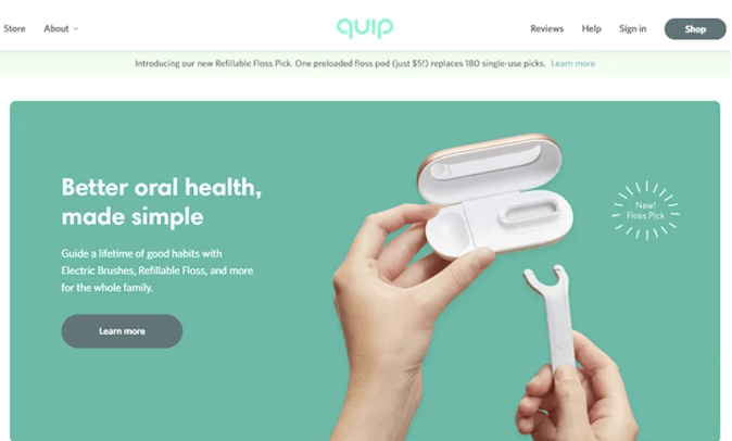
That’s why it’s important to give your page layout some breathing by focusing on negative space and space utilization. Take the below homepage of the oral healthcare brand Quip. This funky new alternative to flossing might look a little strange at first but Quip has cleverly used space to separate the product from its header and subheadings, giving viewers a clear idea of what is on offer.
Source: https://www.justinmind.com/blog/white-space-design/
4. Alignment – Align your content so that it acts as a roadmap for your content to be processed effectively. Don’t be afraid to go against the status quo sometimes, especially if it aligns with your brand identity or theme. Consider scanning patterns and reading patterns, in a particular Z patterns, F patterns, rule of thirds and heat maps, when aligning your web design content.
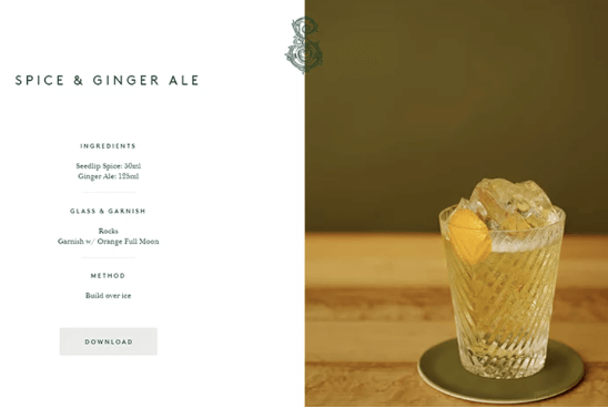
Seedlip does a fantastic job of aligning its content as seen with the example below. Naturally, our eyes are drawn to the delicious looking cocktail aligned to the right. As our curiosity peaks, our eyes are directed to the text aligned to the left in order for us to understand more about the ingredients and directions.
Source: https://www.justinmind.com/blog/white-space-design/
5. Contrast – The last tip to consider for visually attractive content is contrast. Contrast can be an exceptionally fun tool to utilise when incorporating visual hierarchy into your digital marketing content piece. Things like fonts, colours, sizes and textures all help to solidify the message that you’re trying to get across to your readers.
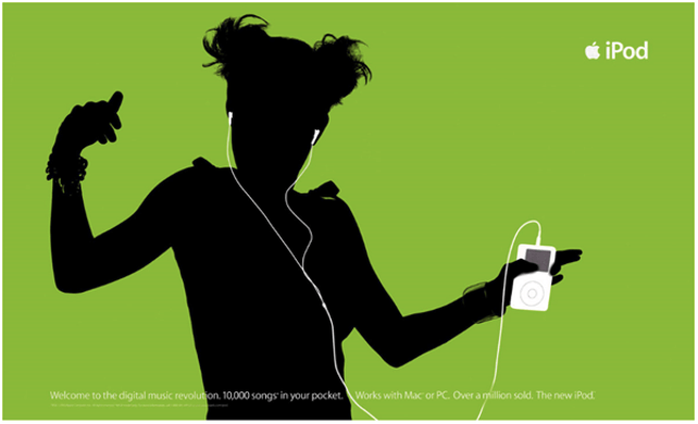
Those Apple iPod ads for instance featured some incredible use of contrast, effortlessly capturing viewers’ attention whilst driving home the content’s goal of highlighting the fun, charismatic and innovative aura that an iPod creates. By using the trademark white iPod and earphones, the ad contrasted beautifully against the silhouetted individual on a brightly coloured background.
Source: https://www.sitepoint.com/principles-of-design-contrast/
So remember, in a world where shoppers are only giving you eight seconds of their time to impress, effectively designing your content piece with visual hierarchy in mind can drastically improve your opportunities of being noticed and creating a lasting user experience.
For more information regarding the creative services that we offer at Cemoh, check us out here.
If you’re looking for a fractional CMO to help to improve your digital marketing content and to use visual hierarchy as a way better engage with your audience, get in touch with us!