

Whether you’re just starting out in the business world or a business searching for a fresh look, the logo is something that could make or break your brand. When you first start out looking for a new logo, it can be a daunting task. There are so many different styles, colours and options available, it’s difficult to know what is going to work well with your brand.
Your logo needs to explain what your business does, why you do it and how you do it all in one tiny package. It’s going to feature everywhere from your business cards, to your social media, uniforms and around your office or store location.
Special attention needs to be paid to your finished result and workshopping should be done to make sure it conveys everything that you want it to, otherwise, the whole process is a waste. We’ve compiled a list of tips that will help you get the perfect logo for your business..
1. Pictures are make or break
If you’re a brand that is very specific or niche, it’s important to get your image right to ensure there are no doubts or confusion about what you do. If you’re a cycling brand, then a wheel or a cycle is perhaps appropriate, but ensure that it is loud and clear. If you half commit or try and be too clever, the message will be lost and the consumer will be confused.
2. Embrace Empty Space
Sometimes in design, the empty space does all the talking. When you leave cleverly placed empty space it makes your logo look much cleaner and prevents the design from looking too busy. It also helps when you’re trying to read the logo from a distance, as the more important aspects stand out.
3. Think Shapes
Using ‘boxed-in’ or shapes within your logo design allows you to create a sense of professionalism. This method is particularly appropriate for service brands like lawyers and accountants. It allows your brand to stand out, while it’s also easier to add to things like business cards and letterheads
4. Visualise the End Product
Think about how your product is going to look in SITU. Whether it be online, on your store sign or wherever it’s going to feature. Paying special attention to the logos used means you can make it as practical as possible. For example, if your store only has a long rectangle space for a store sign, it’s probably better that you have a long rectangle logo, rather than a circular one.
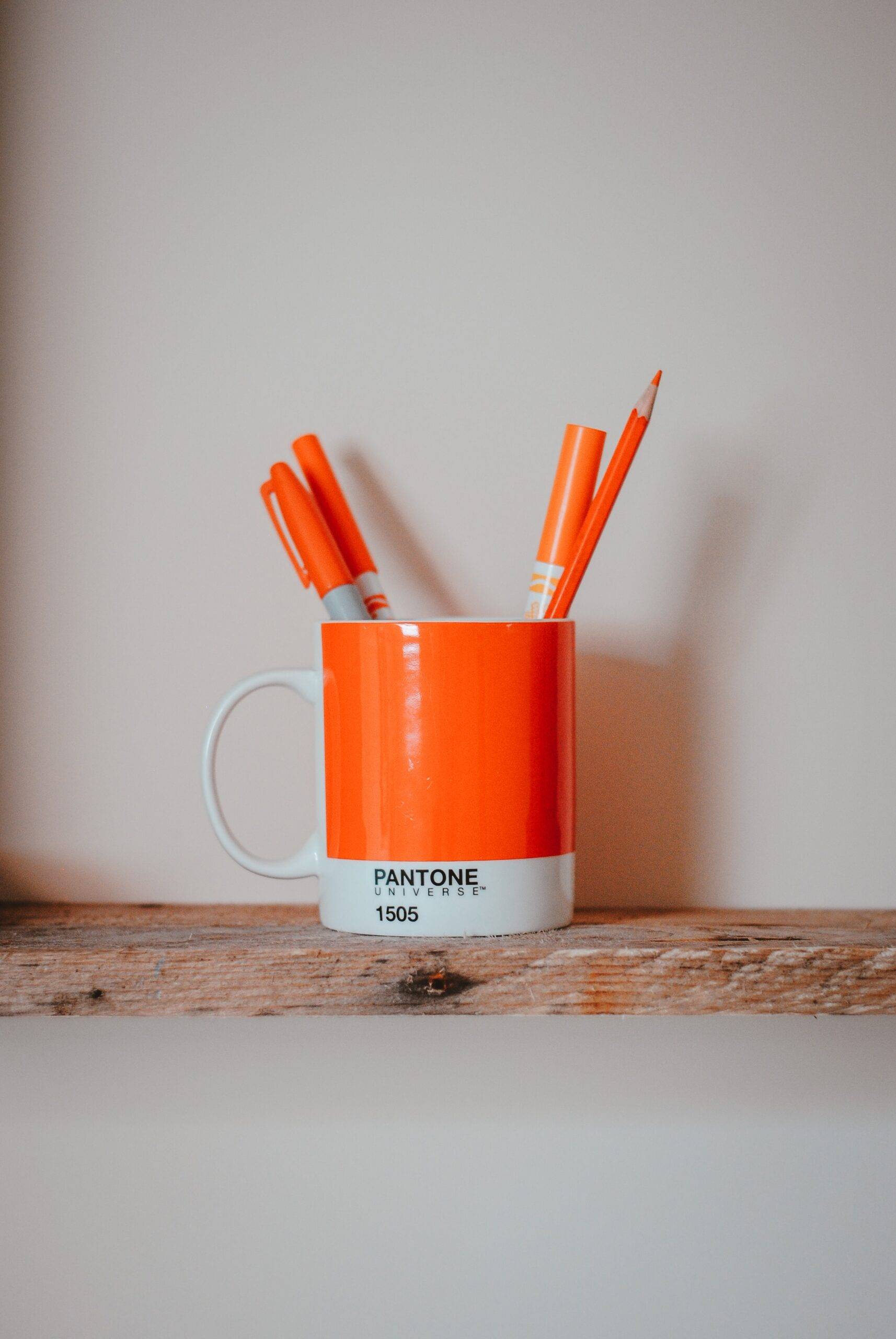
5. Colour is everything
Monochromatic logos can be very fashionable and clean, but they can also be very harsh on our eyes. Use your brand colours to create subtle shades that flow throughout the logo to make it as aesthetically pleasing as possible. You can also pay attention to the emotions that certain colours represent. That information is available online here.
6. Be as Obvious as Possible
In an ideal world, we could all think outside the box and create an Apple logo or a Nike logo, but the reality is that this doesn’t work for 99% of businesses. If you sell golf equipment, put a golf club on your logo, if you’re an electrician, put a lightning bolt on there. The customer should be under no illusions about what you do, and that’s the path to a successful design.
7. Command Authority
Be mindful of your business and what your products and services are. It’s tremendously important for you to command authority if you require authority to gain new customers. If you’re a lawyer, a client wants to see something they can trust, the same goes for almost all businesses in the service industry.

8. Create a Colour Pop
A very effective way of creating an eye-catching logo is to have one single element in a single colour and the rest in black and white. This creates what we call a ‘colour pop’ and it’s an excellent way to draw and focus attention on your brand.
9. Don’t be too innovative.
There’s a tendency to try and be too clever in a bid to stand out, but often the result means your customers are confused and your brand loses its brand strength at the same time. It’s always best to keep things as simple as possible, show what you do and why you’re awesome.
10. If It Ain’t Broke, Don’t Fix It
If you’re just pursuing a fresh look for your brands there is absolutely no need to tear it up and start again. You can rework your current logo to a more on-trend style, or just update colours. Remember, if your customers use your brand, a radical change could alienate them.