You think you’re reading an essay. You’re not. You’re moving through a funnel. This shouldn’t surprise you. You’ve been moving through funnels all day.
Funnels are interesting not only from the perspective of data visualization but also because they’re an important metaphor used to optimize your experience online. As a result, there are different ways that data visualization has been used to view funnels. Most of the time we use a bar chart like the one above. Each bar represents the number of people who made it to that step. There are other ways to represent funnel data, which we’ll see below. The way we represent this data epitomizes the tension between representing precision and accuracy in data visualization.
If you’re online, you’re in a funnel

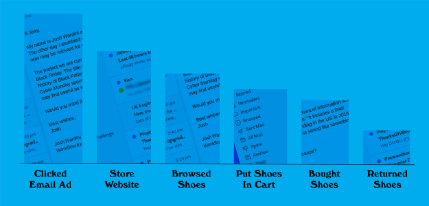
Funnels are used all over the internet to evaluate how well all kinds of applications and websites perform. If you’re online you’re in a funnel. That might seem like a philosophical statement but it’s really very practical because you’re being tracked everywhere you go. The steps you make in the process of “Applying for a job” or “Buying a pair of shoes” or “Watching a television show” or “Finding your life partner” are all stored and tallied and analyzed in order for the people building these systems to make them better.
If it sounds creepy that you’re always being tracked, then welcome to the Internet, this must be your first day, please take a look at a cat video.
Typically, the evaluation and use of funnels are done in aggregate. Applications aren’t optimized based on individual experiences but rather the experience of significant numbers of people. Individual paths are just too messy and too hard to evaluate.
That’s why funnels are often represented using simple bar charts. With these bar charts, the efficiency at each step can be evaluated easily and precisely and from that evaluation, conclusions can be drawn about how to improve the steps.
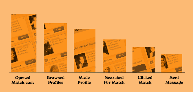
To understand how funnels are used to optimize experience, imagine you own a website that sells dataviz themed candies. Your sales are flat and you want to improve your site so that more people move through the funnel eventually getting to a successful conclusion (buying that sweet sweet chocolate pie chart).
You decide there’s a problem with the buttons on your site, they’re just not… good enough. Your designer gives you three options: add more buttons, make the buttons bigger or use 3D buttons. You implement all three and run a simple A/B test to see the change in how your customers move through your site compared to the original buttons. In such a case, the results would be visualized in a way that shows where the number of visitors at each step remain the same (blue), are statistically lower (red) or are statistically higher (green).
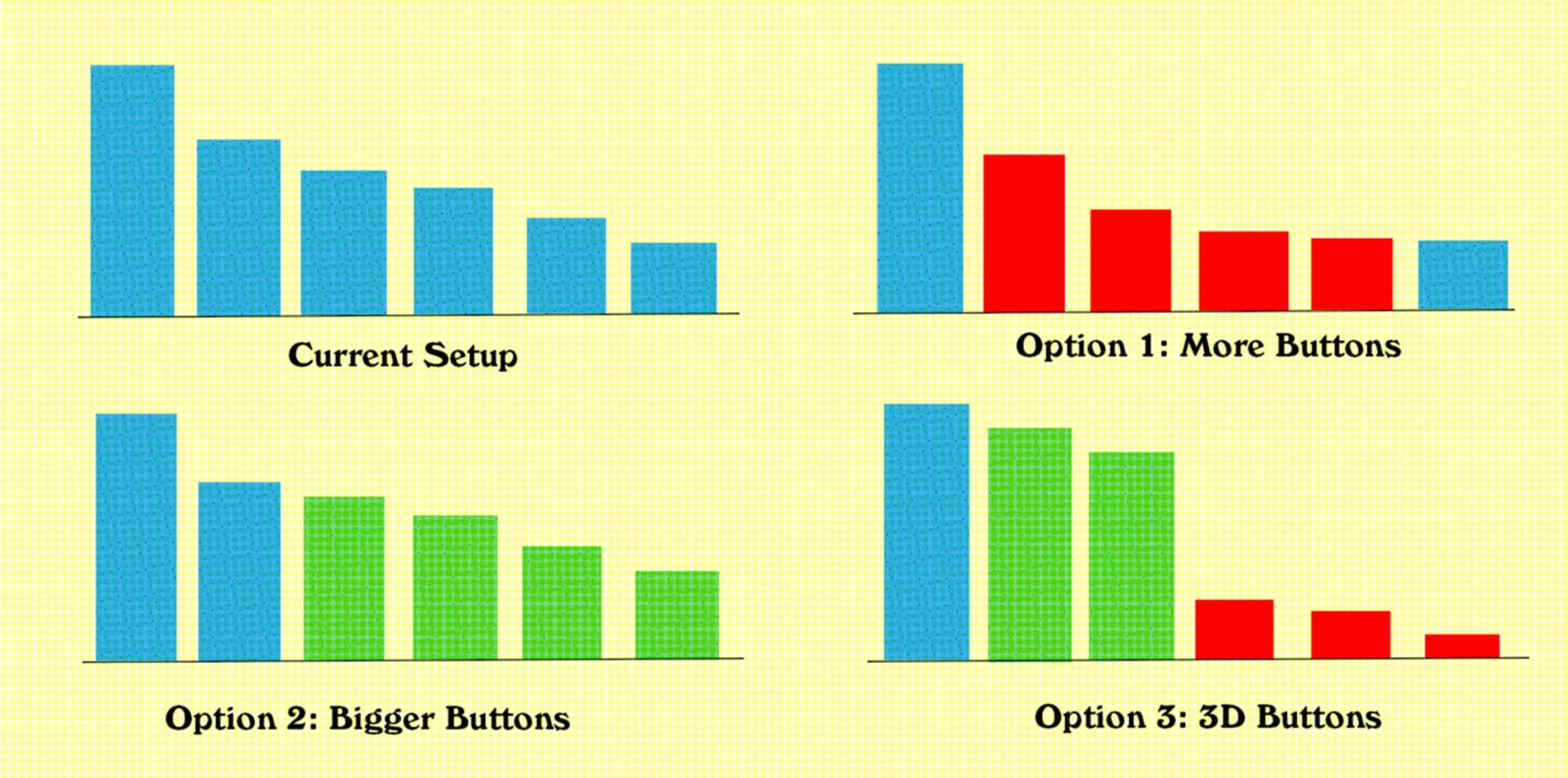
It turns out, the best result came from adding bigger buttons, which any designer will tell you is always the right choice. We know this because it increased the number of people who made it deeper into the funnel, which is typically the measure of success. Typically, but not always. A close observer of the funnels above would notice that one of our funnels above had a step at the end, “returned shoes”, which would not be considered positive. But in general, this approach is straightforward and actionable, two things that are key to effective data visualization.
Funnels are everywhere. We are constantly moving through them and even when you’re not in a deeply tracked environment, you could see yourself as being in a funnel. Every time you’re in a meeting, you are unconsciously participating in a funnel.

But like so many other common ways of visualizing data, as soon as you start to look closely at the visual metaphor of the funnel, you realize how impoverished a view it is. We don’t walk cleanly through the stages of a system. We backtrack, we jump ahead. There isn’t a clear path — there are forks in the path. You might click on a pair of shoes and add it to your cart and then go back and click on another pair of shoes and go round and round trying to decide whether or not it’s the right pair of shoes. You might be reading this essay and never finish it and still share it or click the clap button. That difference in how you move through the system of reading an article on Medium is lost in these overly simplified views.
So then why do we use such a simplified data visualization of funnels? Let’s look at a funnel that is more complex than that. One with where the data visualization shows forks:

And another with forks and with loops:
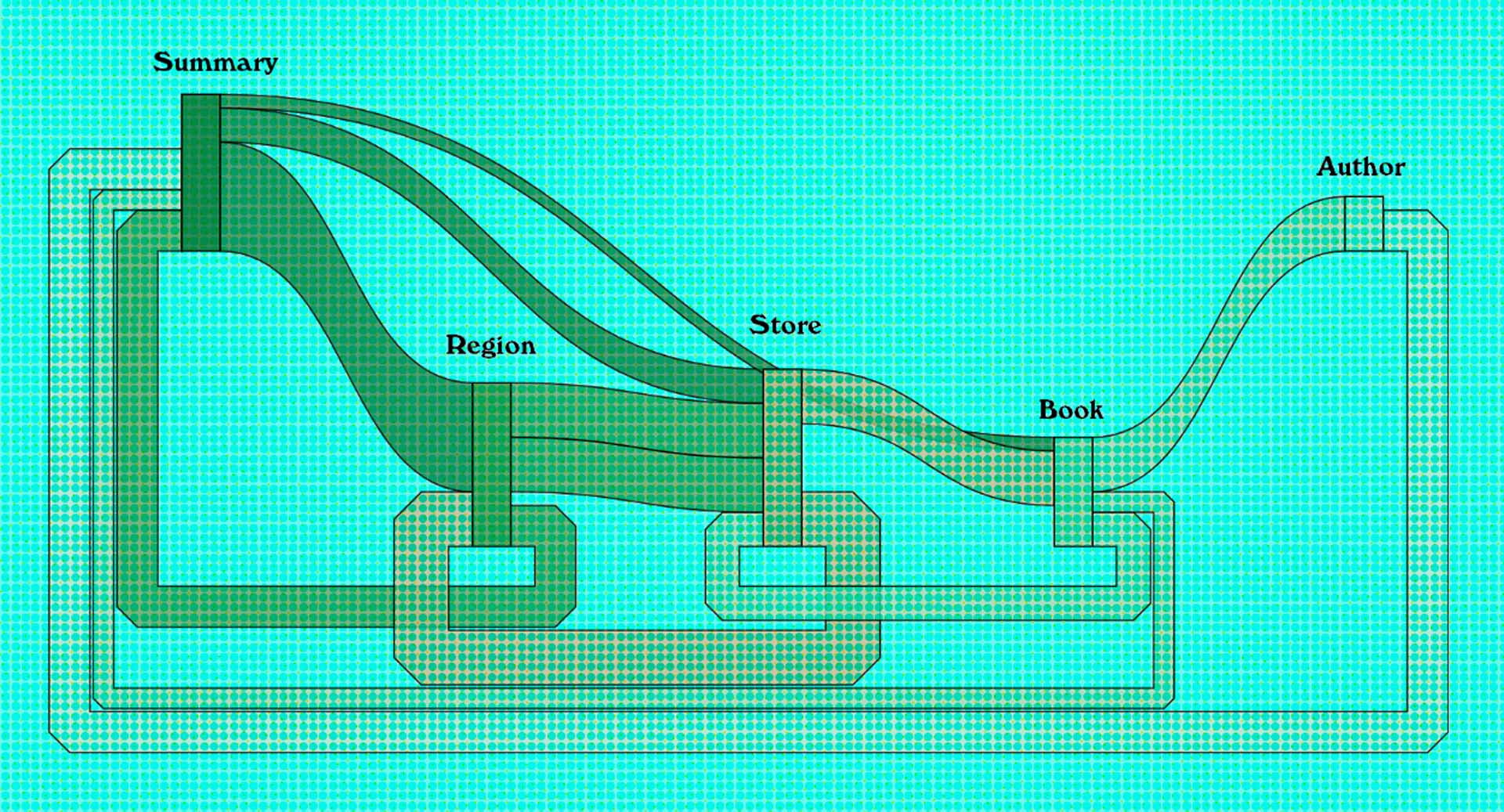
You can probably intuit from looking at these why funnels aren’t typically represented this way. Partly it’s a data issue: it’s much easier to bucket into steps than create the kind of network data necessary for these views. Partly, it’s a technical issue, all data visualization tools support bar charts while few support flow diagrams. Partly, it’s a data literacy issue, people have a hard time reading these complex flow diagrams.
These are serious challenges that as a field we are wrestling with. Creating Sankey diagrams like those above is now possible in many mainstream tools. The capacity to read those diagrams, while by no means a sure thing, is also becoming more common. Even the capacity to generate and process network data is less rarified than it used to be, with graph databases designed specifically for the task.
But we can do better. We can demand better tools and libraries for the diagrams. For me, the two diagrams above are more readable and give more accurate views into flows than were available five years ago, but for most readers they are still too abstract. We can create new and better layout algorithms that deal better with the complex problem of visually optimizing paths. We can also demand better tools that allow us to annotate and style them so that they’re more readable to a larger audience.
On the data literacy side, we can invest more at the organizational and professional level in improving our ability to read flow diagrams. Flow diagrams like these are typically considered overly complex and, unlike a line chart, only occasionally useful. But flows, be they of resources, energy, shoppers, daters, watchers or otherwise, are so common that we should reevaluate our assumptions about whether people should be able to read such diagrams.
Maximizing precision over accuracy
From an information design perspective, precision and accuracy refer to different things. You can have something that is accurate but imprecise, for instance, if you threw darts at a dartboard:

These shots are close to the center but they’re scattered around. So they are accurate in that they come, in aggregate, close to the center of the target.

In contrast, these shots are not accurate (they’re far away from the center of the target) but they are precise in that they are tightly grouped.
Depending on the conditions of the data you want to represent and the system it came from, it may be impossible to have both accuracy and precision. In that case, a decision must be made about which is more important. This is the real value of a data visualization expert. They understand these tradeoffs and how those tradeoffs interact with each other in the visual metaphors used to display data.
Bar charts are lauded for their precision. That’s because human beings are great at measuring and comparing the lengths of rectangles in bar charts. But precision — and especially numerical precision — is just one possible use of data visualization, and you should not evaluate all chart types purely on their ability to represent numerical data precisely. Instead, consider what tradeoffs there are and what other aspects of your data are more important than its numerical qualities.
This dartboard metaphor is a common way to explain precision versus accuracy in GIS but that might not seem to apply to other areas of data visualization. But the tension between precision and accuracy is at every stage in data visualization. What we have available with funnels is precise but inaccurate representations using bar charts versus much more accurate representations (like the Sankey diagrams above) that do not admit to precise measurement or comparison. There is not a correct approach, these are tradeoffs, but one common result of this tension is to split the difference and use hierarchical diagrams, which are more accurate than bar charts and more precise than Sankey diagrams.
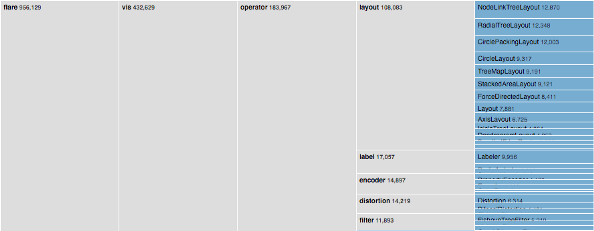


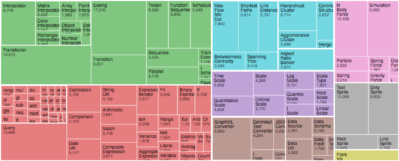
Hierarchical diagrams are called such because they were developed for representing hierarchies like genealogical and market sector data. They are an entire class of data visualization and include charts like dendrograms, treemaps, circle packing, and sunbursts. In their typical use, the data they visualize is either ancestor/descendent relationships or grouped classes of data.
For funnels, the individual nodes represent the steps in a system. Sunbursts are a common form in use for funnel visualization, dating back to Kerry Rodden’s seminal paper on sunbursts for funnel data, though dendrograms are also quite common. Circle packing and treemaps are not suitable for funnel visualization because they don’t visually represent the distinct steps, muddying the information metaphor of the visual.
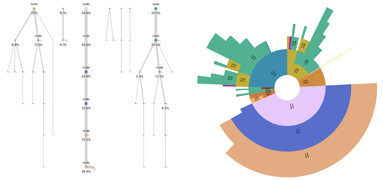
Here is an example of an application I developed that shows the same funnel side-by-side. By representing them like this, we give the audience a more precise measure of the values along different paths than they could with the Sankey-style diagrams while simultaneously showing a more accurate view of the actual movement through the system than a bar chart.
We typically refer to goals in evaluating methods in data visualization, with Robert Kosara pointing out that pie charts are not bad if your goal is to understand part-to-whole relationships rather than (or as a higher priority to) numerical comparison. That’s true, and one of those goals should be accurately representing complex systems rather than using convenient oversimplifications.
Simplistic design leads to simplistic analysis
Earlier on, I mentioned that technical, data and literacy challenges are primary causes of the use of simple bar charts to represent funnel data. But these are overshadowed by an even greater challenge: The use and preference of more simplistic views that naively optimize for precision can lead to simplistic design. Simplistic design can create the conditions wherein the problem space only allows for simplistic solutions. When designers and data scientists evaluate performance using a unilinear funnel, it can cause them to design a unilinear system.
There’s a field of study that deals with how the way we represent a thing affects the way we reason about a thing: it’s known as semiotics. From a semiotic perspective, we risk confusing the actual user paths with the simplified bar chart view. This semiotic feedback loop reinforces and constrains how we design then justifies it by providing analysis only within the limited view of the system.
What that means in layman’s terms is that if you represent a funnel as a bar chart, then the only decisions you can make about it are optimizing that bar chart. If there are efficiencies in the system that have to do with loops and forks, then you won’t be able to even hypothesize about them.
The design of a data visualization can, in an attempt to simply answer a question, create a simplistic view of the system that leads to even more simple answers and simple hypotheses. More accurate systematic views of the behavior afford the ability to make more complex and more accurate hypotheses.
Because as we live in a world of funnels, we reduce the sophistication of our entire world by thinking of it as consisting of unilinear systems with only one path. That’s the kind of thing we stopped telling kids decades ago, whether in the way we expect them to evaluate earlier cultures or the way we say there is no one right way to live your life. We shouldn’t turn around and ignore all that in favor of a technically simple, naively precise view of the systems that exist everywhere in our modern life. In complexifying our view, we may not be able to escape a world of funnels, but we could make it better.