
Whether it’s a purchase, signing up, or a survey, one needs to put some information into a form. Customers have to take time out of their day and fill in the requested information they’ve definitely entered hundreds of times before – name, surname, phone number, email, address, payment card, the list goes on.
Users naturally find this step quite monotonous and annoying, but the torture begins exactly when they deal with a poor form design. A poorly-designed form may result in website abandonment and low conversion rates, as frustrated users won’t be back to the troublesome pages.
The form design influences the overall user experience, as follows a good form design enhances UX and boosts conversions. That’s why it’s important to provide your customers and corporate website users with the best form design, therefore urging them to choose you over and over again.
Great web form design shows that you treat your customers, appreciate their time, and want your brand to be helpful, professional, and enjoyable to work with. So how to design forms?
First of all, let’s examine the basic elements of design forms:
- The structure or form layout encompasses the order of input fields and logical connections between them providing a seamless and intuitive user experience.
- Input fields are the fields designed for user input; they are text fields, password fields, and various checkboxes.
- Field labels are the definitions applied to the corresponding input fields.
- The action button is an ending operation of submitting the input information.
- Feedback helps users to find out the results of their inputs, either by accepting the form or rejecting it because of possible errors.
Above mentioned elements are obligatory components, while forms may also include the optional ones:
- Validation stands for automatic information check.
- Assistance is an explanation of how to fill out the forms.
A form is a mediator in the interaction process between the user and the app. Thus design form should provide a consistent and coherent experience to the user and make it as enjoyable as possible to work with the app. All the components should be implemented properly, but how to do this?
There are some form design principles and practices to take into consideration in order to make your design form shine! Web design form examples are provided. Let’s dive into best forn practices tips & tricks.
In this article
- 1. Greet your respondents
- 2. Apply less information
- 3. Use a single column design
- 4. Arrange fields into semantic groups
- 5. Mark optional fields if there are few of them
- 6. Adopt mobile-friendliness
- 7. Label fields properly
- 8. Employ pre-fill and auto-detect
- 9. Always explain why and what for if you ask for specific data
- 10. Use input constraints for each field
- 11. Align text to the left
- 12. Use autofocus and enable autocorrect
- 13. Use inline form field validation
- 14. Be clear in your error messages
- 15. Enable complete button only when the form is completed
- 16. Apply real-time feedback
- 17. Don’t forget about the thanks page
- 18. Call to Action (CTA)
- 19. The design and some additional tricks
- Conclusion
1. Greet your respondents
Before presenting users with queries welcome them and communicate the purpose of the form straightforwardly. It’s a perfect chance to make a good first impression and put the interaction process on a friendly tune.
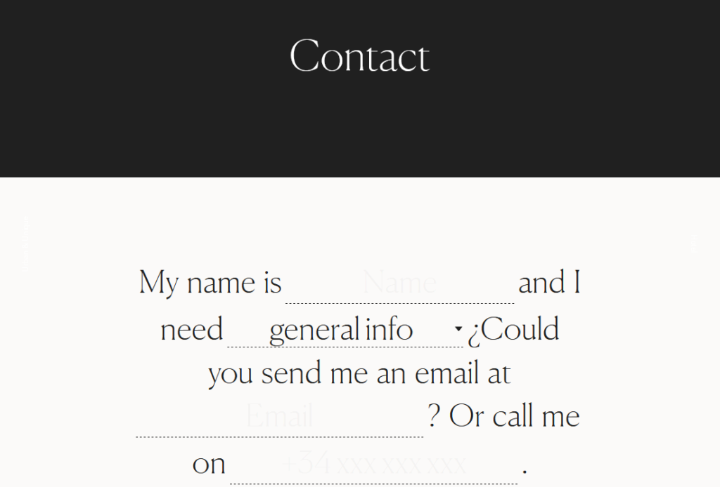
Have a look at ALUXION contact form:
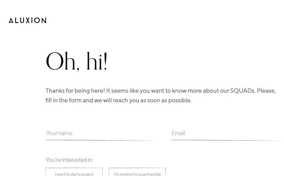
The form begins with the greeting of the visitor. Another point of this form page design is the line of being thankful to the user, showing that the brand treats the user’s time. Also, such an introduction demonstrates the brand’s professional approach. That’s exactly what a good first impression is.
2. Apply less information
To ease the process of interaction use less information in your design forms. Ask only the most relevant and important info about the users. For instance, there is no need to ask their preferred dishes or names of their pets, do it only if it is relevant to your specific form requests. Be simple and straightforward. It boosts the completion time and reduces the risk of a user’s irritation.
Apple definitely knows how to do this:
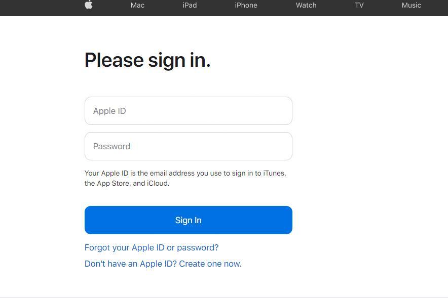
Apple sign-in form is extremely simple, as it supposes the user to fill out only two fields – Apple ID and Password. The design form adheres to the rule of asking for less information thus facilitating the sign in process. The clear and smooth design uses no sophisticated elements and contributes to the overall simplicity that Apple promotes on every platform of its presence. No muss, no fuss.
3. Use a single column design
Multiple-column designs might distract the user’s attention, thereby the completion time is increased. It’s better to apply a single column design. That will ease the filling out process, as the responders will allocate their attention successively furnishing the fields from the top to the bottom. Have a look at this form field design:
Spatulah registration form is quite simple and easy-to-navigate. All the queries are placed into one single column. The design is bright and kind of animated. It’s simple and not distracting, but at the same time an eye-catching form example indeed.
4. Arrange fields into semantic groups
If your specific queries don’t fit properly into the one-column design, you can reorganize them correspondingly to their meanings. Dividing fields according to the semantic groups promote consistency and logical order of the questions. Escaping the massive stream of queries, users will more easily manage the form.
Braintree contact form is a great example of an efficient semantic arrangement:
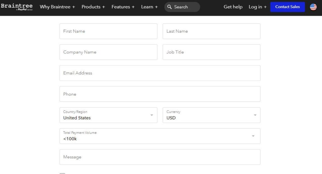
Responders read the information by portions and clearly understand what to fill out in this or that field. They do not have to spend much time completing the form, as the logical arrangement of the information promotes simplicity and helps users to digest the content.
5. Mark optional fields if there are few of them
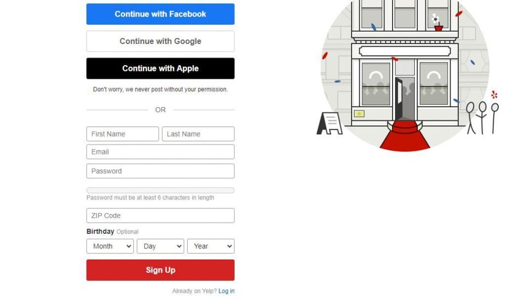
As a rule, there are more mandatory queries than optional ones. For instance, if 5 fields out of 7 are obligatory to fill out, then there is no sense to mark all five. It’s better to indicate 2 optional fields, escaping over furnishing the form.
Yelp has only one optional field while others are obligatory to fill out. Marking the optional field instead of those 5 mandatory is a good decision, as the entire form looks clean and nice:
6. Adopt mobile-friendliness
As half of the overall traffic comes from mobile phones, it’s quite reasonable to make it possible for mobile users to fill out the form with the same comfort as for desktop users. User-friendly design allows you to gain trust from a vast audience.
Have a look at Apple sign-in form accessed by a mobile user:
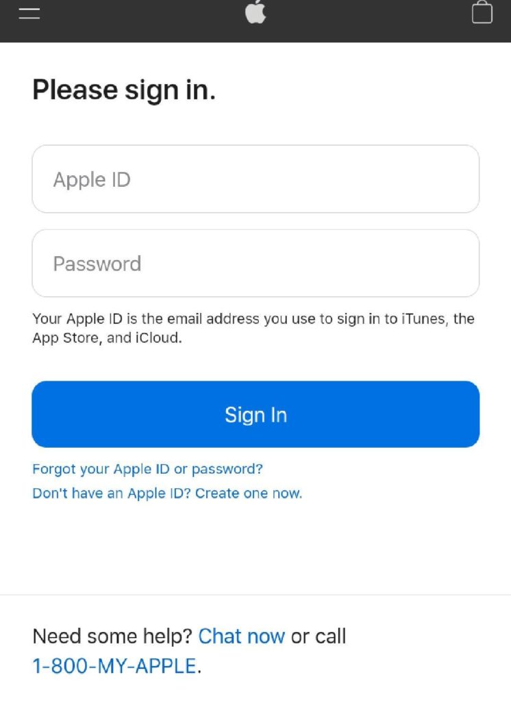
It’s a good example of a responsive form design. It’s extremely important to provide all users with a good experience, regardless of what device they use – be it a laptop, tablet, or a mobile phone.
Besides, there is one more useful function to adjust if you want your form to be user-friendly. Enable the ability to switch to the next form field. It is a good alternative to the constant clicking on the necessary line. It’s time-saving and quite handy.
7. Label fields properly
Labeling each field goes without saying. The question is how to label a field? The main rule is not to hide a label while answering, so the respondent will not lose the content. If there is enough space use them outside the input field on the left side, if not – you can put labels on the top of the field. Also, labels can be put into the field, but the point is to make them visible at the moment the user types.
Omada Health contact form design uses labels outside the field:

Thus the user will not lose the point and will know for sure what content to type in each input field.
8. Employ pre-fill and auto-detect
The point of the good design form is to facilitate the filling out process. Employing pre-fill and auto-detect functions you help your customers and save their time. If you already know some information then fill it automatically. For instance, the user’s city and the country are being easily detected via IP or geolocation.
Braintree contact form automatically detects the country via the user’s geolocation:
9. Always explain why and what for if you ask for specific data
If you need some specific information, always explain the purpose of the query. This is a way to gain trust and credibility among the responders. Otherwise, they are not likely to share their confidential information.
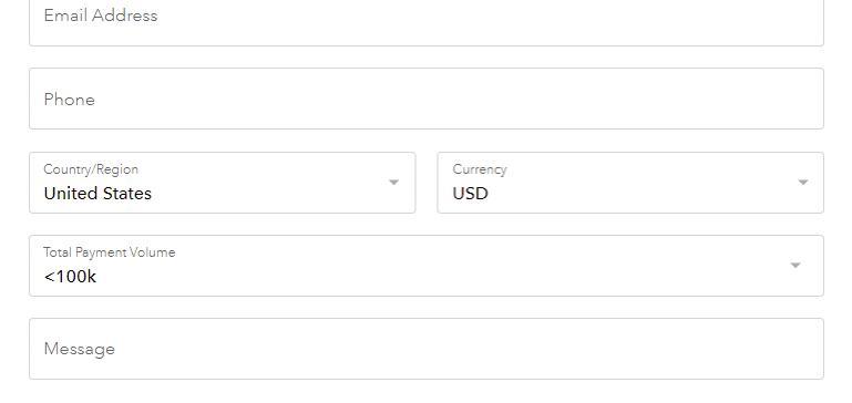
Look at the way how Bestbuy explains why it needs your email:
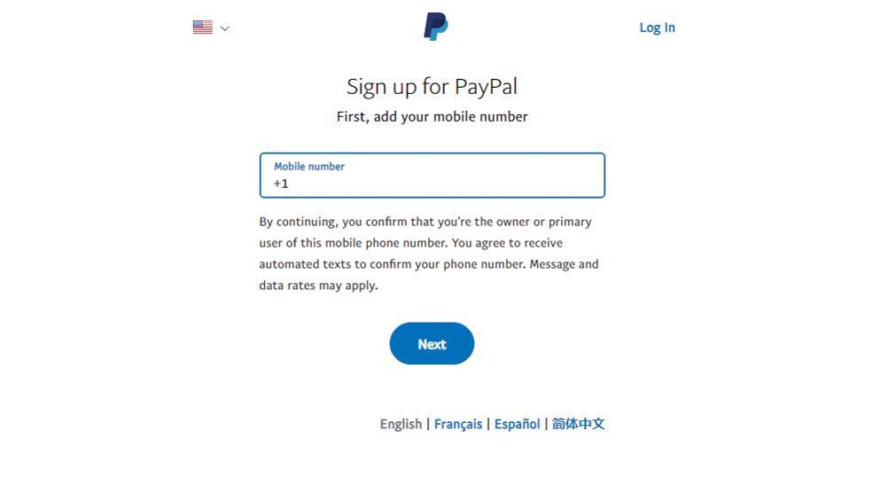
10. Use input constraints for each field
Input constraints are min and max length, the format, use of specific symbols (numeric, alphabetic, alphanumeric) in diverse fields. Input constraints significantly decrease the number of mistakes and wrong data.
PayPal sign-up form puts a constraint on alphabetical symbols in the mobile number field. The user has no way of filling the letters or some other symbols except numerals. It helps to avoid inappropriate data:
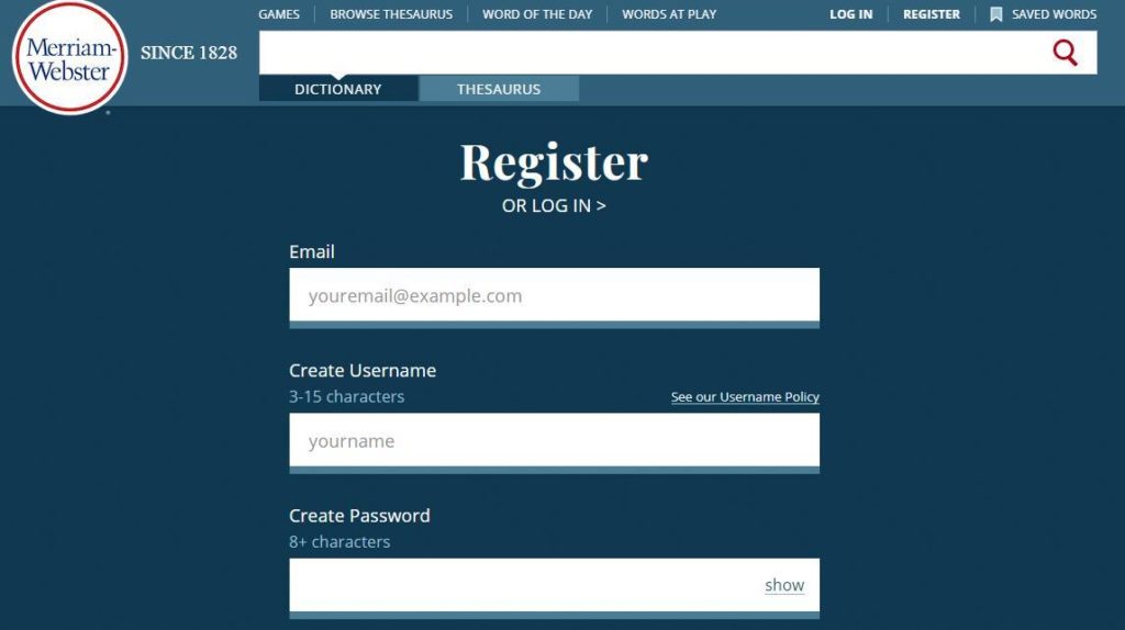
11. Align text to the left
Aligning the text to the left is a matter of mere physiology – it’s natural to read from the left to the right. Thus, the user’s eyes don’t have to jump across the page to get the necessary data. Also, it lowers the amount of time needed to complete the form.
The text is aligned to the left at Merriam-Webster register form:
12. Use autofocus and enable autocorrect
Autofocus is another useful tip that helps the users to fix their attention on one field, without losing the point. Autocorrect, in its turn, helps to avoid unintentional mistakes and allows users not to retype the information.
Chanceupon contact form uses more than just autofocus. The form consists of multiple fields but the point is that they are all clickable. The user only needs to make a choice and click on the preferred field, instead of typing. As the user clicks on the field it becomes yellow. The enabled function provides users with a consistent and enjoyable experience and eases the process of form filling.
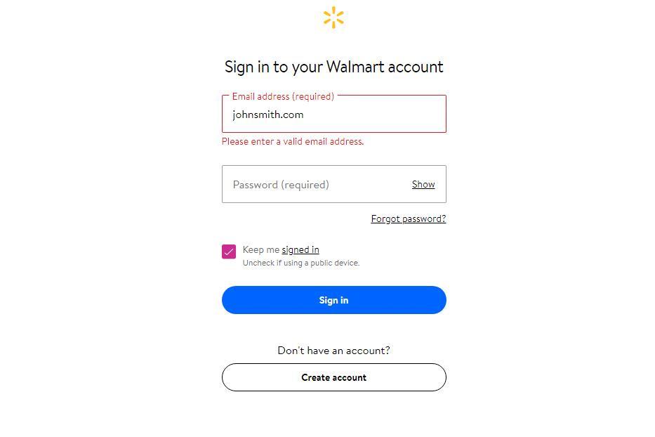
13. Use inline form field validation
The best way to notify the respondents about the mistake and make it evident is to highlight the field and show the error inline. Some services show the mistake only after the form is complete. It’s quite reasonable to notify the users right after they answered the question and allow them to correct the error right away.
Take a look at Walmart inline validation:
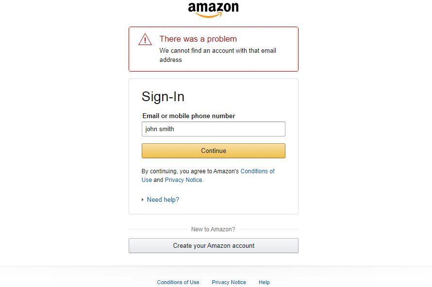
14. Be clear in your error messages
It’s important to provide users with a precise explanation of what went wrong. Avoid general messages like “Error 999” or “Please, try again”. The point is to indicate the mistake as precisely as possible so that responders would easily correct the wrong data.
For instance, this is how Amazon provides the user with an explanation of what went wrong:
15. Enable complete button only when the form is completed
Activate the next-step-button only when the users have responded to all mandatory fields and there aren’t any errors. This will keep the responders focused on the queries and will not let them miss something important. Otherwise, you had to spend your time reviewing completed forms and sorting the ones that were filled incorrectly.
16. Apply real-time feedback
Don’t make the users wait for an email letter with the feedback, instead, give it to them right after the form is filled. Waiting for results too long might be quite irritating. What is more, the longer your website users wait for the feedback, the more confident they are that something went wrong and you didn’t receive their inquiry.
17. Don’t forget about the thanks page
The thanks page is synonymous with the welcome page. Employing these two pages you provide your customers with a consistent experience and again show your professionalism. Thank You page is the last step in your conversation with clients and it’s your last chance for building a long-term relationship with them. So our advice is to take your time and create a Thank You page with the content and design you can be proud of. And don’t forget to complement it with a special discount or gift to turn your clients into your regular customers.
18. Call to Action (CTA)
Almost all web forms include CTA (call-to-action) buttons of various kinds. It can be “Learn more”, “Contact us”, or “Sign up” buttons. The more clicks on your CTA button – the higher your chances to gain new leads or customers. By clicking the CTA users are presented with a design form. That’s why it’s crucially important to design the call-to-action button. First of all, a CTA should be placed in an easy-to-spot location and be eye-catching. The button should look nice enough to grab the visitor’s attention.
Netflix uses vivid red CTA button:

The CTA button is extremely visible and digestible. All important issues on the landing page stick to the one color that attracts visitor’s attention immediately. That’s the purpose.
19. The design and some additional tricks
Choose an appropriate pleasant color palette and appealing fonts. While designing the form, do not forget to stick to the overall web platform design to maintain consistency. Good looking forms have more chances to attract visitors and convert them into customers.
Your design form should be as comprehensible as possible. That’s why try not to employ some complex and sophisticated design elements. It’s better to keep it simple and design a form in moderation. But it doesn’t mean that you should deprive your form of a compelling image and reject any creative ideas that can help you to gain the user’s attention.
Let’s have a look at one of the examples of well-designed forms:
It’s a booking website. The contact form is extremely simple, but it has some peculiarities. All the data presented is framed into one cohesive letter sample. It’s a great decision as it sticks out from the common form pattern and provides the users with an exceptional and enjoyable experience.
Another way to succeed is to make your design form interactive and engaging by applying various images or short animations. This will turn the monotonous process into some kind of story the user goes through.
Look at this form design inspiration idea:
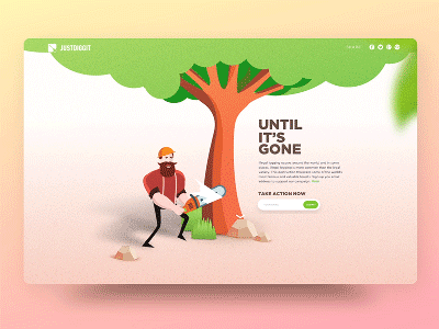
This project is a great example of excellent interactive design forms. The essence of the project is to save trees from felling. On the website, the bear tells the visitor his story and asks for help. Thus the user feels some kind of belonging while surfing through the website. That’s how interaction works. The use of appropriate and engaging animation can greatly enhance the user’s experience.
Another good web form design is created by Rostislav Achilov.
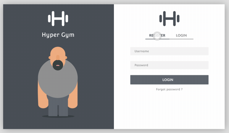
This fancy gym app form consists of two modes – Register and Login. While users switch between these forms, the animation on the left changes correspondingly. This design decision is extremely entertaining, engaging, and highly motivating.
Conclusion
Undoubtedly, the website’s first objective is to adopt a good website design. When visitors go to your site, the design is the first thing that drives their attention. If they are satisfied with its usability and functionality, they will probably search for ways to contact you. That’s where the design form comes into play. If the design form is inconvenient to use and incomprehensible, visitors are likely to abandon the idea and skip the website. That’s why it’s crucial to make your form comprehensible, digestible, and easy-to-use.
With the help of these practices, you can transform the monotonous and annoying activity of filling the form into an entertaining discovery. It’s a great chance to provide your visitors with a seamless experience and gain their trust so that they will decide to become your customers.