Great User Experience (UX) can lead to better conversion rates and return customers. On the flip side, bad UX can ruin conversion rates and ultimately your business. Providing a user-centric experience isn’t just about making a pretty website, although that’s definitely part of it, there is so much more to it! Through our experience conducting in-depth UX/UI audits on eCommerce websites across numerous industries, we’ve identified common UX mistakes we continually see website after website.
Target Market
First things first – who are you targeting? This is a question a lot of clients seem to not be able to answer. Even if you don’t know all of the details or have full personas mapped out, it’s helpful to have some idea to help inform decisions. For example, if you’re targeting men, you’re likely not going to have pinks and florals. If you’re targeting people over 60, you’ll likely want to make sure the font size is large enough for them to read easily.
Navigation
Make it easy for your customers to navigate your online store and easily find what they are looking for. Did you know your website header (including navigation) is generally the first impression a customer experiences with your brand and it often sets the tone for their experience? Over the past 15 years, a consistent issue we see across eCommerce websites we’ve audited is having a chaotic category structure, using industry jargon, or having links leading to empty pages – all of these are a sure way to break user trust.
Mobile Experience
According to Oberlo, 72.89% of users are shopping on their mobile devices over their desktops. By neglecting your mobile experience, you’re likely leaving a lot of revenue on the table for a competitor to take. In your Google Analytics dashboard, have you noticed users starting on mobile, but checking out on desktop? That should be an immediate red flag.
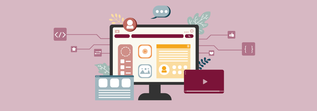
Design, Features, and Content
It’s important to have a balance between the site design, features, and content in order to provide a great experience for your users.
Features
If you have an online store that has a lot of wonderful features but they aren’t easy to use, don’t function correctly, or aren’t aesthetically pleasing, the features (no matter how great) won’t have a good impact. And, if you have too many features it likely will be confusing for the user.
Design
White space or negative space is described as the area between design elements and content (and no it doesn’t necessarily have to be white). Many people seem to think of it as “wasted space” but research shows that leaving this space puts emphasis on important elements, helps users process information, and promotes legibility which ultimately leads to a better experience.
Content
Content is a huge part of the design, therefore, they should work together not against each other. When you have large blocks of content it can become overwhelming and users are less likely to read all that valuable information you spent all that time crafting. Instead, focus on bite-sized pieces of content that are easily scannable and digestible.
If you think your online store is struggling in any of these areas (or in general) it may be time for a UX/UI Audit! Learn more about what our audits include and why you should consider one.