It has been over 30 years since Simon Pemberton and I first began trading as Pemberton & Whitefoord. Since March 1987 we have experienced many challenges and witnessed the design profession evolve almost beyond recognition into an industry that is now primarily dominated by pixels rather than pencils.
While the tools of our trade may be somewhat different, our ethos has remained consistent. An unwavering commitment to producing memorable, intelligent creative solutions that meet the commercial objectives of our clients.
In recognition of this company anniversary and a longevity spanning over 3 decades, we have assembled a collection of 13 projects selected by current staff members that encapsulate our passion for design, ideas and craft. We hope you enjoy this eclectic snapshot of P&W packaging projects and the history they represent".

Adrian Whitefoord
(Partner)

Jon - Tesco Finest Chocolate. 2009
P&W combined simple elegant pack architecture with stunning editorial food photography to create this striking range, setting the bar very high for other retailers to follow with similar products.

Ben - Tesco Spanish Orange Juice. 2012
This ‘freshly squeezed’ design brought a light hearted, fun twist to the juice isle. The matador wraps around the whole pack bringing the character to life and creating a witty, unique and eye catching design.

Sam - A Waka Waka Snacka! 2011
Waka Waka stands out for me as a great creative brief to work on. A wacky chip stick daring to take on the big brands with intense spicy flavours and eccentric shapes. Pop art graphics in eye-popping colours create charismatic chaos.

Akiko - Seicomart Beaujolais Nouveau. 2008 to Current
Each year for over ten years P&W has created dynamic vibrant designs for this Beaujolais Nouveau range. Diverse themes include: flowers, songbirds, jazz clubs and postage stamps, capturing the playfulness, personality and tradition of the wines.

Vicky - Knead Bakery. 2010
Knead bakery packaging is one of my favourite P&W designs. The packs were simple & modern while delivering strong flavour cues through “foodie” photography and product viability via the die cut ‘K’ window. A stand-out product in the FreeFrom sector.

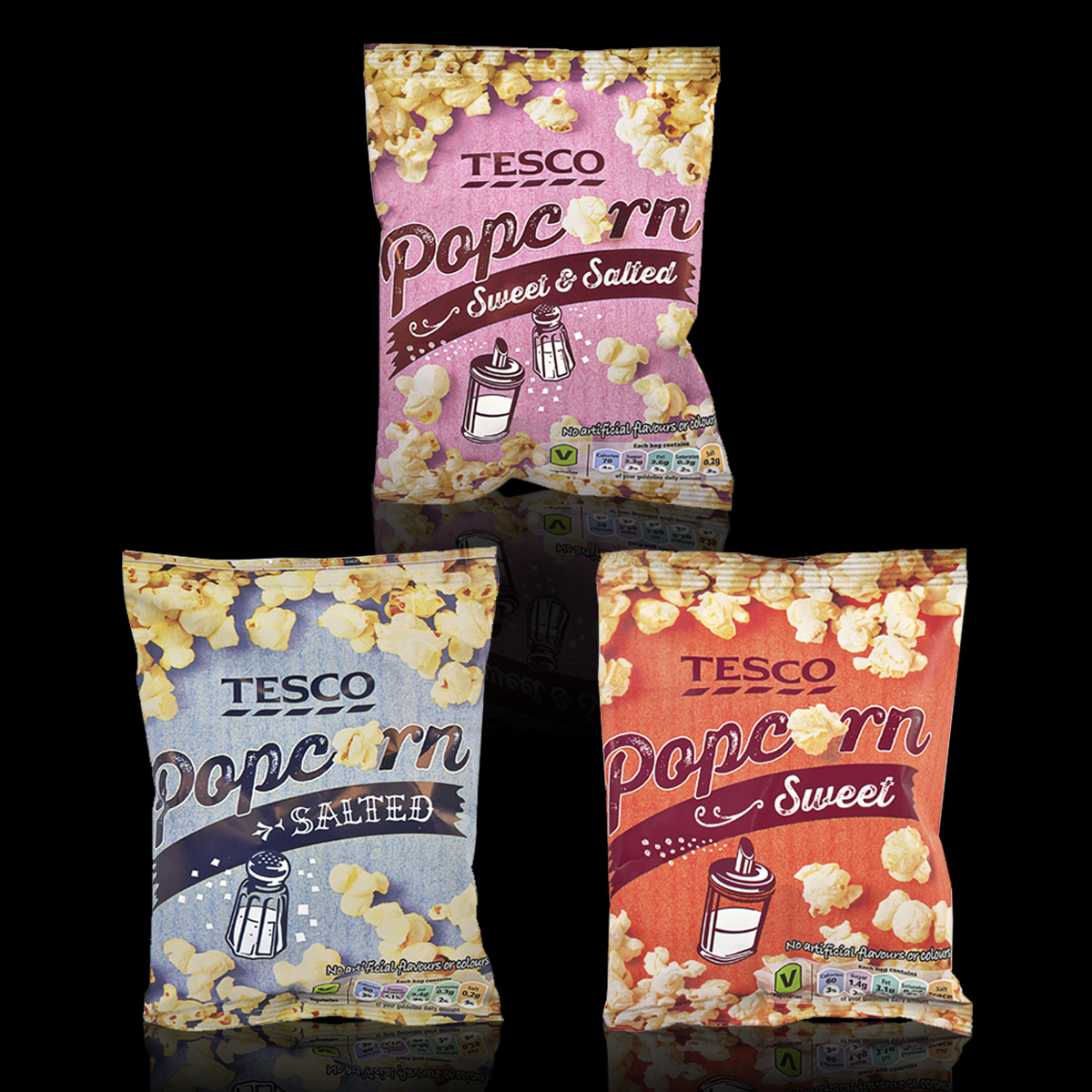
Amanda - Tesco Popcorn. 2014
I chose this popcorn design because I love the way it homogenises; bold illustration, product photography and retro typography. The overall effect is evocative of old movie posters and the fun factor synonymous with a trip to the cinema.

Simon - Fresh & Easy. 2009
P&W defined the brand and personality for an entirely new retail venture in USA.
The scope of the brief was immense with highly challenging hard launch timescales. The result was a highly original and distinctive solution registering exceptional research response and growing sales.

Darren - Tesco Tortilla Chips. 2007
Our work for Tesco’s Tortilla range was perfectly executed to inject passion into a mundane product. Flavour variations are defined by the humorous change in personality of the Bandito and a strong colour coded background. Barriga llena, corazón contento. Full stomach, happy heart.

Harry - Liberation Nuts. 2007
I really like the overall, minimalistic feel of the packaging with its loose chalk-like cartoon illustrations of a stickman campaigner and black backdrop, that gives great shelf presence. It’s a win, win product - I can simultaneously embrace the fairtrade cause while relaxing with a tasty snack.

Amy - The Fresh Pasta Company 2004
The pack design for ‘The Fresh Pasta Company’ is clean, neat and engaging. The fine art style prints of the pasta on the pack are signed off by the artist / chef, along with tasting notes about the style of pasta.

Richard - Love Food. 2009
I like the strong use of contrast, in a graphic simplicity and immediacy to create a strong and memorable logo design. The simplicity of the logo was core to its strength, making it versatile enough to work with any pack format: carton, bottle or label.

Maria - Tesco Novelty Tissues 2015
I love these quirky tissues that have been brought to life through the interaction of design and pack structure. From the ‘water’ blowing out the elephant’s trunk, to the flaps that accentuate each animal’s silhouette – A simple, impactful and fun spin for a commodity product.

Adrian - Loseley Ice Cream. 2004
Premium Ice cream derived from Jersey cattle on the the Loseley family estate in Surrey. A brand with aristocratic heritage and sales channels in cinemas and theatres. Charismatic, enigmatic and quintessentially British

