
According to the CDC, 61 million adults in the United States live with a disability. Given the number of people who have a disability and the rise of Americans with Disabilities (ADA) website-related lawsuits over the past years, it is imperative that we design for these individuals. After all, accessible design drives better usability. Accessibility standards such as the Web Content Accessibility Guidelines (WCAG) are a good starting point for those aiming to improve the accessibility of their design. Additionally, platform-specific UI recommendations such as Apple’s Human-Interface Guidelines and Google’s Material Design also include accessibility guidelines for designers working within those ecosystems. This article presents 5 general guidelines that can be used to improve the accessibility of your visuals.
1. Design for Color Contrast
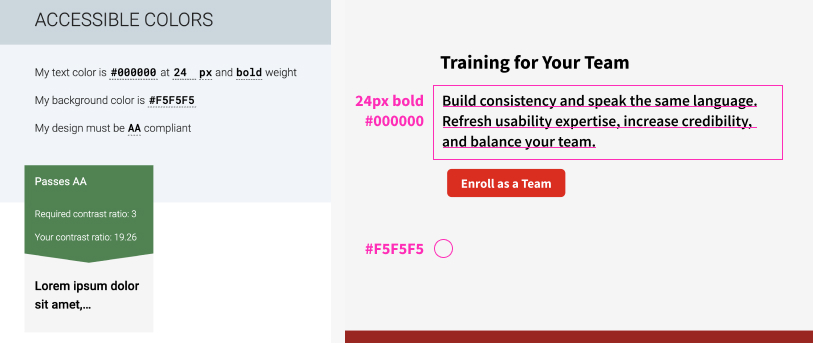
People with vision impairments can have trouble reading text on low-contrast backgrounds. A higher contrast ratio between text and its background helps users with a low vision to read without contrast-enhancing assistive technology. This color contrast can also help users with normal vision to have a comfortable reading experience. According to the WCAG, the color-contrast ratio between text and its background should be at least 4.5:1. For text that is at least 18pt or 14pt bold, the ratio is a bit more generous at 3:1.
There are several tools to check color contrast. I like using accessible-colors.com because it provides decent alternative color suggestions if your contrast ratio is not compliant. To check for the color-contrast ratio, you will need to input the text size, the text weight, and the hexadecimal codes for text color and background color.
2. Provide Visual Cues in Addition to Color
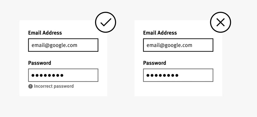
Individuals who have color blindness or low visual acuity may not be able to distinguish between elements differentiated by color alone. It is thus important to use additional cues (such as strokes, patterns) to communicate important information.
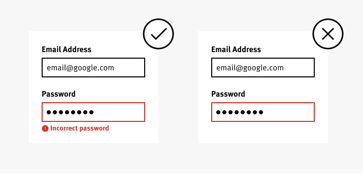
If you’re not sure if you need an additional design element in addition to color to get a point across, try the grayscale trick. Turn your design into grayscale and see if you can correctly understand the design.
3. Identify Focus State
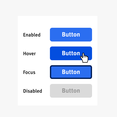
Not only is it good usability practice to make interactive elements easily identifiable, but it is also beneficial for individuals who use the keyboard to navigate the web. A focus indicator, which is, by default, a blue outline around an element, helps people know which active element has the keyboard focus.
Focus states are easily customizable to fit your visual-design needs or brand standards. Links, form fields, widgets, buttons, and menu items should be focusable and their focus state should be clearly indicated.
I recommend using a visually obvious stroke (e.g., a thick-weight line around the in-focus element) to clearly identify a focus state for two reasons:
- This indicator is the default signal and many users expect it.
- Color change alone is not enough to distinguish between different states (see guideline #3 above), as it may not be perceived by some people with vision impairments.
4. Use Robust Alternative Text for Images
Some users may use screen readers to interact and use a website. Alternative text (or ALT text) should be used to describe images and other graphic elements so that people who cannot see them can still get an idea of what is represented. A few guidelines to keep in mind when writing ALT text:
- Keep ALT text succinct.
- The ALT text should not replicate the caption of the image (since both will be read by the screen reader).
- ALT text should not be used for purely decorative images. If an image has no ALT text, the screen reader will jump over it, thus lessening the working-memory load for users.
If you’re having trouble coming up with something valuable to include in your ALT text, reach out to a content designer.

5. Test with Real Users
Make accessibility part of your research. Here are some tips to test your designs:
- Get familiar with common assistive tools. Understand how tools like screen readers, screen magnifiers, or Braille devices work and how to support them with your design.
- Try it yourself. Use the keyboard to navigate through your designs or turn on a screen reader. What did you miss or not account for? Is there anything confusing about the experience? Address these issues before testing your design with real users.
- Test your design with real users. You need only 5 users to get valuable feedback. Fix the issues and test again as needed.
- Consider recruiting users with a mix of accessibility needs — for example, people with low vision and people with motor difficulty.
Conclusion
How do your visuals hold up against these guidelines? If you haven’t designed with accessibility in mind, add it as a theme in your UX roadmap. Review your designs for accessibility and test them with real users with accessibility needs. It’s easier to design with accessibility in mind as you go, so there is less rework. Don’t sacrifice usability for aesthetics.


