August 19, 2021 - Brittany Garlin
25 Digital Marketing Call-to-Action Examples You Can’t Help But Click
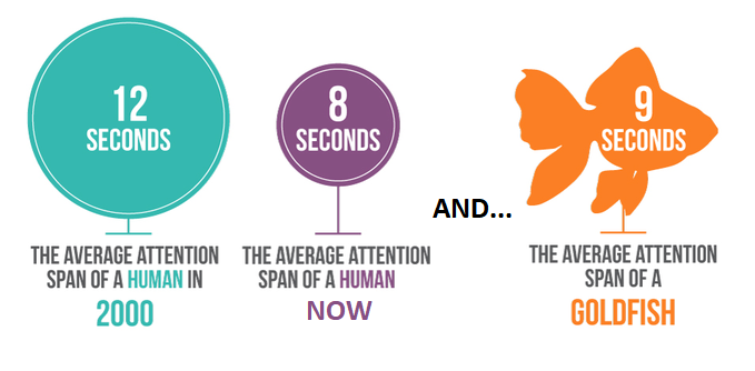
An effective digital marketing call-to-action (CTA) eliminates confusion. As a marketer, you’re very familiar with CTA’s but may not realize the magnitude of importance they hold in today’s digital market. Consumers are overwhelmed with brand messages every day. A constant cascade of videos, images, and text that promise to solve their every problem. The outcome? An audience with decreased attention and decision fatigue. And a frustrated, confused reader is far less likely to become a paying client.
So, what’s the solution? A clear digital marketing call-to-action, also referred to as a CTA. Read on to learn how using the right CTA can help create a better user experience and keep them engaged with your brand.
What is a Call-to-Action (CTA) in Digital Marketing?
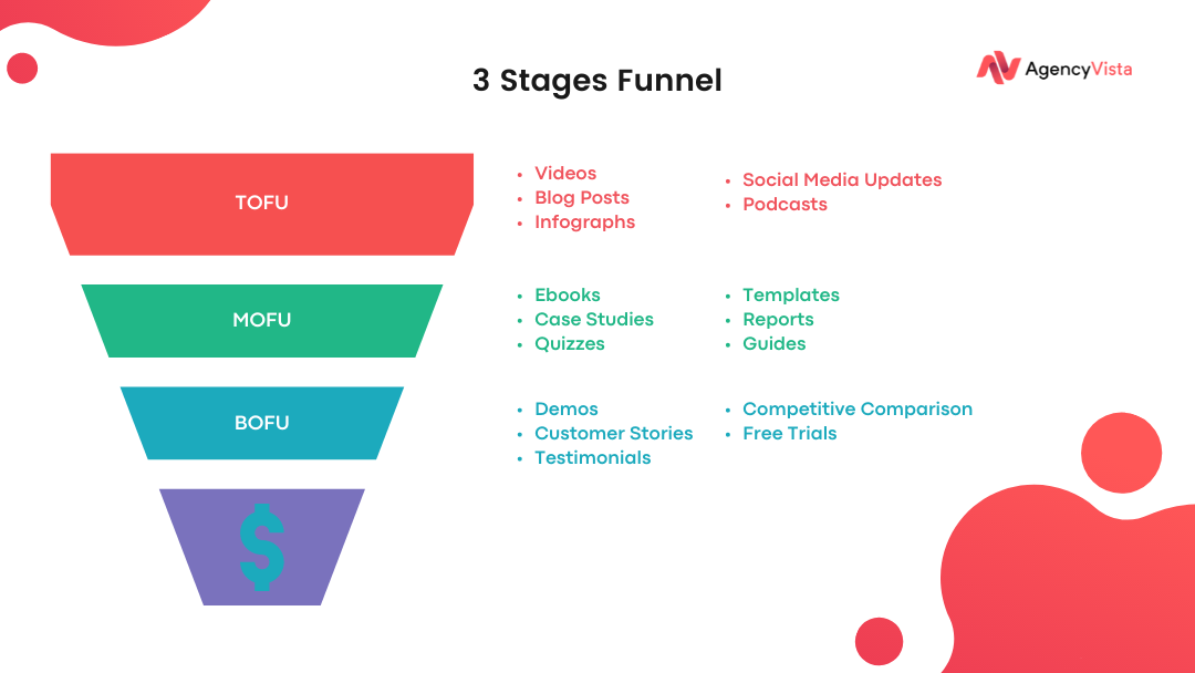
A call-to-action (CTA) in digital marketing is the desired task you want the viewer to complete. For a bottom-of-funnel content piece, this could be getting them to signup or purchase your product. The key to a great digital marketing call-to-action is aligning the desired result to the right content piece. Some CTA’s work better with certain content pieces. Take a look at the chart below for reference.
The most common digital marketing call-to-actions are:
- A sign up (demo, webinar, free trial)
- A subscribe or follow (podcast, YouTube, newsletter)
- Giving information (gated content, lead gen)
- Purchasing a product or service
CTAs are also excellent for directing the customer journey. Since it gives them a clear idea of what to expect, marketers should mention what will happen if they follow the CTA. For example, a CTA like ‘sign up for our webinar to learn how you can earn more revenue’ explains exactly what will occur after the target audience clicks on the button. Ensuring that the CTA is self-explanatory is the first step in motivating audiences. Once the reader or viewer knows what to expect, they are more likely to act.
Why Are CTAs Relevant In Digital Marketing?
Marketers need to get high conversion rates. The fastest way to do this is with effective CTAs. Marketing campaigns are measured by their conversion rates, reputation building, and brand recognition. Many marketing campaigns have metrics on email signups, shares, click-throughs, and more.
While not all content pieces are sales-driven, the overall goal is. Each type of content needs to be aligned with where that prospect is in your marketing funnel to increase sales. Depending on the buying situation, there are three types of decision making consumers go through.
Three Types of Consumer Decision Making:
- Routine Decision Making: this involves very little thought after the original decision has been made (i.e., buying gum).
- Limited Decision Making: this focuses on purchasing products that require a moderate amount of time and effort to compare models and brands before making a choice (i.e., which brand of shoes you want to buy).
- Extensive Decision Making: this requires more thought and is generally focused on higher-cost/infrequent purchases (i.e., buying a car or house).
Everything comes down to timing. If you have a product you’re looking to sell and it falls into the extensive decision-making category, you most likely will need to produce a number of content pieces before an outcome occurs. Each content piece will require a dedicated call-to-action that aligns with where your prospect is in the funnel.
How To Write An Effective Digital Marketing Call-to-Action (CTA)?
Writing CTA’s is not rocket science. It takes a little strategic thinking and placement. Here are a few tips to help marketers write effective CTAs.
- Use First Person: Using the first-person tense in writing CTAs makes it more personal. It almost feels like a friend is speaking to you.
- Use Action Words and Phrases: As we mentioned earlier, make the action clear. Avoid being obtuse and dropping hints. Instead, marketers should remember to be extremely direct in the CTA.
- Eliminate Friction or Roadblocks: For CTAs that require signups or social linkages, it is best to add a social media share button or an email symbol right next to the CTA. Including social sharing and email, buttons avoid hurdles and roadblocks.
- Create Urgency: Use words that denote a sense of urgency in the CTA. Stress on the time sensitivity of following through with the CTA. A CTA like ‘Sign up now while stocks last’ is highly effective because it gives a sense of urgency and prompts viewers to act.
- Make The CTAs Stand Out: Adding bright colors or colors that match the brand logo will help instantly recognize the CTA. Large fonts, eye-catching text, or images with the CTA will also help it stand out.
And, don’t forget to keep it simple! Sometimes as marketers, we get caught up in all of the specifics and can lose the audience along the way. Keep character count low. Your calls to action should be clear enough that your audience knows what to expect, but they should also be concise enough to hold the visitor’s attention. A compelling CTA is typically in the range of 90 – 120 characters, which equates to about five to seven words.
15 Digital Marketing Call-to-Action Examples You Can’t Help But Click
1. Evernote: Remember Everything
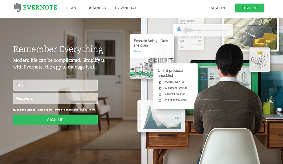
“Remember Everything” This simple wording is a powerful, all-encompassing message that helps visitors understand what Evernote is all about. The CTA to sign up for free is the same color as the logo, which creates a strong sense of identification in audiences’ minds.
2. Dropbox: Sign up for free
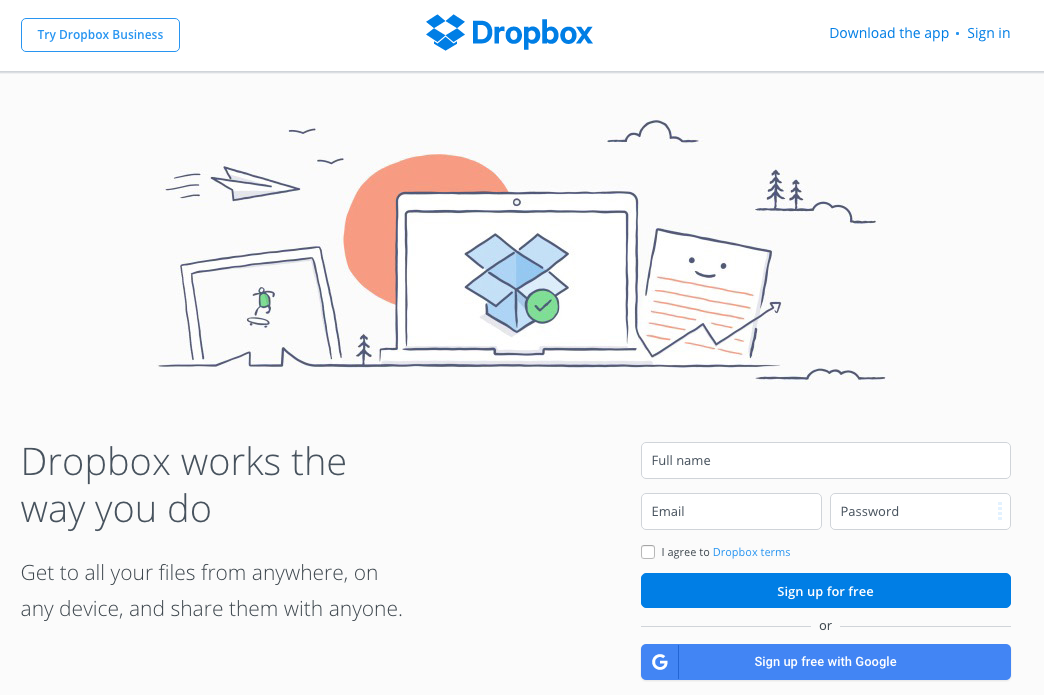
File-hosting giant Dropbox also has something similar to Evernote. Their CTA is ‘sign up for free’ and is an intelligent way to benefit the user while also asking them to sign up. This their CTA also allows the user to choose which sign up method would be easiest for them (manually or with Google). The primary graphic on the home page benefits the user and is another CTA or enticer to sign up for all the advantages immediately.
3. Netflix: Join Free for a Month
Netflix capitalized on the greatest fear that users have – not being able to cancel a subscription. Their CTA is ‘Join Free for a Month,’ and right below the CTA are the words ‘Cancel Anytime’ Putting this fear to rest is probably what contributed to the success of the streaming giant. Like many other successful businesses, it is also noteworthy that Netflix has ensured that their primary and secondary CTA is the same color as their red logo.
4. Prezi: Give Prezi a try
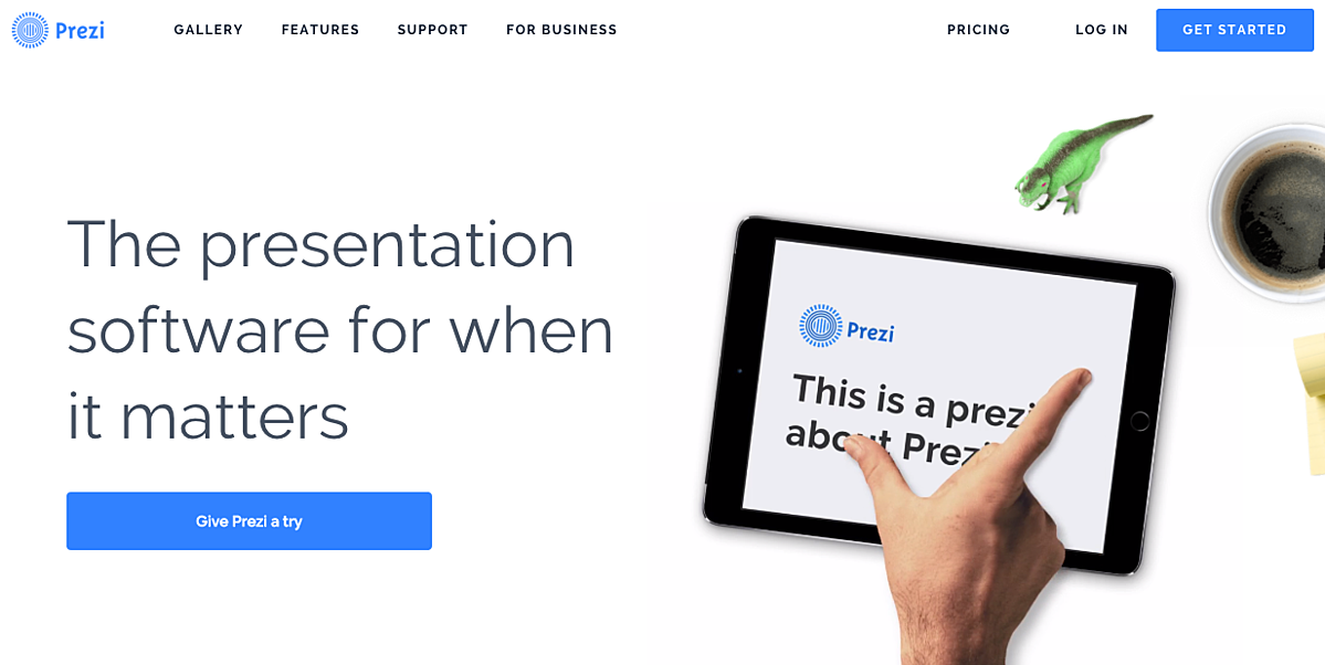
The team at Prezi utilizes their brand colors to drive conversions on their CTA buttons. That bright blue is strategically placed on the homepage: the main “Give Prezi a try” CTA, and the secondary “Get Started” CTA, both of which take users to the same pricing page. Color psychology suggests that blue is known for its trust and dependability. Blue is a well-liked color that can bring a sense of calmness and trust when building relationships, especially in marketing.
5. Panthera: Read More
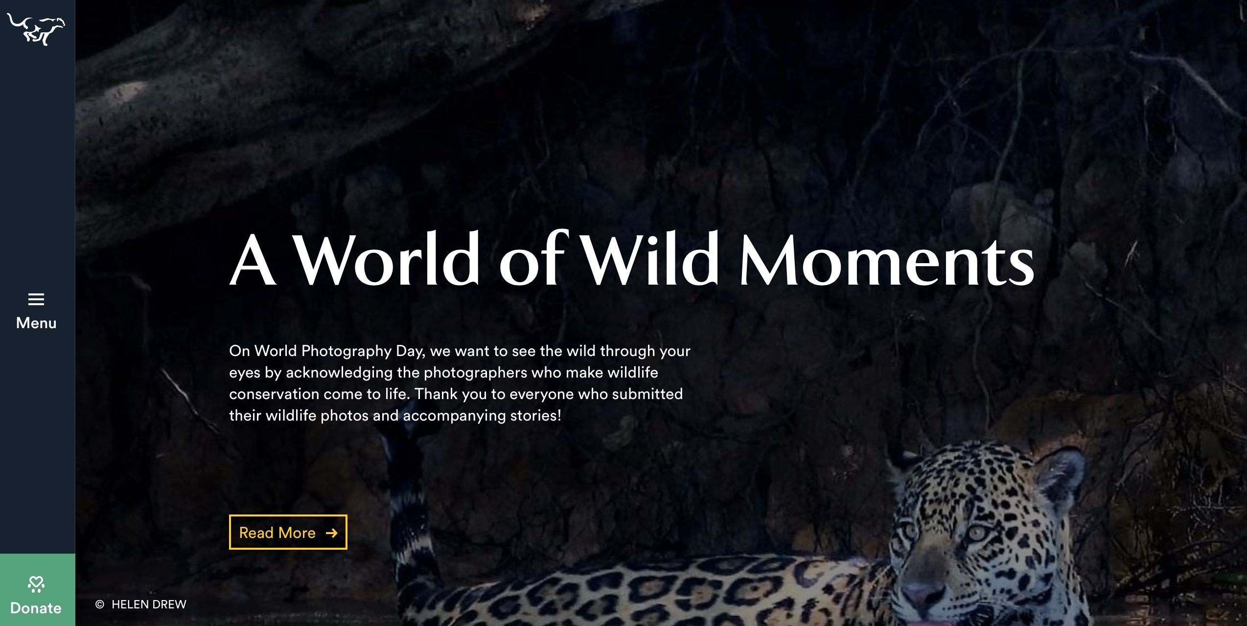
The Panthera website is full of CTAs at each step. The common ones are ‘Read More,’ ‘Learn More,’ and ‘Get To Know,’ while the others are ‘Show all,’ ‘Visit,’ ‘Donate Now,’ and ‘Lets Check.’ The ‘Let’s Check’ CTA is a brilliant initiative and data gathering method to entice businesses and companies to donate towards the Saving The Cats initiative that Panthera strives for. Smart CTAs like these help build awareness and drive donations towards the social cause.
6. Spotify: Get Spotify Free
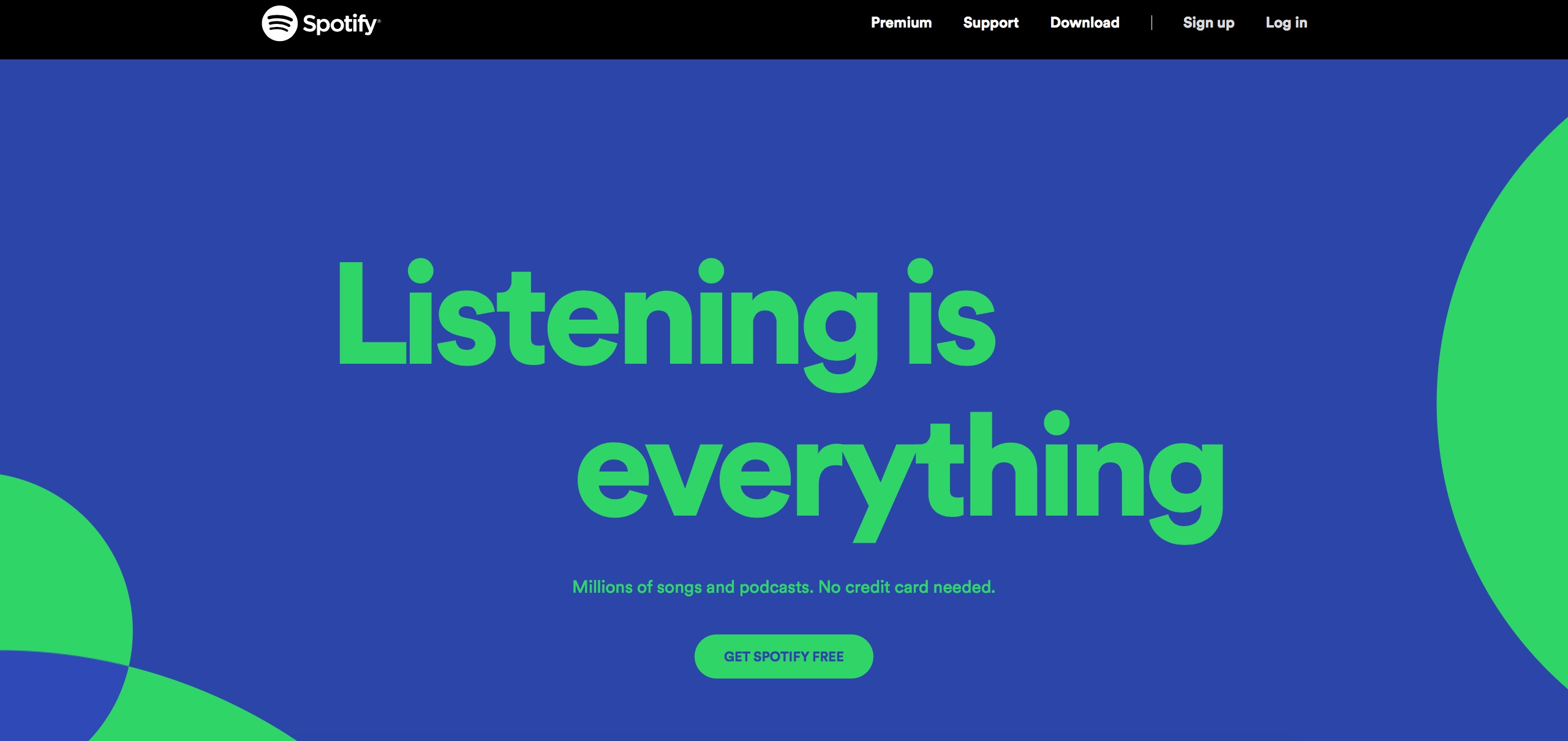
Another issue most users have with clicking links or CTA buttons is that they need to pay money or link their credit card immediately. Like Netflix, where most users felt they could not cancel their subscriptions, Spotify capitalizes on users not entering their credit card details. Spotify’s primary and secondary CTAs help give information and alleviate the fears for signing up. Spotify plays on human nature with their CTA with ‘Millions of songs and podcasts. No credit card needed’ and ‘get Spotify Free.’
7. Etsy: Add to Basket
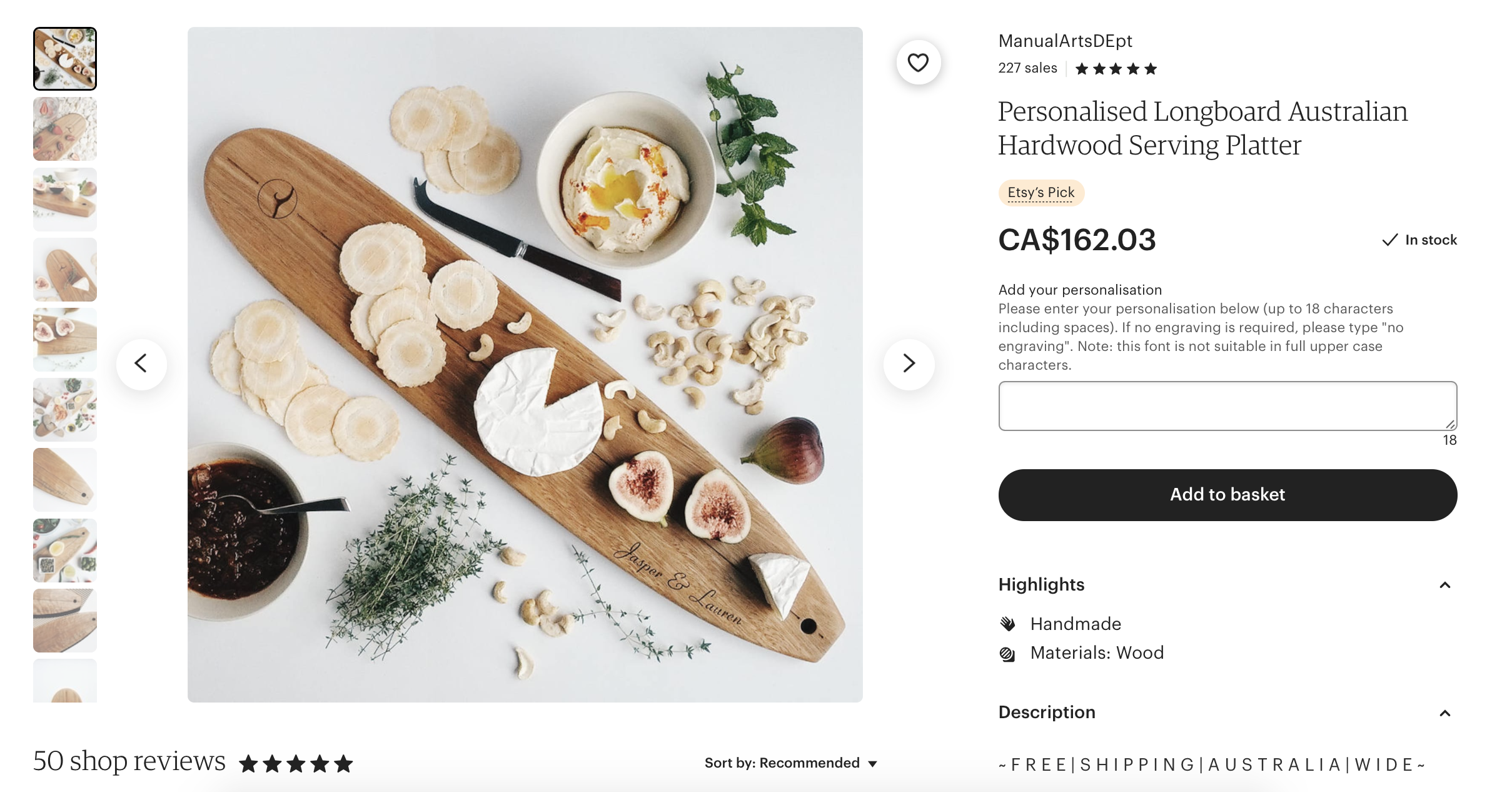
The Etsy CTA is unique and creative. They add CTAs on each product, inviting users to purchase their goods constantly. They continuously push users to support independent sellers and find things that they will love. They capitalize on human emotions of finding everyday things quickly. You can see ‘Add to Basket’ CTAs everywhere on Etsy.
8. The Nature Conservancy: Donate
The digital marketing team for The Nature Conservancy has done a fantastic job with extremely well-placed, heart-moving CTAs, that appeal to readers. Their CTAs are clickable buttons that compel readers to help transform the landscape, donate, and contribute towards a better tomorrow. CTAs with direct information like ‘Submit Yours Today,’ ‘Donate,’ ‘It Starts With You,’ and more (all on the home page) nudge readers to consume more content.
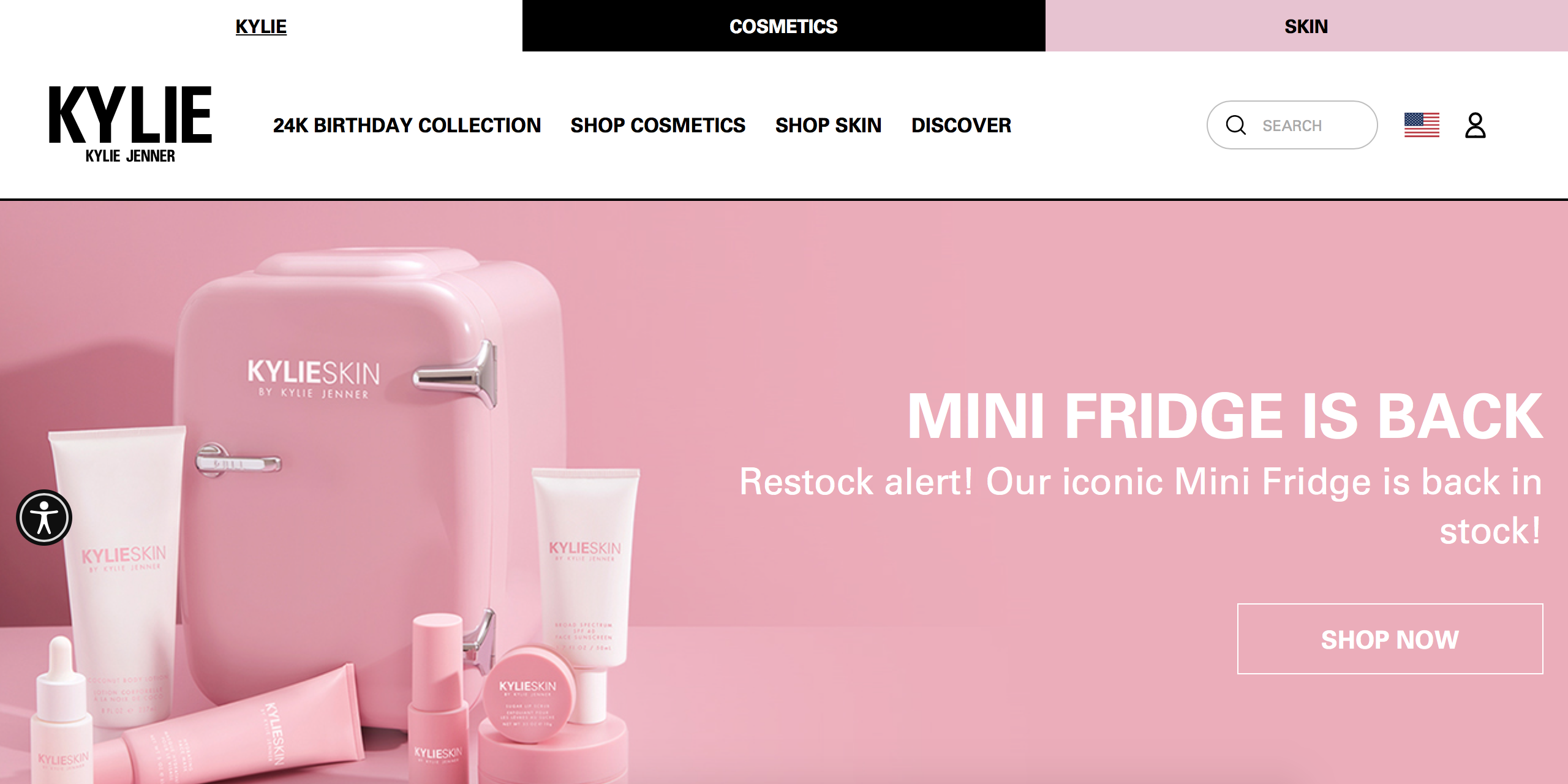
9. Kylie Cosmetics: Shop Now
The marketing team at Kylie Cosmetics by Kylie Jenner has successfully roped in several different marketing techniques and added plenty of CTAs throughout the website. Apart from incredible images, graphics, and luxury-cosmetics feeling, the main page pop-up invites users to sign up for email updates by getting a discount. Their ‘Shop Now’ and ‘Add to Cart’ buttons also entice users to keep purchasing.
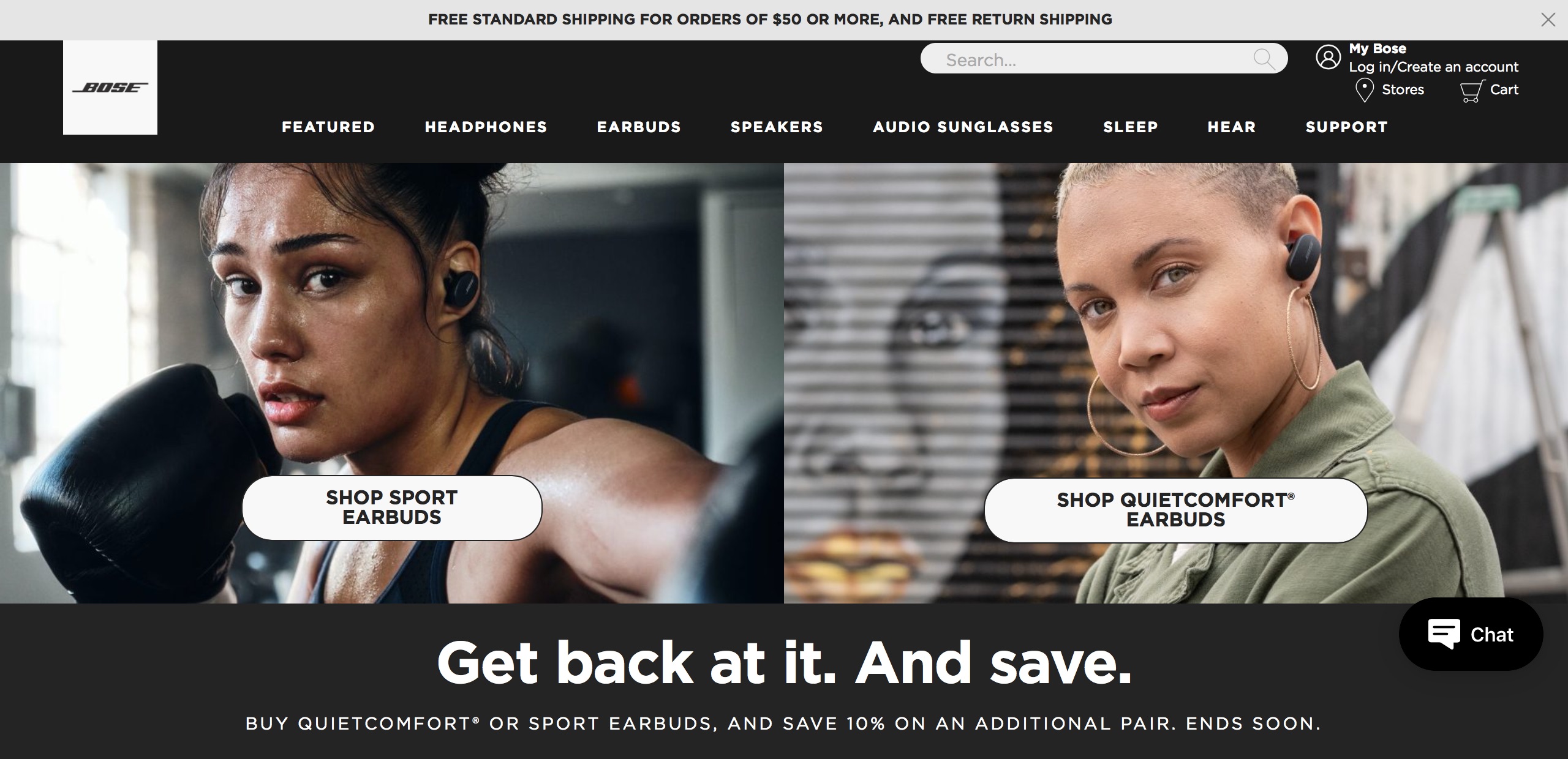
10. Bose: Shop [product]
Music giant Bose has a huge CTA button on their website that simply says ‘Shop.’ This fundamental redirection has helped Bose get a huge fan following. Each product featured has a ‘Shop’ button immediately below it. They also have email signups where users can get exclusive first looks at new launches and promotions.
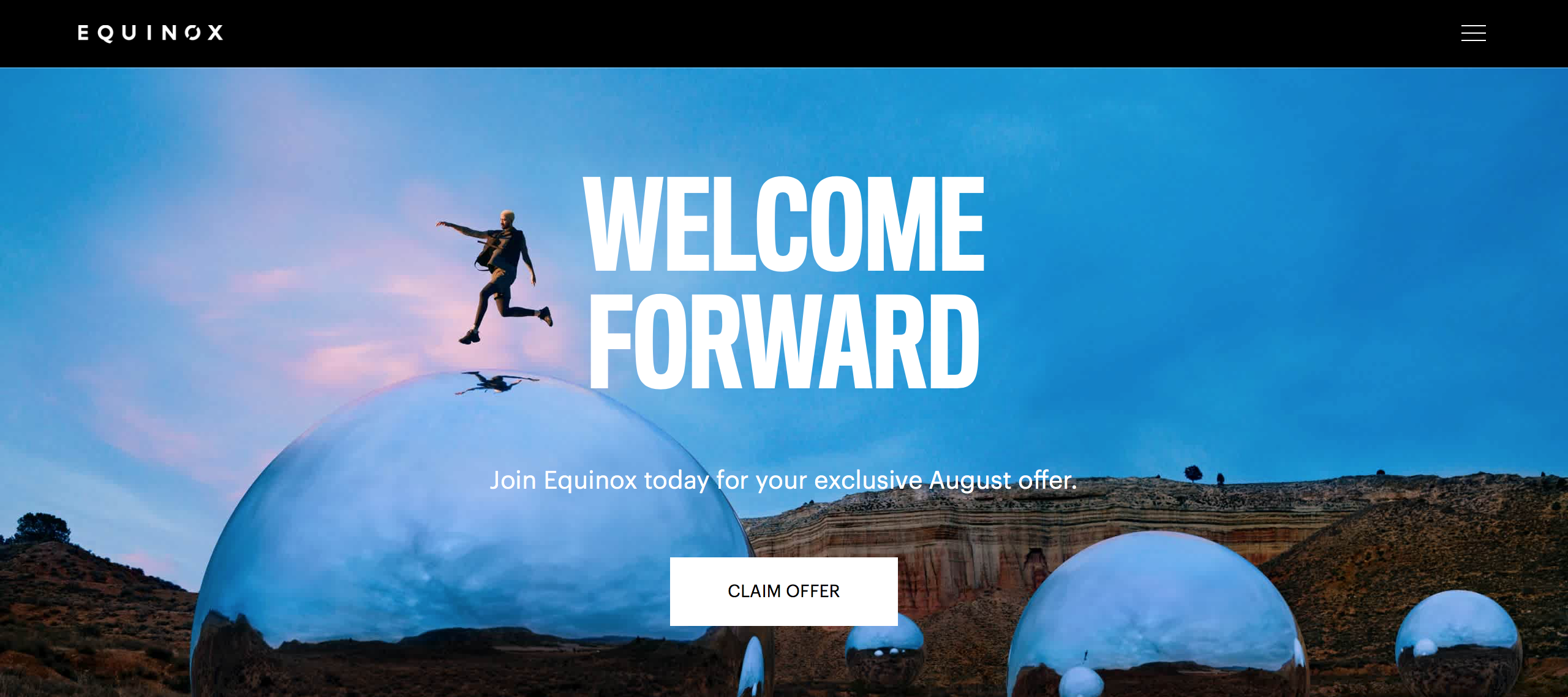
11. Equinox: Claim Offer
The Equinox training site offers fabulous CTAs in many different ways. Since they want fitness enthusiasts to sign up with them, they offer CTAs like ‘Claim Offer,’ ‘Schedule a visit/booking,’ ‘Member Benefits,’ ‘Explore Classes’, and more. Since the goal is health and fitness, each CTA is paired with mindfulness, healthy living, and exercising.
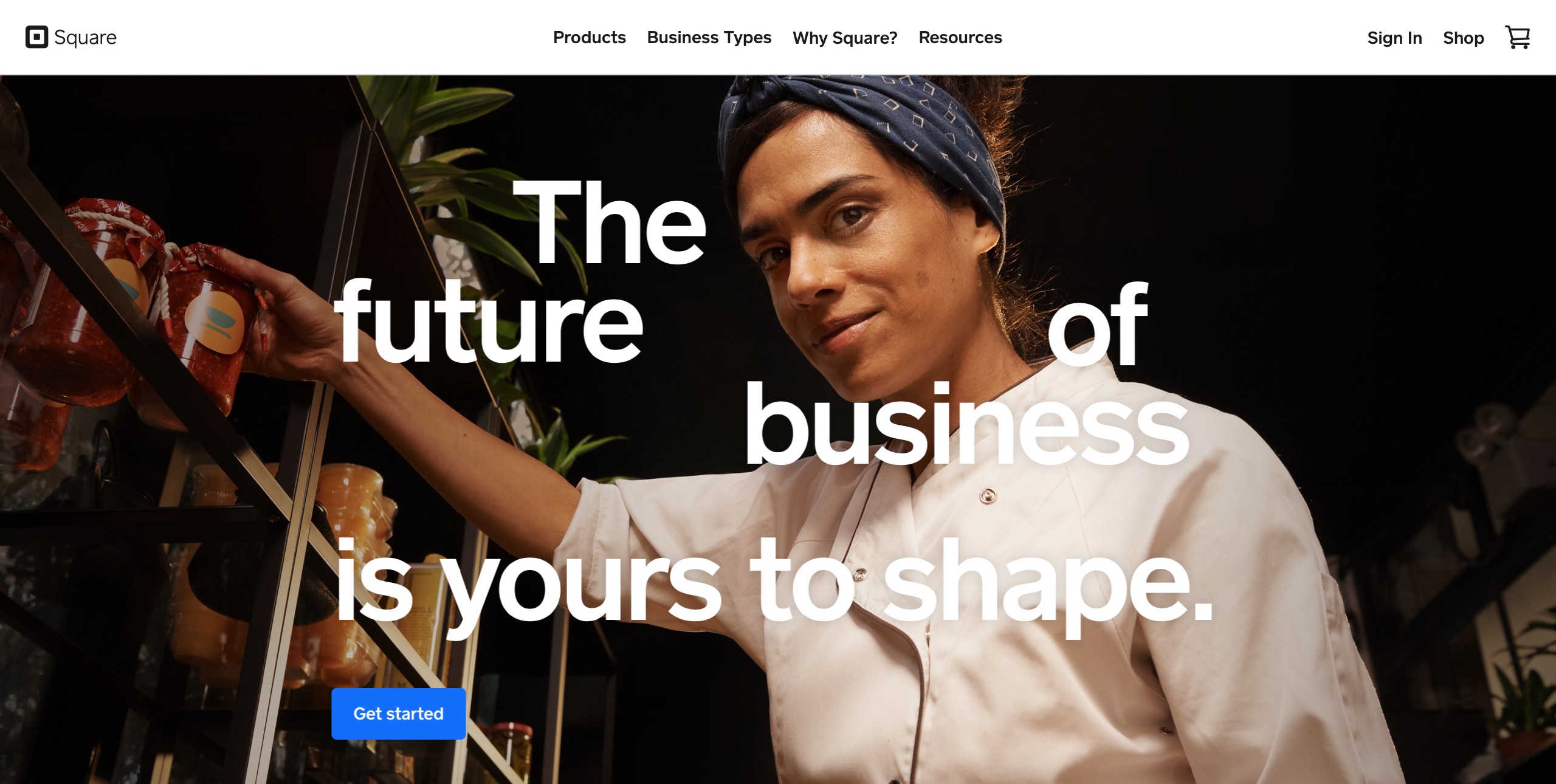
12. Square: Get Started
The digital marketing team at Square is highly mindful of all their parameters when considering CTA and design components. While the CTA button ‘Get Started’ may be small, the rest of the page also has content filled with keywords and phrases that invite users to ‘Get Started!’
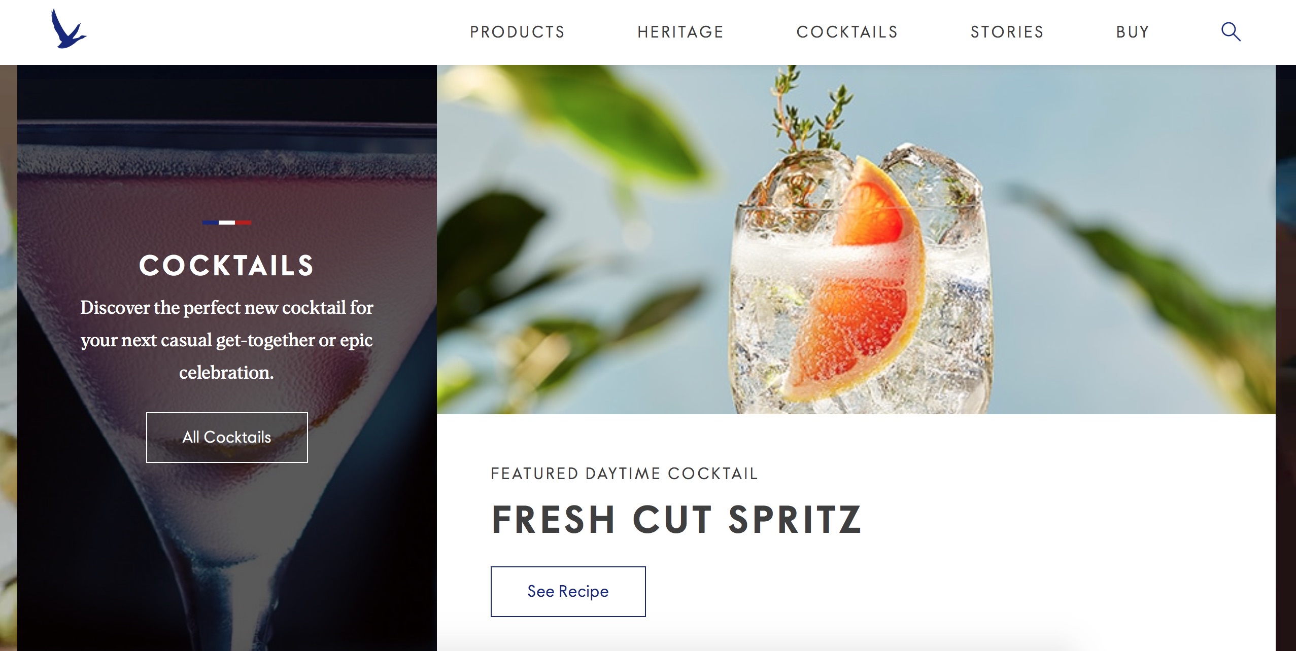
13. Grey Goose: See Recipe
Since most people love to see an excellent presentation, the marketers at grey Goose have made the site interactive with videos and recipes. The CTAs invite readers with ‘Discover Now’ for the new Grey Goose range, ‘See Recipe’ for new cocktail recipes, and ‘Buy Cocktail Kit’ for their merchandising.
14. OK Cupid: Get The App
Online Dating App OK Cupid always has pictures and images of happy couples in love, with the CTA ‘Join OkCupid’ and ‘Get The App’. Since it is an app that suggests partners for the user based on interests, hobbies, beliefs, and quirks, the graphics and CTA help people download the app and sign up.
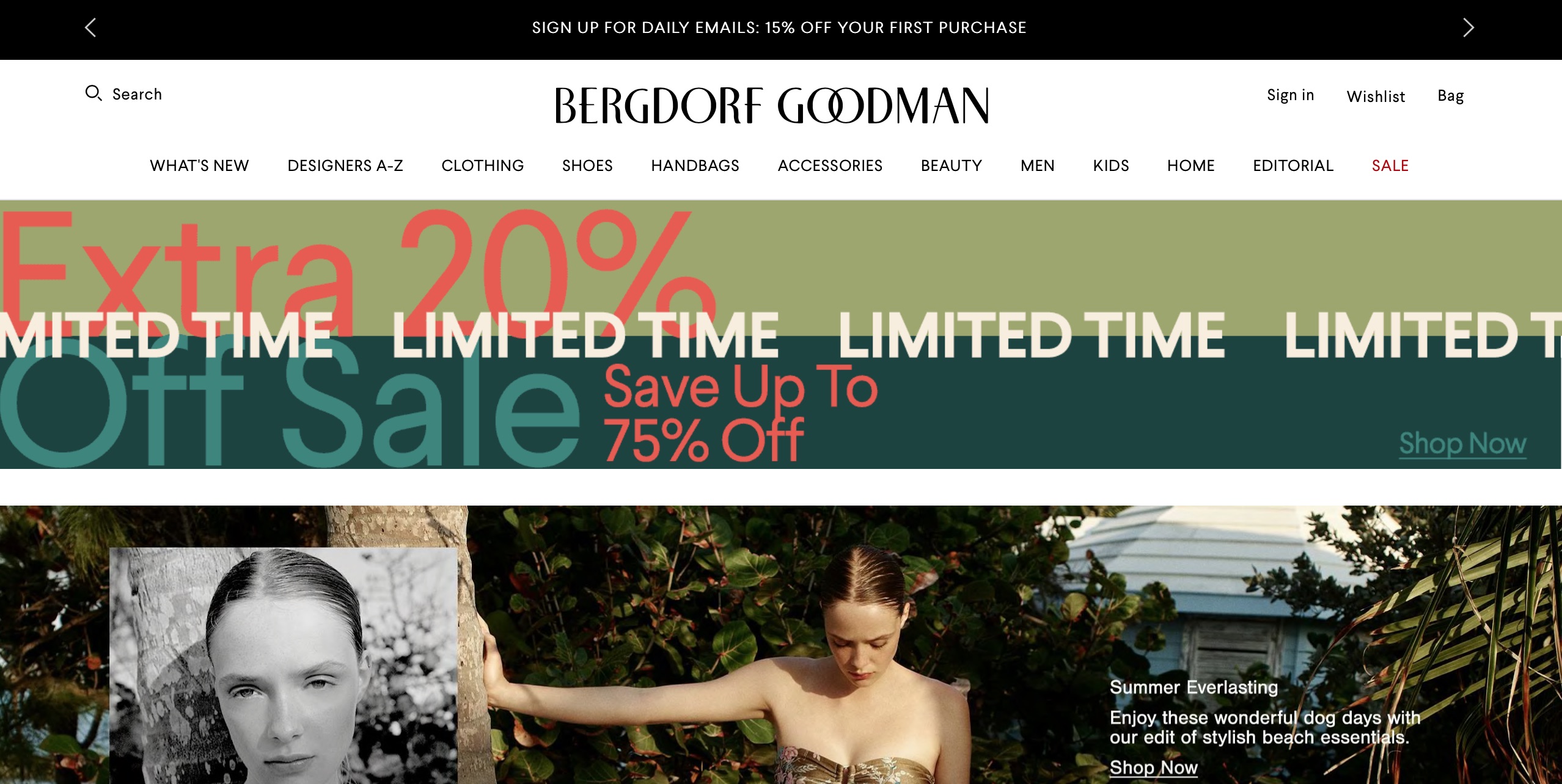
15. Bergdorf Goodman: Save Up To 75% Off
Retail giant Bergdorf Goodman has an excellently highlighted CTA with a 75% discount for shoppers who ‘Shop Now.’ Their Designer Sales and Stock Clearance discounts are enormous incentives to get shoppers to purchase from them.
Final Thoughts
All these brands listed above use Calls To Actions successfully on their sites to drive traffic, signups, raise awareness, and more, depending on their goals. Digital marketing experts always make and place CTAs based wholly on the needs of the business.
Ready to drive more click throughs from your marketing campaigns? Find the perfect agency to help scale your digital growth!
If you’re a marketing agency, discover how Agency Vista’s plans can drive more conversions for you while you’re managing your clients.
Grow with the #1 marketing agency network and top destination for businesses to hire
Sign up for Agency Vista, and see why over 50,593 marketing agencies trust us to grow their online presence and foster credible relationships with businesses. We’re free forever, and you can upgrade, downgrade, or cancel any time.
Get Started
Get started free
Setup in minutes
No credit card required

Agency Vista is the new way for brands to find and easily connect with marketing agencies. Explore 50,593 verified profiles and reviews to find the right agency for your business.
Copyright © 2025 Agency Vista LLC. All rights reserved. Lovingly made in NYC.
