


December 19, 2024 - Natalya


Does Pantone’s Color of the Year Matter to Marketers?
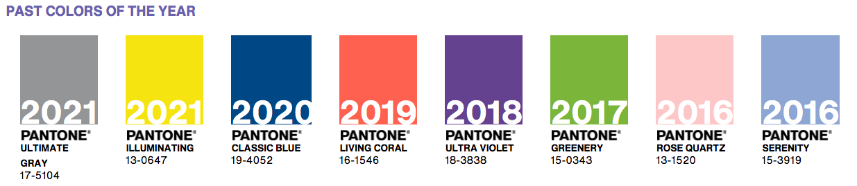
Do you remember an iconic scene from The Devil Wears Prada (2006) where Meryl Streep’s character performs a monologue about Andy’s lumpy blue sweater? But, of course, it was not blue – it was cerulean! This specific color was announced as Pantone’s Color of the Year for 2000. Today, in 2022, Pantone has chosen a lavender tone, Very Peri 17-3938, placing the future ahead in a new light.
What is Pantone? Does Pantone’s Color of the Year matter to brand marketers? What does color psychology in marketing say? Let’s dive into the topic to receive answers to these questions.
What is Pantone?
Before Pantone, every printing service used its own color guide. For example, each ink company printed “blue” differently depending on how they interpreted the color to look.
In 1963, Pantone introduced the first color matching system. The Pantone Matching System is an innovative tool assistant when it comes to color matching and identification. Today, it is the easiest way to classify, communicate, and match colors using a color fan catalog.
In addition, the tool organizes color standards through a proprietary numbering system and chip format, which have become iconic to Pantone. As a result, creatives and brands have color consistency across all of their designs and marketing materials.
The Pantone Color Institute is a consulting service within Pantone that forecasts global color trends and advises companies on colors. Whether it is brand identity, product development, or integration of color as a strategic asset, the service is recognized as the world’s authority on color.
Pantone Color Institute partners with global brands to leverage the power, psychology, and emotion of color in their design strategy.
In 2000, the Pantone Color Institute released the Pantone Color of the Year. It is a trendsetting concept for branding, marketing, and overall creative society. So, over the last 22 years, the announcement of the Pantone Color of the Year has become a pop culture phenomenon.
This event commands the global design community’s attention and delivers an iconic message to billions of color enthusiasts.
This year’s color? Pantone 17-3938 Very Peri.
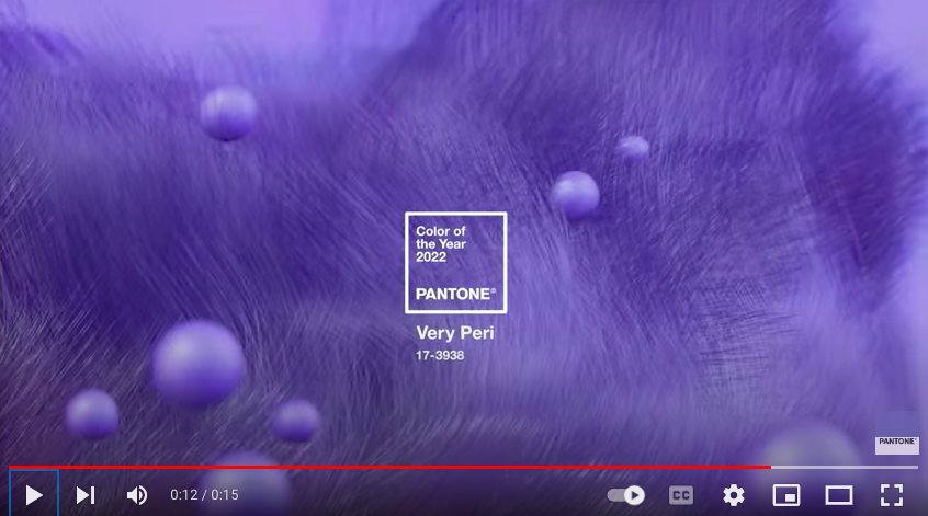
Pantone says it symbolizes the global zeitgeist of the moment and the transition we go through. Very Peri helps us embrace this altered landscape of possibilities, opening us up to a new vision as we rewrite our lives.
How Does Pantone’s Color of the Year Influence Marketing?
Before the new color’s release, Pantone Color Institute analyzes numerous aspects of society – fashion, marketing, social media, and even politics. Therefore, Pantone’s Color of the Year is a trend forecasted for the consumer. Its announcement sets the tone of the consumer market and drives the decisions of retailers and shoppers alike.
Numerous brands start designing products with the Color of the Year once it is available to the world. This proves that the Pantone color trend forecast is crucial and influential.
Moreover, in recent years we can observe a lot of media coverage related to the color of the year. Bloggers write articles about Pantone’s Color of the Year and the areas to use it. Graphic designers craft relevant social media templates. Homemade producers start making products for sale in the most desired color. And indeed, influencers cannot ignore this topic in their social media publications.
As a business owner/marketer, you can take advantage of Pantone’s Color of the Year and incorporate it into your business.
It is not necessarily about rebranding. Also, it does not mean you must immediately include these colors in your ads or blog posts. Instead, consider these colors a sign of what your clients may need.
Here Are a Few Ways How You Can Use Pantone’s Color of the Year in 2022:
- Clothing stores can design some garments in Very Peri.
- Makeup brands can launch a new Very Peri collection.
- Cake and dessert companies can make some Very Peri sweets.
- Graphic designers can sell ready-to-use designs or social media graphics in a Very Peri tone.
- Interior designers can include and promote Very Peri decorative pieces.
- Merchandising companies can offer Very Peri products.
With no reference to the specific brand, you can gift your employees or customers with on-trend Very Peri items. Also, using the color of the year in your marketing materials will attract potential clients and show your brand’s commitment to staying relevant. This will set your brand apart from the competition and help you achieve the expected response from your target audience.
Let’s stop on Pantone 17-3938 Very Peri in more detail and see how it can be used in various areas of design.
5 Examples of How to Use the Pantone’s Color of the Year in Business
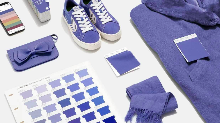
Very Peri has a futuristic look, but it also looks great on handmade products. This versatility creates a harmony of unrestrained expression and experimentation.
1. Interior Design/Home Decor

Very Peri has a high-energy quality that increases health awareness. In addition, it gives a sense of playfulness to interior design and home decor items. Its shade can enliven a space by adding it to unusual color combinations. Moreover, it can be combined with various materials, finishes, and factors.
2. Fashion
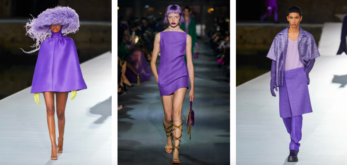
This shade of periwinkle demonstrates youth. Adding contrasting colors such as green and yellow to asymmetrical and structured plantings will make the outfit look bolder. Take a look at the Valentino collection.
Very Peri candy shades on accessories such as crossbody bags, necklaces, or glasses will create a chic and refined look.
3. Web Design and App Design
One way to apply Very Peri to the web and app design industry is to give vectors and cartoon characters a common style remake. Avatars dressed in outfits of a periwinkle shade or concept illustrations with a Very Peri color are nice to see.
Very Peri expresses trust and creativity. It shows a good-natured warmth that instantly attracts attention. This makes it the perfect shade for various multimedia and graphics applications. Graphic designers can also create ready-to-use designs using Very Peri templates and sell them to marketing teams.
4. Marketing and Brand Design
Changing brand colors in favor of Pantone’s Color of the Year can be expensive and risky. However, when it comes to brand marketing and design, the Very Peri shade can be used in various marketing materials with faster production times and shorter life cycles.
You can create ads with this color and play around with numerous design concepts without changing the existing brand colors. Moreover, it would be a great idea to have social media posts, limited-edition products, and packaging in this shade.
5. Other Uses
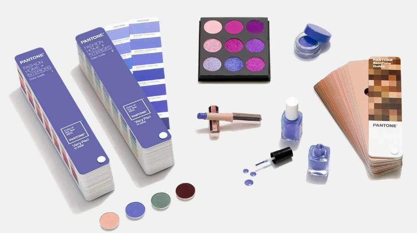
Very Peri symbolizes the desire to create. It is a great color if you want to experiment with adding a bold shade to various products. Undoubtedly, it is a fun color to add to the workspace accessories. The Very Peri tone labels for candles, water bottles, and even pet accessories are perfect for enjoying relaxing purple and lavender tones with these essential items.
For those planning to create a new product line with a Very Peri tone, it may help to note that even the Pantone Institute produces new products every time a new color of the year is announced. Some examples of these products are mugs, keychains, and special colored chips.
To improve your marketing with Pantone’s Color of the Year, you must first understand the close connection between colors and marketing.
Color Psychology in Marketing and Branding
Colors are one of the factors why the brain recognizes specific features of an object, including products and brands. This is why there are colors that the brain instantly associates with particular objects and why most people are attracted to products of the appropriate color.
In marketing, color psychology is focused on how colors impact consumers’ impressions of a brand and whether or not they persuade consumers to choose specific brands or make a purchase.
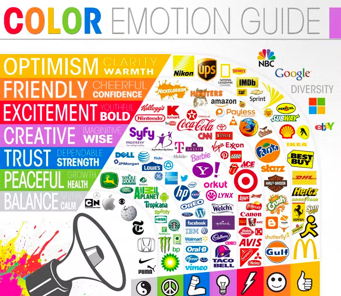
Both branding and marketing efforts use science and aesthetics to make campaigns work. Brain associations with colors allow brands to communicate more effectively with their audience. Customers can meet brand expectations by choosing the perfect color palette for branding.
Almost everyone chooses trendy colors for their brands because they give the impression that they are relevant over time. Therefore, it is no coincidence that most companies change their marketing colors yearly, following trends.
7 Facts Proving the Power of Colors
People look at your brand from the prism of its colors. Check out a few mind-blowing color facts and stats proving that.
- Colors alone can influence up to 90% of an initial impression.
- People perceive colors differently depending on their gender and culture.
- Blue is the favorite color of 35% of women and 57% of men.
- Color influences 85% of shoppers’ purchase decisions.
- Colors increase brand awareness by 80%.
- Colors affect people’s behavior, mood, and stress levels.
- 93% of shoppers focus on visual appearance alone when considering a purchase.
Colors are effective for communicating on an emotional level. They are guaranteed to convince if used correctly. While it is essential in marketing, it is still challenging to know how to use the psychology of color to your advantage.
How to Make Proper Decisions About Color in Your Marketing
The reality is that there is no universal guideline for choosing colors for your brand. The context matters – feelings, mood, and image that your brand or product creates. Below we have listed a few tips on how to choose the right color palette for your marketing.
- Pick up the colors appropriate for your specific brand. Ask yourself, “Is this color appropriate for what I am selling?” when considering colors for your marketing.
- Consider colors that show off your brand’s personality. No doubt, colors influence how the target audience views the “personality” of the brand. Forget about stereotypical color associations and choose those tones that support the personality you want to demonstrate. Jennifer Aaker’s studies point out five core dimensions that play a role in a brand’s personality.
- Choose the colors that appeal to your target audience. For example, Joe Hallock’s work on “Colour Assignment” shows some clear preferences in specific colors across gender. Decide if you will work outside of gender stereotypes or not.
- Consider colors that will differentiate your brand. Some studies have revealed that our brains prefer immediately recognizable brands. This makes color an essential element when creating a brand identity. Think over the color options that will differentiate you from entrenched competitors.
- Finally, test your colors. Once you pick up the colors for your marketing campaign, test them in a few different combinations. Ensure they complement one another and deliver the message you are aiming for.
Conclusion
Color affects our perception of the world much more than we think. Marketing pays special attention to this because an incorrectly chosen color can destroy the brand’s reputation and negatively affect sales.
The Pantone’s Color of the Year announcement is not just crucial for designers. It sets the stage for upcoming trends, and brand owners and marketers should also take notice to capitalize on the trending color. It does not matter what you sell, whether a product or service – if Very Peri aligns with your brand and target audience, you can incorporate the “mood” of the year and remain ahead of the curve.
Grow with the #1 marketing agency network and top destination for businesses to hire
Sign up for Agency Vista, and see why over 51,370 marketing agencies trust us to grow their online presence and foster credible relationships with businesses. We’re free forever, and you can upgrade, downgrade, or cancel any time.
Get Started

Get started free
Setup in minutes
No credit card required
Agency Vista is the new way for brands to find and easily connect with marketing agencies. Explore 51,370 verified profiles and reviews to find the right agency for your business.
Follow us

Copyright © 2026 Agency Vista LLC. All rights reserved. Lovingly made in NYC.