October 16, 2019 - Rebecca Hey
Facebook Ad Examples to Inspire Your Client’s Next Campaign
With Facebook ad best practices continually changing it can be difficult to find new inspiration that fits your business (or your clients).
There’s no denying that the audience on Facebook is massive. Every day, more than 2.45 billion monthly active users (MAU) as of September 2019 people log in to Facebook.
But with nearly five billion pieces of content being posted daily, the trick for marketers, brands, and businesses is to ensure that their message is heard above the noise.
It’s also no secret that the organic reach for a Facebook page has gone down and it’s no longer enough to rely on conversions from Facebook posts alone.
While you can work on increasing the reach of your clients’ Facebook pages, for quicker and more definite results you should create Facebook adverts. In fact, nowadays, more than 90% of marketers on Facebook use paid adverts.
It’s not always easy, but when you follow proven best practices, stick to consistent schedule, test and iterate your campaigns, you will generate a positive return on investment.
This article will take you through the best practices behind building a successful Facebook advert as well as some Facebook ad examples of brands killing it on social media.
Facebook Ad Examples: Best Practices
#1 Copy
One of the hardest parts of creating a killer Facebook advert is the copy.
Stellar copy not only increases the number of clicks through to your website, but it also tells the user what to do next.
Advert copy needs to be short and sweet, but it also needs to do the following:
- Attract attention: Facebook users are notoriously distracted, plus news feeds are cluttered with adverts already. It’s imperative that advert copy attracts attention and breaks through the noise.
- Build trust: Advert copy needs to quickly build trust with a user. You can showcase social proof or compelling statistics to provide a reason for a customer to trust you.
- Compel action: A Facebook advert is useless without a user making an action. Therefore, advert copy needs to tell the user what their next action should be and convince the user to make the action.
When successfully combined, it’s these three elements that persuade someone to take action, whether it’s to visit your store, submit a lead form, or send a message.
Whatever the desired result, without compelling ad copy, your advert won’t be successful or profitable.
For attracting attention, building trust, and compelling action, consider these quick tips when crafting your ad copy:
- Does the copy match the visual? If the image mentions a discount of $10, does the copy match?
- Is there one (and only one) clear call to action (CTA)? Is it immediately obvious what the user is supposed to do?
- Does the advert use simple, everyday language that your target audience can relate to? Avoid jargon or overly technical language where possible.
#2 Video-Based Adverts
Facebook users love videos, so much so that Facebook reports more than 100 million hours of daily video watch time.
While it shouldn’t be your only method of Facebook advertising, it is a key Facebook best practice that can often be overlooked.
Granted, Facebook video adverts are harder to produce than standard image ads. However, when done correctly, the results can surpass image-only ads.
Here are some tips to create a successful video advert:
- Create assets for sound on and off: Many people use their mobile devices with the sound off throughout the day, make sure your video conveys your message visually. You can also try adding subtitles to the ad (auto captioning tools are available in Ads Manager).
- First impressions count: People’s attention spans are short, especially when they are scrolling on social media. To counter this, showcase your brand or product immediately so the viewer understands the “why” of the ad. This can help to drive brand awareness and ad recall lift!
- Be authentic: Users come to social media to interact and be engaged. Aim to use videos to show an honest, authentic representation. People are much more likely to trust authentic videos than staged or stock acting.
#3 Be Highly Relevant
In order for a Facebook advert to be successful, it needs to be relevant to the person viewing the advert.
There is no point in spending money on clicks or views if they aren’t part of your target audience. They won’t be interested, nor will they be compelled to take action – and you’ve just wasted a ton of ad spend.
Before you even start a campaign, you need to define your target audience and its demographics in order to ensure that you’re targeting the right group of people.
Facebook targeting allows you to be really specific about who sees your advert. You can target pet loves, pregnant women, parents with kids of a certain age, and so on, as follows:
- Custom audiences: target existing customers, leads, email subscribers, or website visitors
- Lookalike audiences: target new customers by finding people similar to your custom audience
- Location: target by city, state, or country
- Gender: target men or women
- Interests: target by interests or hobbies like beer, business, clothes, or books
Plus, when your ad has been running for a while, you can use Facebook’s quality score to ascertain how well your advert is performing and repeat as needed.
The quality score takes into account your advert image, advert copy, and destination URL. The more relevant they are, the higher your score, and the better results you should see.
#4 Value Proposition
Tied closely to creating compelling copy is the importance of a value proposition. By using a clear and definite value proposition, you can quickly grab users’ attention.
Your value proposition should answer these questions:
- Why should the user click?
- Why are you better than the competition?
- Why should they visit your website?
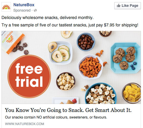
In the advert below, Naturebox combines impactful colors, the word “Free,” and the price to quickly get attention.

Other examples of value proposition include the following:
- 10% off all products for a limited period of time
- Free shipping on orders over $30
- Social proof “As trusted by Nike and Adidas”
- Win a $250 gift card
#5 Mobile-First Experience
Did you know that a whopping 96% of users access Facebook on mobile devices?
This means that your adverts are being scrolled through by mobile viewers who are going about their day-to-day lives and are easily distracted
Not only does your advert need to grab the attention of a distracted user quickly, but it also needs to look great on a small screen.
When you’re creating your advert, ensure that your advert is fully optimized for mobile screens. Consider using bright overlays for images, and make sure your videos are less than 15 seconds long.
Facebook Ad Examples
Whatever the aim of your Facebook advertising campaign, when you follow best practices, you can generate positive ROI for your clients. If you’re looking for a little inspiration, here are five ad examples of brands killing it in the news feed.
Example One: CoSchedule
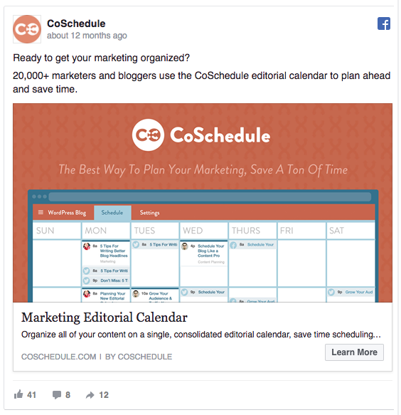
This advert is an excellent example of a Facebook advert. Its colorful design is both eye-catching and perfectly tied to the logo. This works to attract users’ attention and drive brand awareness.
What’s more, the ad copy contains a killer value proposition:
“20,000+ marketers and bloggers use the CoSchedule editorial calendar to plan ahead and save time.”
Boom. They’ve told us why we should trust them, what their product does, and the benefit of the product.
Not bad for one sentence.
Here’s what we love about the advert:
- Statistics: Numbers and facts in adverts work really well. They grab users’ attention and build trust. If 20,000 similar people like the product, why wouldn’t you?
- Benefit: This advert speaks directly to the target customer. It not only nails the customer’s pain point but it also neatly positions CoSchedule as the solution.
- How it works: As well as explaining why it will help you, the calendar shows you how it works. The message is clear and simple.
Example 2: Bluehost
The Bluehost ad example below is used in the middle of the sales funnel. When a website visitor has added something to the cart but then abandoned the purchase, this Facebook advert is used to retarget them.
- Speaks to the customer: Asking a question at the start of the advert is an excellent way to speak directly to your target customers. Remember, this advert is only shown to people who’ve abandoned their cart, so this direct question re-engages them into the process.
- Value proposition: The low price is clearly advertised on the second line of the advert. With such a low cost, any barriers to entry are obliterated.
- Trust: By adding a statistic about how many customers currently use Bluehost, you’ve immediately built trust. If millions of other people are using the service, it must be good, right?
- Video: Using a video with many different business owners reinforces social proof. It also holds the attention of the user.
- A clear call to action: There’s one single, clear CTA, and the user is in no doubt about their next action.
Example 3: United Airlines
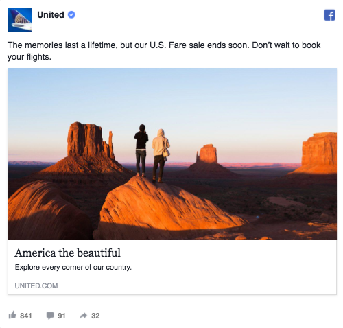
United Airlines uses a simple image ad and unbelievably compelling copy to craft the perfect Facebook advert. It’s simple but very, very effective.
Here’s what we love about the advert:
Nowadays, customers prefer to buy experiences rather than products. Beautiful imagery is a great way to sell the dream to potential customers.
However, this advert is much more than a stunning image. It expertly uses FOMO to compel customers.
Think about your feelings when you are scrolling on Facebook. You’re viewing your friend’s social life, you’re seeing pictures of other people’s holidays, and you’re wondering if you’re missing out.
The copy on this advert capitalizes on those feelings and adds some jeopardy into the mix: “Memories last a lifetime, but our U.S. fare sale ends soon.”
The ad finishes it off by connecting the user to the company – “Explore every corner of our country” – and creating a feeling of shared ground.
Genius.
To Conclude
We’ve covered the best practices for creating highly profitable Facebook adverts and a few Facebook ad examples of some brands killing it on social media.
Good ads can be broken into three core elements: copy, visuals, and the call to action. But great ads ensure that there is consistency between all three elements.
What do you think of the ad examples? Which ad was your favorite? Let us know in the comments below.
Grow with the #1 marketing agency network and top destination for businesses to hire
Sign up for Agency Vista, and see why over 51,172 marketing agencies trust us to grow their online presence and foster credible relationships with businesses. We’re free forever, and you can upgrade, downgrade, or cancel any time.
Get Started
Get started free
Setup in minutes
No credit card required

Agency Vista is the new way for brands to find and easily connect with marketing agencies. Explore 51,172 verified profiles and reviews to find the right agency for your business.
Copyright © 2026 Agency Vista LLC. All rights reserved. Lovingly made in NYC.


