

April 19, 2021 - Brittany Garlin


The Psychology Of Color – How Colors Helps Your Facebook Ads Convert
Colors always add aesthetics to advertisements, web pages, landing pages, and posts. Websites, online content, Facebook ads, and reels add significant importance in communicating feelings, sentiments, and emotions. Most people don’t realize that colors also play a critical role in buyer behavior and consumer decisions. Since colors impact our moods and feelings, each color holds a different meaning. Understanding the psychology of color can help drive more conversions on your Facebook campaigns.
The psychology of color or color psychology is used extensively when strategizing for product launches, marketing techniques, adverts, and Facebook ads. Most business owners rely heavily on the psychology of color when launching new products and services online. Since studies have revealed several psychological triggers can influence behavior, colors play a massive role in influencing people’s decisions.
Since most marketers have to influence buyer behavior based solely on the available resources, influential words, graphics, emotion-invoking content, and colors help them achieve their goals. Using the perfect colors can help them connect with customers, make the brand memorable, drive conversions, and convey critical subliminal messages.
Importance Of Psychology of Colors
Almost anyone who’s ever taken an art class in school is familiar with the types of colors. Let us jog your memory with a quick color refresher.
1. Primary Colors
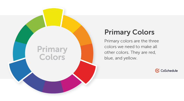
Primary colors are red, yellow, and blue. These three are used to make the next set of colors called Secondary colors. On-screen, primary colors are considered red, green, and blue.
2. Secondary Colors
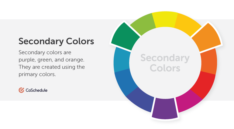
Secondary colors are orange, purple, and green. These are made by mixing up primary colors. Red and blue make purple, red and yellow make orange, and blue and yellow make green.
3. Tertiary Colors
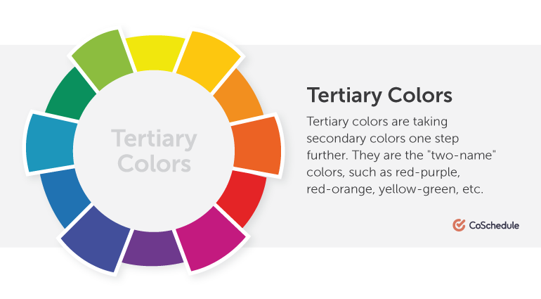
Tertiary colors are a mix of primary and secondary colors. They add shades to otherwise ordinary palettes. These are two name colors like yellow-green, red-orange, and blue-purple.
These colors are further subdivided into different categories. Paints that are not mixed with white or black are called Pure Colors. These colors are usually used for marketing and advertising children’s toys, spring and summer clothing, fashion accessories, and play areas. Since these colors are vibrant, cheery, and invoke joy, they are used in ads to get higher conversions.
When primary, secondary, and tertiary colors are mixed with white, they are called tints or pastels. Pastel tints are lighter than pure colors. They are also not intense and are known to soothe emotions and sentiments. They depict ease of use and are associated with the colors of nature.
When pure colors are mixed with hints of black, they are called shades. Shades are used to dull or darken pure colors and can range from slightly dark to nearly black.
Which Colors Provoke Emotional Associations?
Colors provoke various emotions and sentiments in people. However, some can be characterized to fall under traditional associations in all forms of marketing.

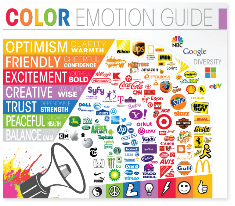
Emotions associated with the color red: celebration, passion, power, to highlight importance, love, excitement, energy.
Emotions associated with the color orange: success, confidence, playfulness, religious ceremonies, heat, fire, spice, and signify orange and citrusy flavors in products.

Emotions associated with the color yellow: creativity, happiness, joy, cheer, warmth, optimism, intelligence, hope, and used to signify flavors like banana, butterscotch, and pineapple.

Emotions associated with the color gold: confidence, charm, treasure, luxury, abundance, friendly, self-righteous, proud, and is used to denote jewelry.

Emotions associated with the color green: freshness, nature, vegetarian or vegan, clean energy, healing, growth, fertility, abundance, and used to signify lemon flavor.

Emotions associated with the color blue: tranquillity, peace, calm, royalty, wisdom, truthfulness, trust, confidence.

Emotions associated with the color pink: sophistication, compassion, sincerity, feminity, sympathy, flirtation, sweetness in flavor like in baked goods and candies, and to depict strawberry flavor.
Rose: hope, love, optimism in marketing.

Emotions associated with the color purple: the color of royalty, spiritualism, enlightenment, wisdom, sensuality, humility, ambition, luxury, and to signify lavender essence.
Violet: creativity, elegance, grace, artistic ability.

Emotions associated with the color brown: earthy qualities, trustworthy, simple, easily recognizable, traditional, friendly, and used to denote bakery and confectionery products like chocolates, flavors, and foods.

Emotions associated with the color black: formality, security, sophistication, drama, absence, modernity, rebellion, mystery, seriousness, conventionality, professionalism, sleekness, and mourning.

Emotions associated with the color white: purity, neutrality, tranquillity, simplicity, innocence, sterility, humility, cleanliness, coldness, fear, new beginnings, medical and pharmaceutical products, and to symbolize vanilla essence and flavor.
Emotions associated with the color grey: elegance, boredom, balance, respect, old age, neutrality, pessimism, and mourning.
For many ads on Facebook, white is used as a background or backdrop for short videos to enhance other colors on screen.
Many potential and existing customers also start associating specific colors with a brand type or quality. Some examples would be the color green for clean energy, blue for tech companies like Facebook, IBM, Dell, red for beverages like Coca-cola, etc.
Most viewers on Facebook tend to associate certain ads with colors for brand recognition instantly. It is easy for marketers to continue a color trend once an association has been made. However, to get to this point, the colors used must resonate with the emotions and sentiments associated with the brand. So a brand that deals in clean energy in green color should avoid a sudden change in colors that do not resonate with the vision and mission of the business.
How Marketers Can Use The Psychology of Colors
Marketers must constantly monitor brand positioning, brand image, and launches of products and services. It is critical to creating lasting value in the minds of all customers, clients, key stakeholders, and passive audiences. Doing this will help grow the brand and increase its market standing. Since we now know that colors play a crucial role in buyer behavior, marketers need to understand a few critical aspects of color theory.
1. Understand The Psychology of Color
Always remember, colors do not exist in isolation from each other. The only colors that are exempt from this rule are black and white. Color theory helps understand the nuances in shade and tone differences, with clear notations of primary, secondary, and tertiary color groupings. It’s crucial to get the groups and shades right while designing the images and graphics. The correct combination of colors will help capture audience attention and make your content eye-catching.
2. Research Colors Used By Competitors
Just knowing colors and how they work isn’t going to help in the long term. Understanding the psychology behind competitor brand colors, font, sizes, and palettes is extremely important. Colors that competitor businesses are using can have a massive impact on buyer behavior. For instance, Facebook, Twitter, and WordPress use blue in their logos. Once you, as a marketer, understand the importance of creating a long-lasting impression in customers’ minds, it will be easier to judge the shade differences and choose a color palette that is similar or different from competitors.
3. Simultaneous Contrast of Colors
Most people assume colors that look good individually work with each other well. This is not the case. Relativity of color is as vital as isolation of color. Hues and shades can affect each other when placed side by side. These subtle changes alter user perception. The interaction of these colors is known as simultaneous contrast. Just like two shades can affect each other in simultaneous contrast, so can the absence. This is called isolation of color. While designing ads, infographics, videos, and other online collateral, simultaneous contrast and isolation of color are crucial. Backgrounds, font colors, lighting, and environment can also cause differences in user and reader perception.
Psychology of Colors in Facebook Ads
Daily marketing via ads posted on social media sites like Facebook, Twitter, Instagram, and LinkedIn can help get massive conversions if used correctly. Since most content is derived wholly from the message and emotion they need to invoke; it makes sense to use the psychology of color to get a higher conversion rate. With the amount of money that goes into marketing advertisements online, it is best practice to be well-versed in the colors and their meaning.
When consumers see the correct colors associated with the brand, they tend to purchase the products and services irrespective of the price points. Colors, fonts, and texts in advertisements should immediately tell users that your product or service has the solution to their issue or problem. These colors should flow seamlessly without causing chaos in the viewers’ minds and instead tempt them into clicking on the ad.
To increase conversion rates on ads, select colors that are associated with a positive ambiance. Since each color has a special meaning, you should carefully consider color choices before finalizing the ones that make the best sense for your advertisement. Always remember, ads should be vibrant, positive, and provide value to the viewer or potential customer. Ads without value will not get a reasonable conversion rate.
1. Analogous Colors
Colors that are similar to each other are usually used to depict continuity and harmony. Such colors are called analogous and are excellent for Facebook conversions for nature inspiring or sleep mental health awareness-type ads. Many meditation apps usually have Facebook ads that use analogous contrasts in blues and greens to show peace, tranquillity, and calm. Similarly, others use analogous colors to show emotions and sentiments that resonate with their products or services. The related colors show harmony in the palette and can become beautiful backgrounds for Facebook ads.
2. Monochromatic Colors
Monochromatic colors are those with the same shades, tints, and tones. These shades usually range from soft to bold in a single color palette. Monochromatic colors are typically used as backgrounds for Facebook ads, with contrasting colors for images or text. Rich complimentary monochromatic colors paired with pure contrasts usually get a lot of attention and a high conversion rate in the long term.
What Are The Best Colors For Facebook Ad Conversions?
Always remember, there is no single color that will fit each ad on Facebook. As with any advertisement, conversion and click-through rates will increase only with continuous user engagement. Keeping the same font, size, style, and color will create boredom in users’ minds. Colored borders, contrasting link colors, and colors that invoke strong responses should be used as often as possible for Facebook ads.
Facebook allows marketers to select audiences while posting ads and videos. While choosing the demographic and geographical audience, it is best practice to be culturally sensitive. In western countries, black is associated with mourning; in Asian countries, white signifies death; in middle eastern countries, red is associated with prosperity, and so on. Being culturally aware of the meaning of different colors will help your Facebook ad get higher conversion rates.
1. Blue
The color blue is widely accepted by almost all genders on Facebook. Blue resonates with security and trust. Darker shades of blue tend to invoke a sense of professionalism, efficiency, and sincerity. In contrast, light blue shades have a calming effect on people’s psyche.
For Facebook ads, avoid using only blue and white since the advertisement will get lost in the Facebook color scheme. For advertisements dealing with social causes, foods, and retail products, avoid using the color blue.
2. Green
Green can be used for Facebook ads on environmental products, organic foods and products, vegetarianism or veganism, and clean energy. Green signifies positive action and association. Green is also associated with the activity ‘Go’ at traffic lights. This association is subconsciously driven in our minds to indicate ‘moving forward’ Green is easy to read and follow. Most people are very comfortable with the emotions associated with this color.
3. Red
Many businesses avoid using red in advertisements since red is used widely to denote mistakes or negativity. Red also signifies halting an action. However, red also attracts attention – negative and positive. You should avoid using red as a primary color in Facebook ads since it is a forceful color. Suppose the advertisement has a call to action or needs particular emphasis. In that case, you could use red as a border color to denote significance.
4. Purple
Purple is a favorite on Facebook. Purple denotes wealth, looks good with the black and white background on Facebook, and is a favorite with women. For women-centric advertisements, purple is a good color choice. Ads on wealth management, finances, investments, and other money-related topics should have purple either as a primary or as border color.
Combinations of purple, blue, and white look good against a stark background and are non-clashing colors.
5. Orange
Orange is another favorite on Facebook ads. Fast foods, beverages, and other food-related ads find their conversion rates higher with the color orange. Orange tends to stimulate viewers into feeling hungry or working up an appetite. Eye-catching orange backgrounds with white text are easy to read and follow and helps get a good contrast on laptops and mobile devices. Many advertisers on Facebook use orange for calls-to-action and to garner interest in dull products and services.
6. Black
The color black is perhaps the most serious of all colors on Facebook. It signifies intelligence, sincerity, professionalism, and permanence. For serious businesses that want to come off as professional, black is a perfect choice. However, if your brand is trendy, young, joyful, and vivid, you should steer clear of black. Using black text is a good alternative for businesses that want to show an engaging persona but maintain their professionalism.
Facebook ads with black backgrounds and white text also get a lot of attention. However, this color contrast should only be used to convey important and critical messages. Avoid using greys, tans, and off-whites for text with a black background since the colors will get washed out, and the message will be difficult to read.
7. Shades and Tints
Bright colors, soft colors, and other shades and tints should be used when targeting a specific demographic. Men tend to prefer bold, bright colors, while women prefer paler hues in pastel. Before finalizing an ad on Facebook, you should internally circulate the advertisement with colleagues to better understand which shade and tint look the best and which colors resonate more than others.
8. Contrasts
Since Facebook has a blue and white background, contrasting colors naturally draw the viewers to the ads. Depending on the message of the Facebook ad, contrasting colors should not be too jarring to the naked eye. Colors that are too bold or too light can have a negative or positive effect on the viewer.
Contrasting colors on Facebook ads for higher conversion rates of a product or service should be tested through trial and error on low-budget ad spaces. Once you see a higher conversion rate, you can replicate the chosen colors for a significant return on investment.
Final Thoughts
In general, the psychology of color is a fascinating area of study that has been used widely on social media platforms. From a psychological viewpoint, colors give meaning to almost everything we do, and Facebook ads are no different.
Marketers who understand the target audience’s psyche will find it easy to make a perfect selection from the color wheel. However, it is best to try the best color combinations for each new brand before deciding that one size fits all.
Grow with the #1 marketing agency network and top destination for businesses to hire
Sign up for Agency Vista, and see why over 51,283 marketing agencies trust us to grow their online presence and foster credible relationships with businesses. We’re free forever, and you can upgrade, downgrade, or cancel any time.
Get Started

Get started free
Setup in minutes
No credit card required
Agency Vista is the new way for brands to find and easily connect with marketing agencies. Explore 51,283 verified profiles and reviews to find the right agency for your business.
Follow us

Copyright © 2026 Agency Vista LLC. All rights reserved. Lovingly made in NYC.