


June 2, 2022 - Natalya


50 CTA Examples You Can’t Help But Click
In a world where attention spans are rapidly reducing due to the sheer amount of information available, do your audience a favor by using a high-quality call-to-action (CTA). A CTA acts as the desired action of the overall text that transparently suggests the user should make: buy, like, subscribe to the newsletter, and more. A properly written CTA will successfully complement the selling texts on the website, social media posts, and blog articles. And what more effective solution to improve your writing than reading a bunch of CTA examples from the experts?
According to Statista, ad spending in the Social Media Advertising segment is projected to reach US$229.50bn in 2022. With that said, bothering about a winning CTA makes sense. We have collected 50 CTA examples from popular brands for your inspiration in this post. Grab the ones you like and customize them for your campaigns.
Why You Need a CTA in Your Marketing
CTAs are elements on a website, newsletter, and social network that allow visitors to perform specific actions. For example, you can see CTA examples in the form of clickable texts, buttons, or banners that lead to gated content, product description, subscription, or registration.
A CTA is a powerful digital marketing tool since it encourages the audience to take the targeted action, thus increasing a brand’s bottom line. Without a clear call to action, a web page visitor will likely never reach the point of buying a product, ordering a service, or subscribing to an email newsletter.
For example, users read an article on the company’s blog but did not find a call to action. As a result, they will simply leave the page. On the other hand, adding a button with an offer to subscribe to an email newsletter about blog updates motivates a person to continue interacting with your brand. Since marketing campaigns aim to guide your audience in the buyer’s journey to complete the purchase, it is essential to create highly effective CTAs based on which point your prospect is at in the customer journey.
Types of CTA buttons you can come across in marketing:
- Sign Up – The audience might be invited to sign up for a free trial, an online course, a future event, or even a software product. You should see such CTA examples a lot on the websites.
- Subscribe – This CTA does not commit a person to purchase. Instead, it invites them to receive updates from the company. ‘Subscribe’ CTAs are common to company blogs for which the business wants to develop a readership.
- Try for Free – CTAs of this variety allow people to demo a product before deciding if it is worth the cost.
- Get Started – This CTA can drive various behaviors for a company, from a free trial to a virtual reality experience.
- Learn More – Sometimes, all you want is to give your potential customers a little more information to be prepared to buy something. That is what this CTA is for.
- Join Us – Do you manage an online community? Is your product built on collaboration between users? You might find yourself placing a ‘join us’ CTA somewhere on your website.
When creating a CTA, it is essential to find a balance between effectiveness and uniqueness and, at the same time, not cause a loss of user interest. Read further to get the tips for writing a winning CTA.
Tips for Writing an Effective CTA
Although there are no hard and fast rules when creating a call to action, a few principles will still help you write strong CTAs.
1. Use strong action words and phrases.
The button’s text must be specific, accurately indicate the action, and contain a call. Therefore, it is good to choose strong action-oriented verbs and avoid words that imply any obligations.
For example, ‘Buy now,’ ‘Download now,’ ‘Find out today,’ and so on.
When writing a CTA, use the lift model to deliver value prepositions with relevance, clarity, and urgency, avoiding anxiety and distraction.
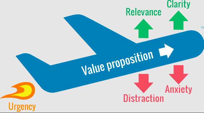
If we take ‘Download this app now’ as a value proposition,
download = relevance
this app = clarity
now = urgency
Most of successful CTA examples show that you should avoid unnecessary images or links to reduce distraction and ease anxiety with the note “no credit card required.”
2. Evoke emotions.
Social media ads are all about engaging the audience, so you can add a few more works to create a CTA that provokes emotions and enthusiasm.
Use the trigger words “free”, “gift”, “discount”, “promotion”. They help attract customers and give them additional motivation to learn more about your product. For example, instead of “Leave a request,” – “Get a free consultation.”
Another CTA examples that evoke emotions are “Buy now and get 25% off!”, “Find your dream travel destination with us!”, “Time is almost up – get your free bag!”. Remember, your clients make decisions based on emotions than rational considerations, so do not be afraid of emotional marketing.
3. Create your own CTAs.
CTAs that work in some business niches may not be suitable for others. For example, the call “Order” or “Place an order right now” may work for everyday goods. But they will not work for products with a long cycle of transactions. That is because buyers need time to make a decision. So the CTA “Find out details,” “Get advice,” “Sign up for an inspection,” and “Check out pricing plans” look better.
Do not be afraid to experiment and develop your own creative CTAs. However, keep in mind that the call to action should emphasize the benefits that your audience will receive by performing a specific action.
You can use words, phrases, and terms in your ads that your audience uses in everyday communication. Finally, run A/B testing to find which CTA option works best. To evaluate the effectiveness, you need to see how many conversions CTA brings.
4. Check your CTA for spam.
Spam is about using more than one CTA per page. Several calls can defocus the users’ attention. As a result, they will not perform a single action. Therefore, it is better to have one CTA per page. It can be formulated differently, but it calls for one action.
50 CTA Examples to Use in Your Marketing
When creating a call to action, it is not always necessary to start from scratch and reinvent the wheel. Here are the 50 best examples of effective CTAs for high conversion.
1. Agency Vista
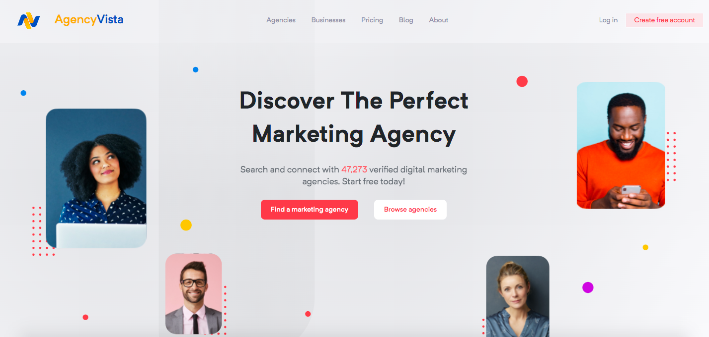
We will start our list of CTA examples from our website. Agency Vista’s homepage suggests searching and connecting with verified marketing agencies for any business and offers to start for free. Moreover, you can see two CTA buttons – ‘Find a marketing agency’ and ‘Browse agencies.’ When clicking each one, you are requested to provide more information to receive a list of the best agencies specifically for your brand.
2. Evernote
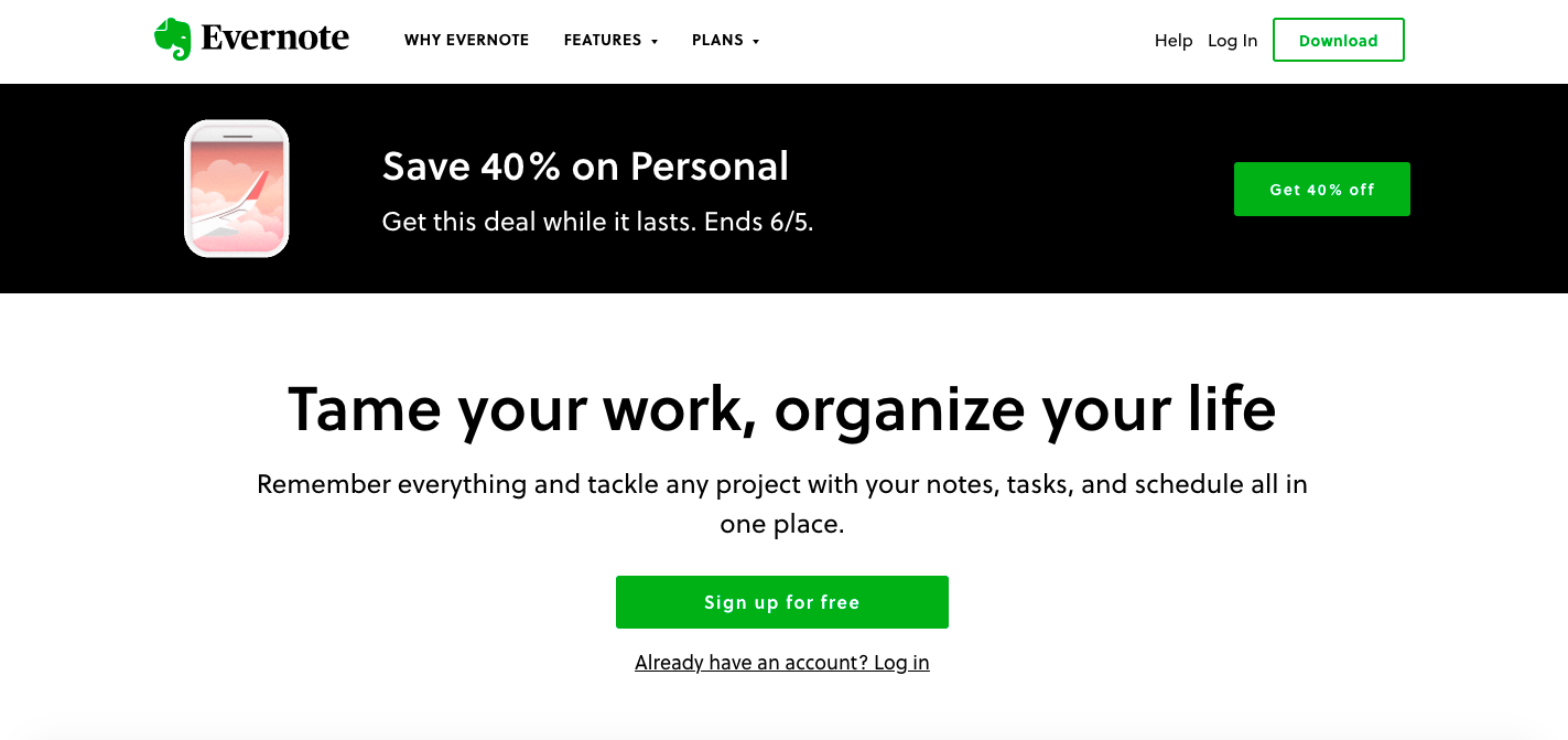
Evernote’s website design is clean and straightforward for users. It is clear what actions to take to achieve the desired actions. Bright green buttons “Sign up for free” and “Get 40% off” contrast with the web page elements and attract attention.
3. Netflix
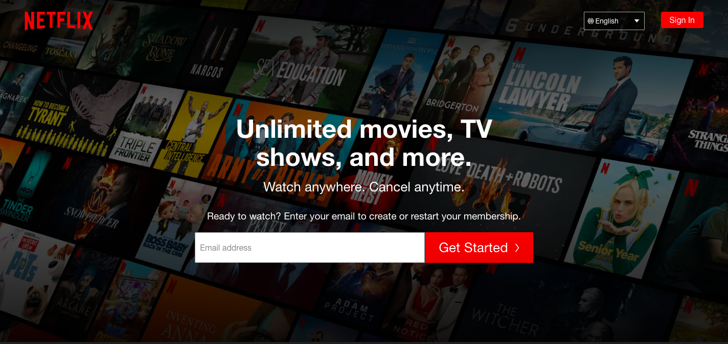
Red buttons with CTAs “Get Started” and “Sign In” match the logo’s color and help draw users’ attention at once. Also, note how the brand reassures the audience they have nothing to worry about – they use the phrase “Cancel anytime” to boost sign-ups.
4. IMPACT Branding & Design

The bright orange CTA button “Talk to an advisor” suggests visitors learn more about the company before taking further actions. It stands out on the black background, so you can’t help but click.
5. Uber
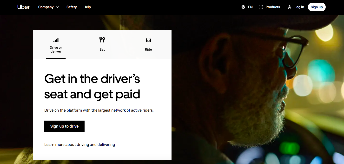
When you browse the Uber website, you will see that the platform is oriented toward drivers and riders. For example, ‘Sign up to drive’ is a CTA for drivers, and ‘Sign up to ride’ is a CTA for riders. It is one of those CTA examples that shows how easy it is to tie and target two types of customers.
6. Spotify
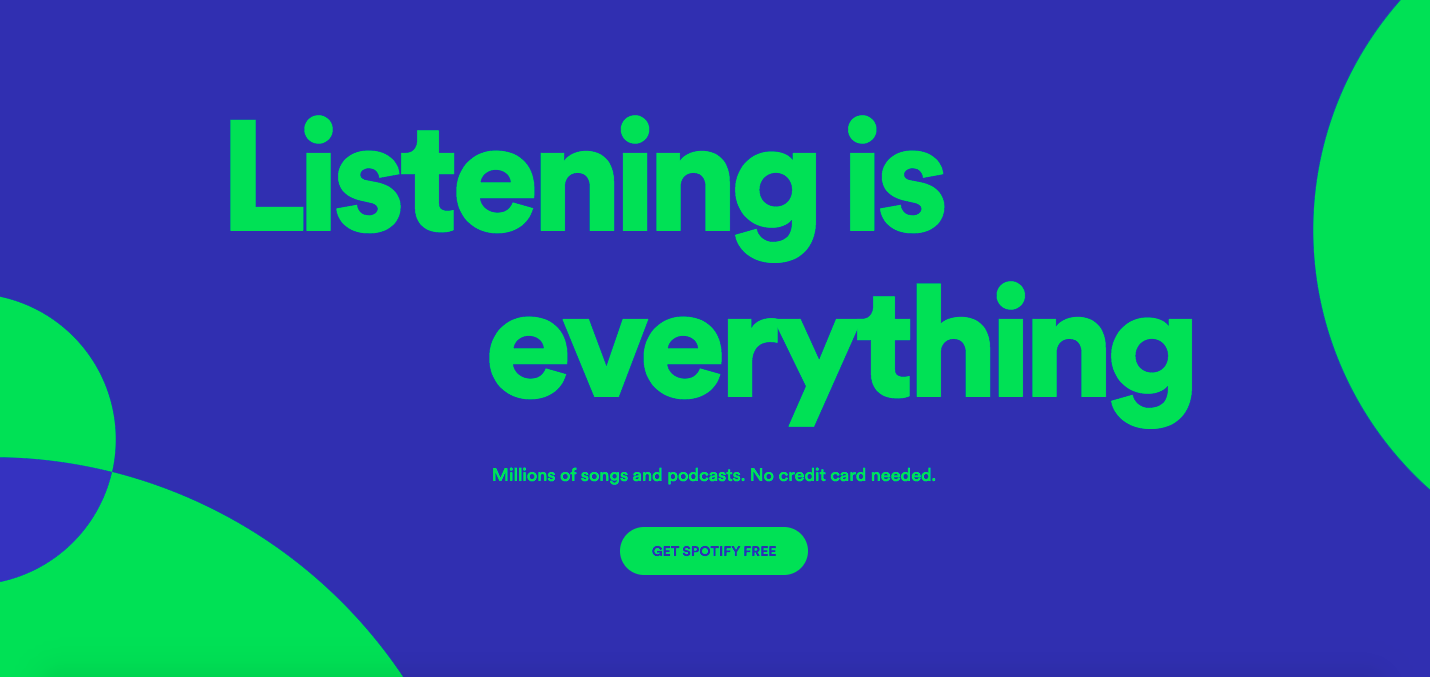
As soon as you open Spotify’s homepage, you will see a lime green CTA button, ‘Get Spotify free.’ In addition, you see ‘No credit card needed’ among the CTA phrase to reduce anxiety due to the CTA formula. You will see this phrase further in other CTA examples.
7. Pinterest
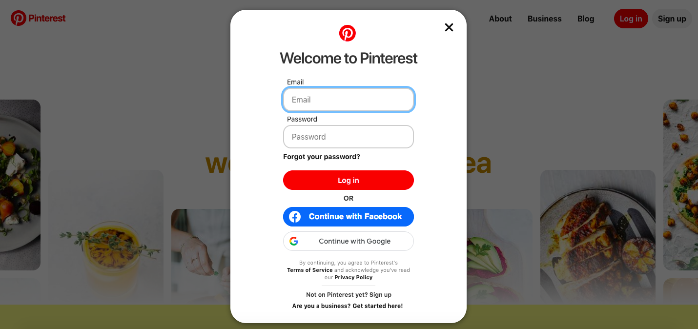
The “Welcome to Pinterest” window offers a few options to sign up – you can log in through the email and password and “Continue with Facebook.” If you log in through the Facebook platform, Pinterest will pull in Facebook’s API data and collect more information about you. Such an option is widely used since it saves visitors time signing up.
8. Levi’s
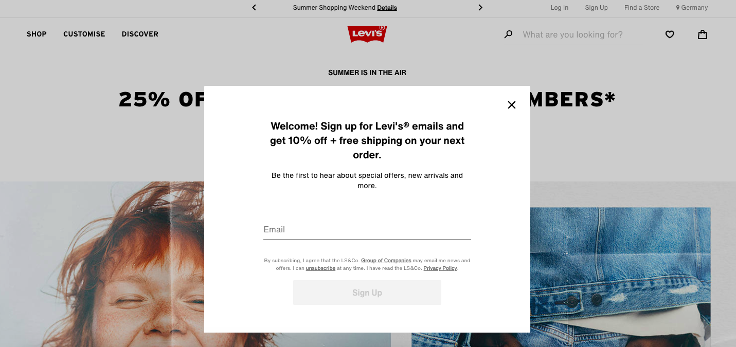
After you browse Levi’s website and specify your country, you can see a welcome sign-up window. The brand encourages the audience to sign up for Levi’s® emails and get 10% off + free shipping on your next order. This CTA emphasizes the uniqueness and profitability of the offer.
9. Instagram
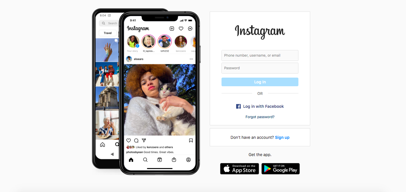
Here we can see two black CTAs – “Download on the App Store” and “Get it on Google Play.” These buttons look the same since it does matter how exactly the application is downloaded. If you have an app, think over such CTAs to make it easier for your users to download your product.
10. Barkbox
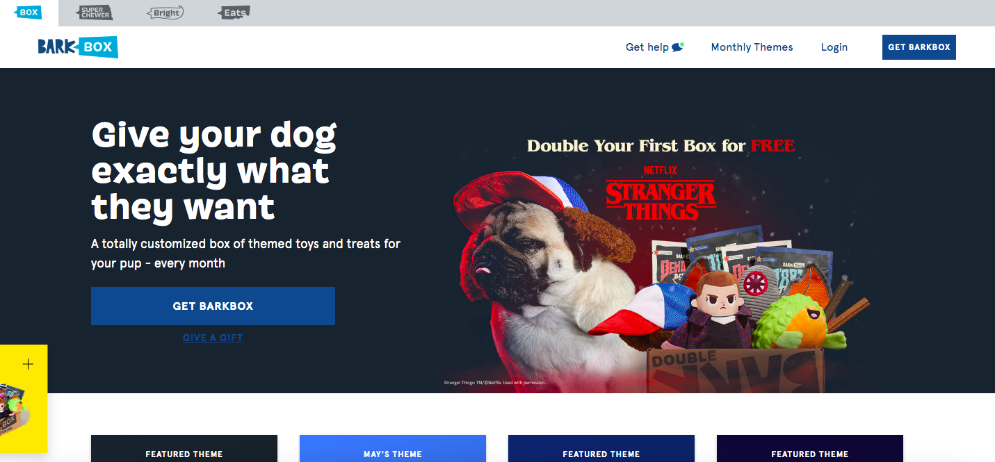
Barkbox’s homepage shows two CTAs – “Get Barkbox” and “Give a gift.” This means the company knows its audience – while some people browse the website for themselves, others want to present Barkbox as a gift. So choose the best phrases reflecting your brand voice and come up with CTAs that serve different customers.
11. General Assembly
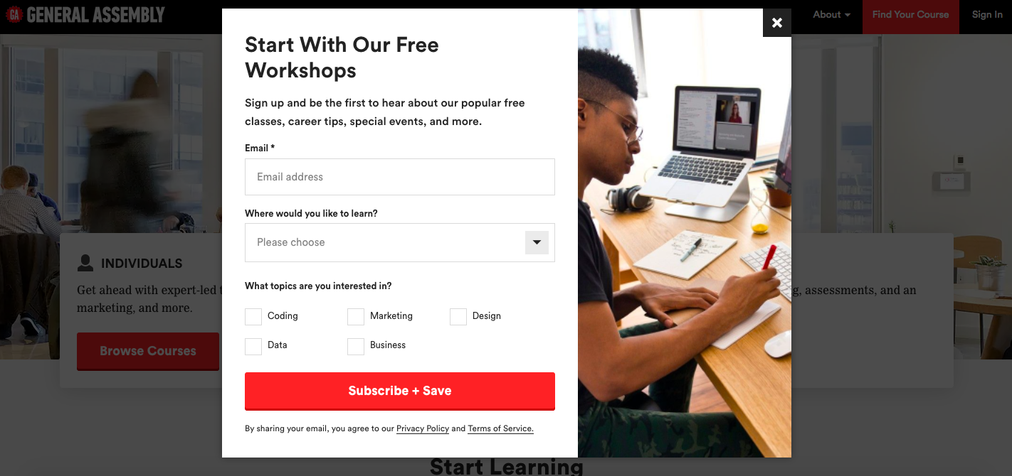
Once you get to the homepage and start scrolling, you can see the ‘Start With Our Free Workshops’ window. It offers to sign up and specify what you would like to learn and what topics you are interested in. Below you see ‘Subscribe + Save’ CTA on a bright red button. It is effective enough to get people’s attention.
12. Hipmunk
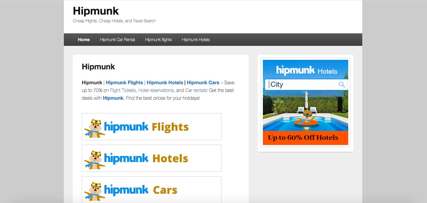
When you open Hipmunk webpage, you will notice three tabs – flights, hotels, and cars. Once you click any option, you will be able to specify more information. For example, when you are on the cars tab, you will get new CTAs specific to your chosen tab.
13. TeuxDeux
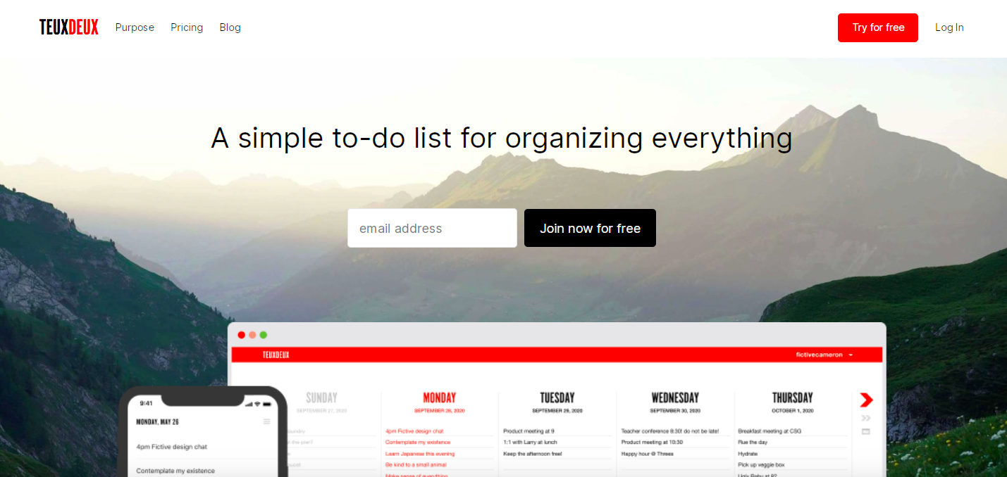
TeuxDeux homepage is another example of a simple and pleasant design. The colors repeat the brand’s color scheme, and the CTA button stands out against the background and emphasizes that you can join and try the product for free.
14. Glossier
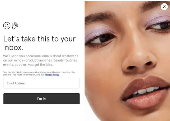
Glossier CTA appears right after you start scrolling down the web page. So what do you think of ‘Let’s take it to your inbox’ instead of the widely used ‘Sign up for our newsletter’? To our mind, a photo of a model with beautiful Glossier makeup and clever phrasing both make this CTA exciting and appealing.
15. Vista Social
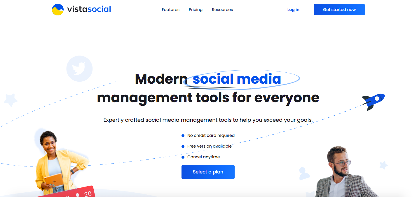
Vista Social’s homepage shows two bright CTA buttons – ‘Select a plan’ and ‘Get started now.’ Both buttons are designed in bright blue that easily attracts users’ attention. Moreover, you can see phrases like ‘No credit card required,’ ‘Free version available,’ ‘Cancel anytime.’ That is an excellent solution to decrease users’ anxiety in further work with the product.
16. Elementor
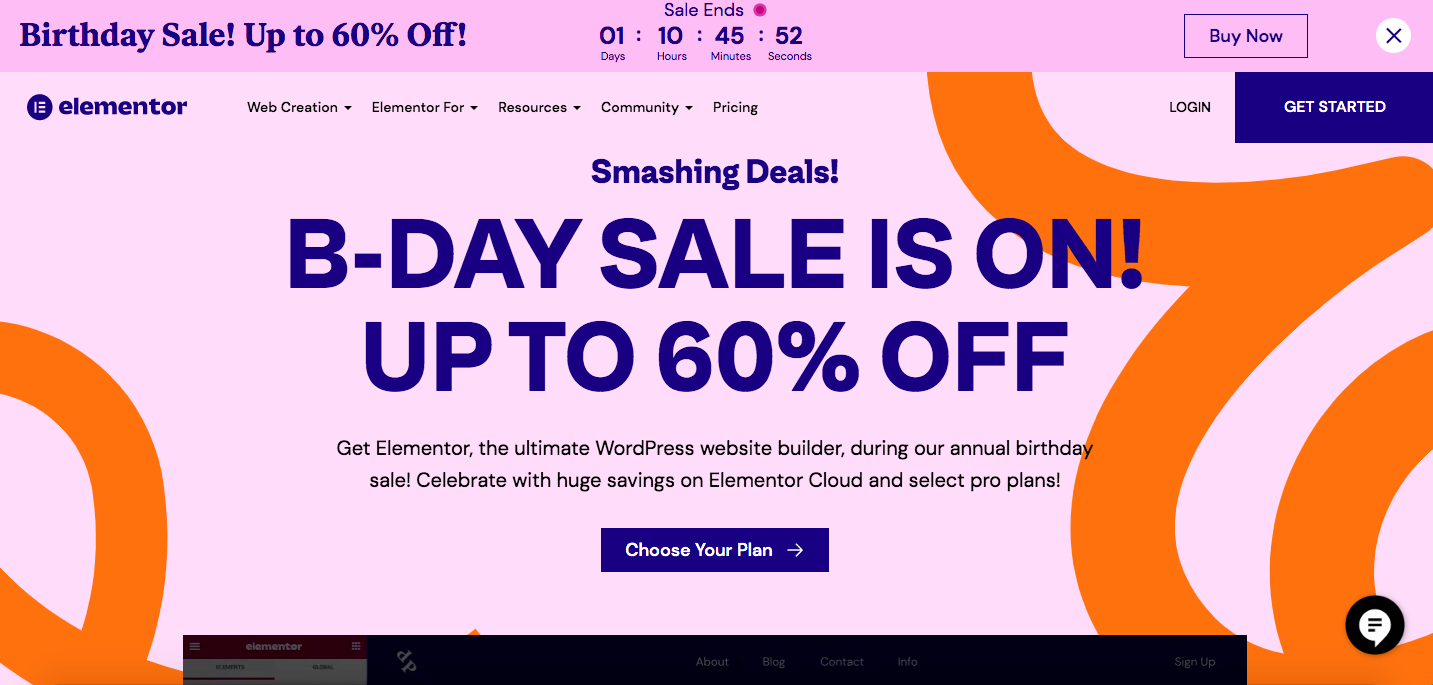
After you land on the Elementor website, you see their annual birthday sale offer. The webpage suggests celebrating with huge savings and select pro plans. The primary CTA button, ‘Choose Your Plan,’ immediately attracts attention and offers to select your path to web creation. Two more CTAs, ‘ Login’ and ‘Get Started,’ located on the top, are concise and direct.
17. Heifer International
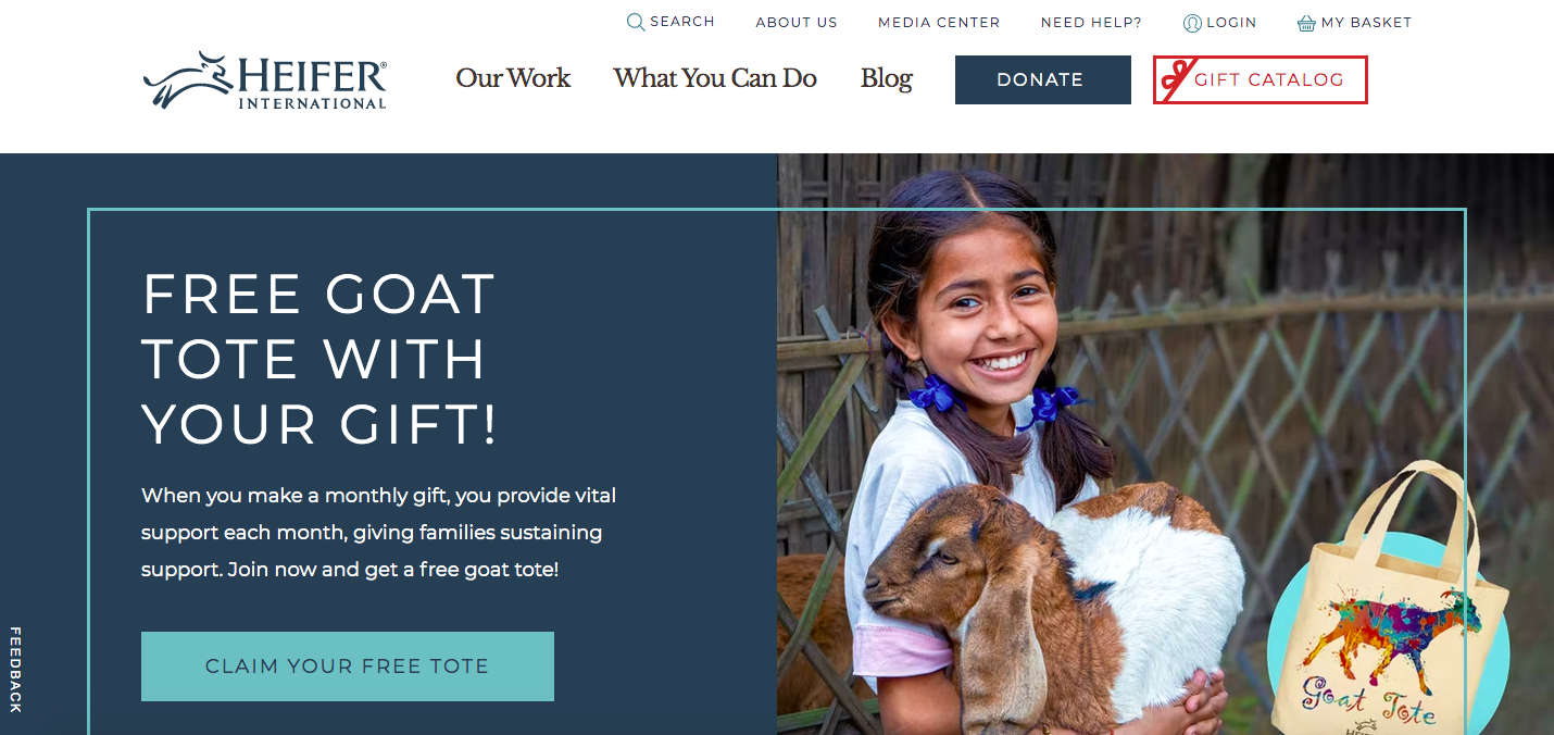
The community focuses on building social capital by increasing income and assets within farming families, improving food security and nutrition, and protecting the environment. ‘Claim your free tote’ CTA appears on the homepage and suggests joining now and getting a free goat tote.
18. Touchland
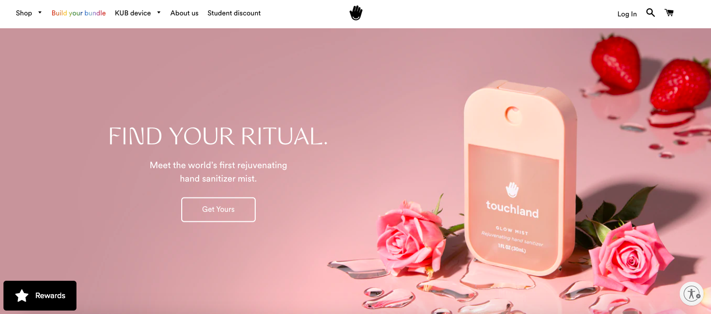
The brand offers to meet the world’s first rejuvenating hand sanitizer mist. “Get yours” CTA reminds you that many people already enjoy one – you will only fit in if you get yours. The CTA button is transparent, which gives the webpage an airy feel.
19. Airbnb
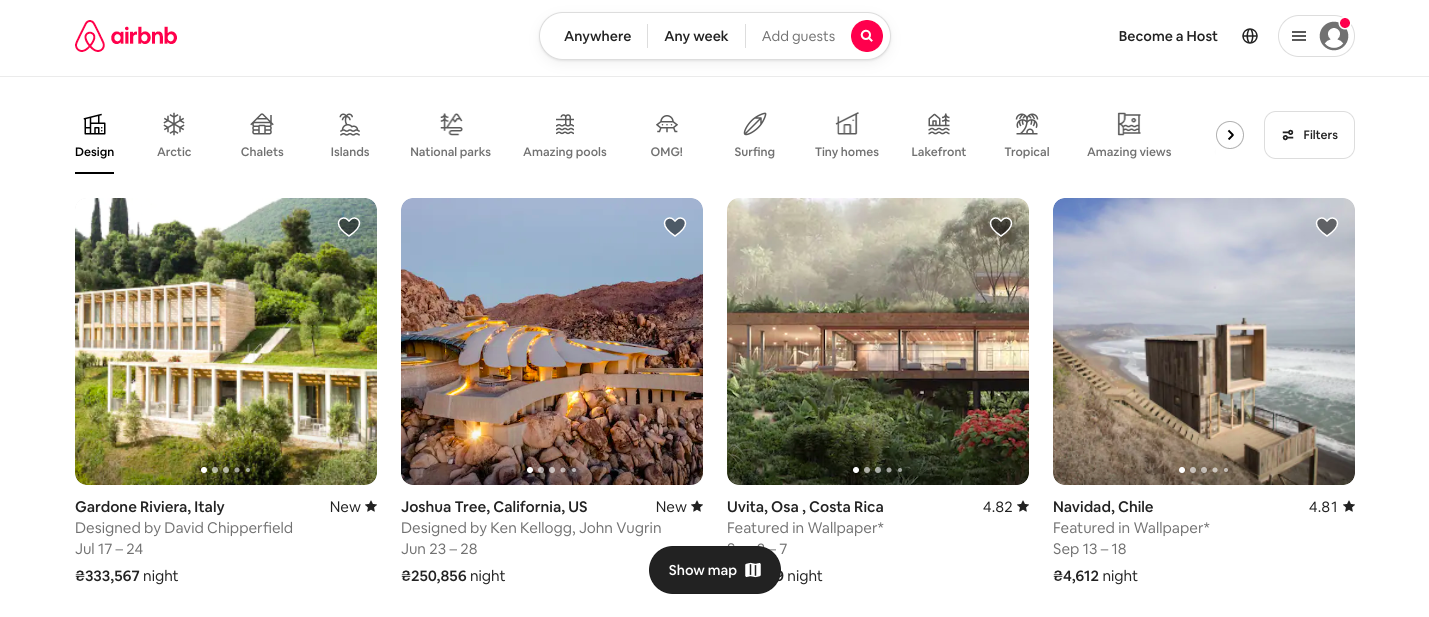
The travel website’s homepage shows variants of destinations, and you can see a CTA button “Show map” on the bottom. This call to action button stands out against the white background and invites users to explore designation options on a map.
20. Smartlook
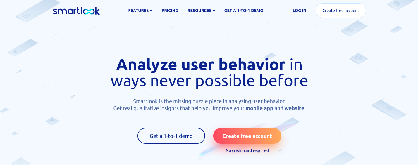
When you land on the website, you can see that its central goal is to prompt users to sign up for a free trial. ‘Create free account’ CTA button is an eye-catcher that evokes excitement and optimism. Moreover, if you have any doubts about the cost, “No credit card required” replies to your question.
21. Goodtimer
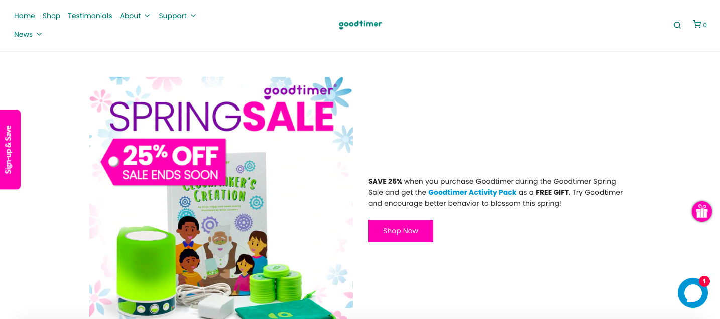
Though you are not winning any originality contests with the ‘Shop Now’ CTA button, it clearly defines the result. Also, the text ‘SAVE 25% when you purchase Goodtimer during the Goodtimer Spring Sale and get the Goodtimer Activity Pack as a FREE GIFT’ encourages greatly to click the CTA button.
22. LeadPages
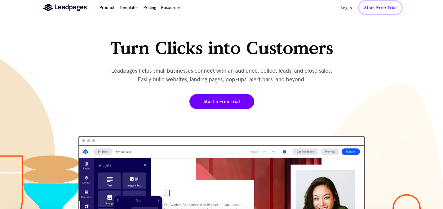
LeadPages website shows the ‘Start a Free Trial’ CTA button to allow the audience to try the service and quickly build websites, landing pages, pop-ups, and more. Note that you should not add any extra words to the CTA button. However, if any additional information is required, you can place it above or underneath the button.
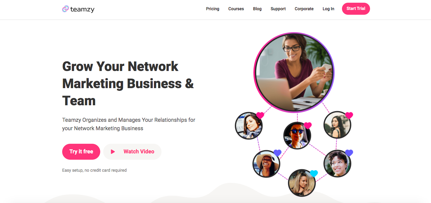
23. Teamzy
Teamzy’s homepage shows that you are not restricted to one CTA button. That is fine to have a few ones with the same meaning. For example, Teamzy uses ‘Try it free’ and ‘Start Trial’, and both CTAs options allow users to start a free trial.
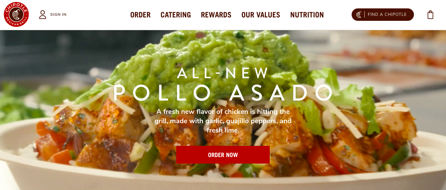
24. Chipotle
An efficient CTA instructs the user what to do. While overall website design compels the viewer to convert, a good CTA tells them how. That is precisely what Chipotle’s CTA does with its ‘Order now’ button.
25. Segment
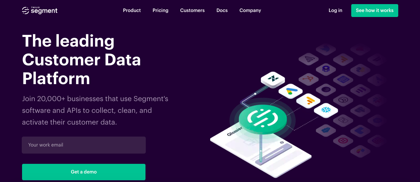
“Get a demo” is a quite popular call-to-action option that you will meet in various CTA examples. The Segment’s “Get a demo” is a descriptive, simple, and straightforward way to push the customer in the right direction.
26. Yoga International

It is not surprising that the word ‘Free’ has a good impact on conversion rates. Yoga International gets the most of it and uses the CTA button ‘Start free trial’ to attract more customers and increase sales. ‘Cancel online anytime’ will convince the audience that it is worth trying.
27. Hulu
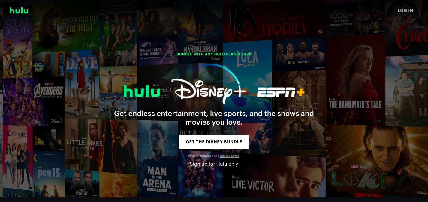
When it comes to compelling CTA, ‘Buy now’ and ‘Log in’ are not the only CTA buttons to use. You are welcome to express creativity and create something unique. For instance, Hulu’s welcome page shows the ‘Get the Disney bundle’ CTA button to open the pricing plans page.
28. Steve Madden
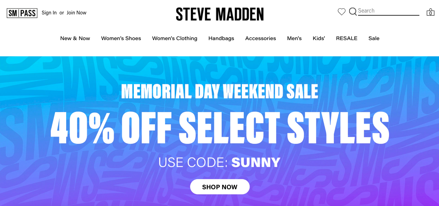
As an example of an e-commerce brand, Steve Madden’s website uses the ‘Shop now’ CTA button. It is a widely spread and correct solution when a customer shows intent to buy.
29. The Sill
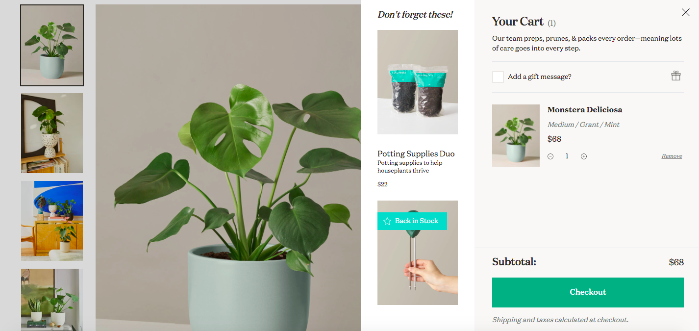
When adding the product to the cart, you can see a simple ‘Checkout’ CTA button designed in a bright green color. It is an eye-catcher under the order summary and is required to move your client to the page where they can enter the payment details.
30. Banana Republic
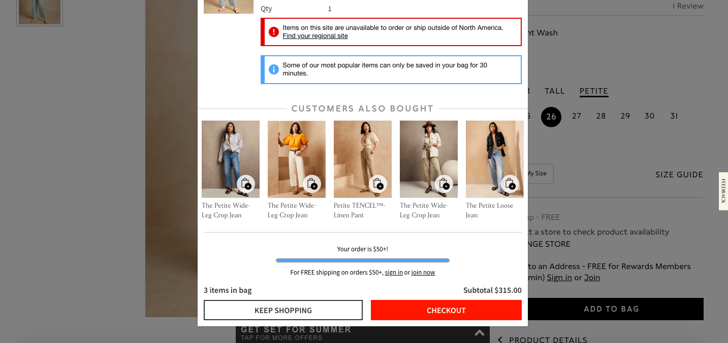
In this example, the ‘Keep shopping’ CTA button appears after the user adds an item to the shopping cart. This is an excellent solution to encourage the customer to buy more.
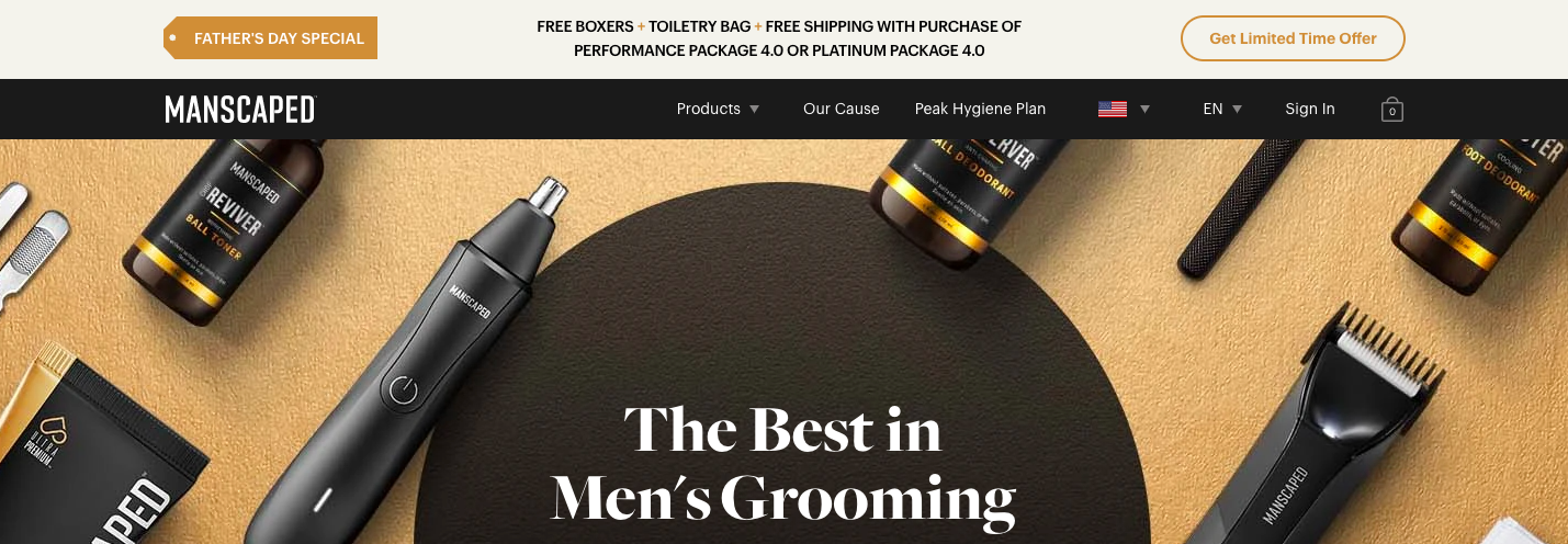
31. Manscaped
The ‘Get Limited Time Offer’ button is one of those CTA examples highlighting the exclusivity and urgency of getting the goodies. It is an efficient approach to increasing sales’ value proposition.
32. Yves Rocher
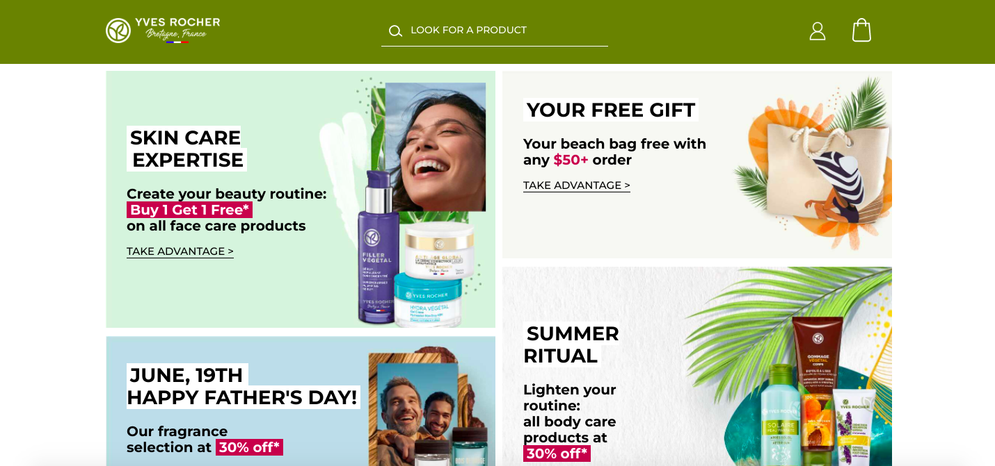
When browsing the Yves Rocher website, pay attention to how the brand uses the ‘Take advantage’ CTA button instead of the ‘Shop now.’ This example shows that you can create something unique and specific to your company.
33. Yeti
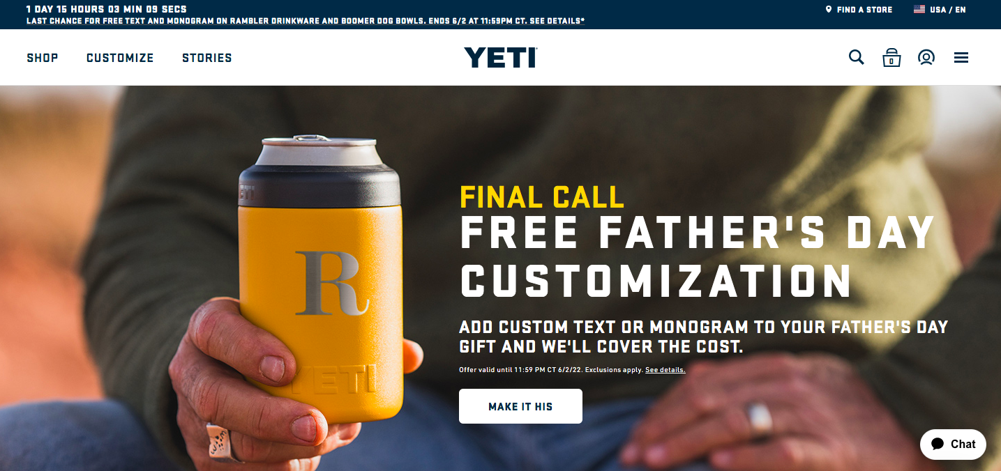
Yeti’s website offers free father’s day customization of your father’s gift, and you can see the ‘Make it his’ CTA button to discover more details. Such a creative approach instead of banal ‘Shop now,’ ‘Browse,’ and so on.
34. Crazy Egg
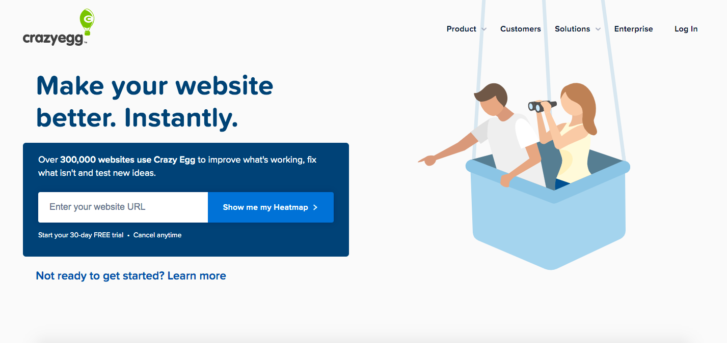
Crazy Egg demonstrates a compelling CTA – the ‘Show me my heatmap’ button on the homepage. This way, the brand assures the audience of the safety of trying out their service and reflects the customer’s voice.
35. GiftRocket
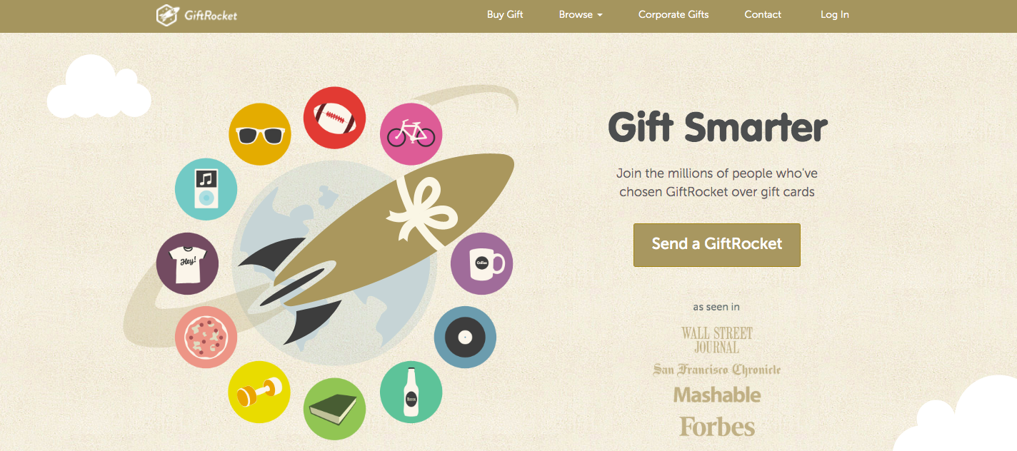
‘Send a GiftRocket’ is the CTA button you will see when browsing the GiftRocket web page. Why is it effective? The web page does not ask you to sign in but allows you to ‘Send a GiftRocket,’ resulting in a compelling experience.
36. Basecamp
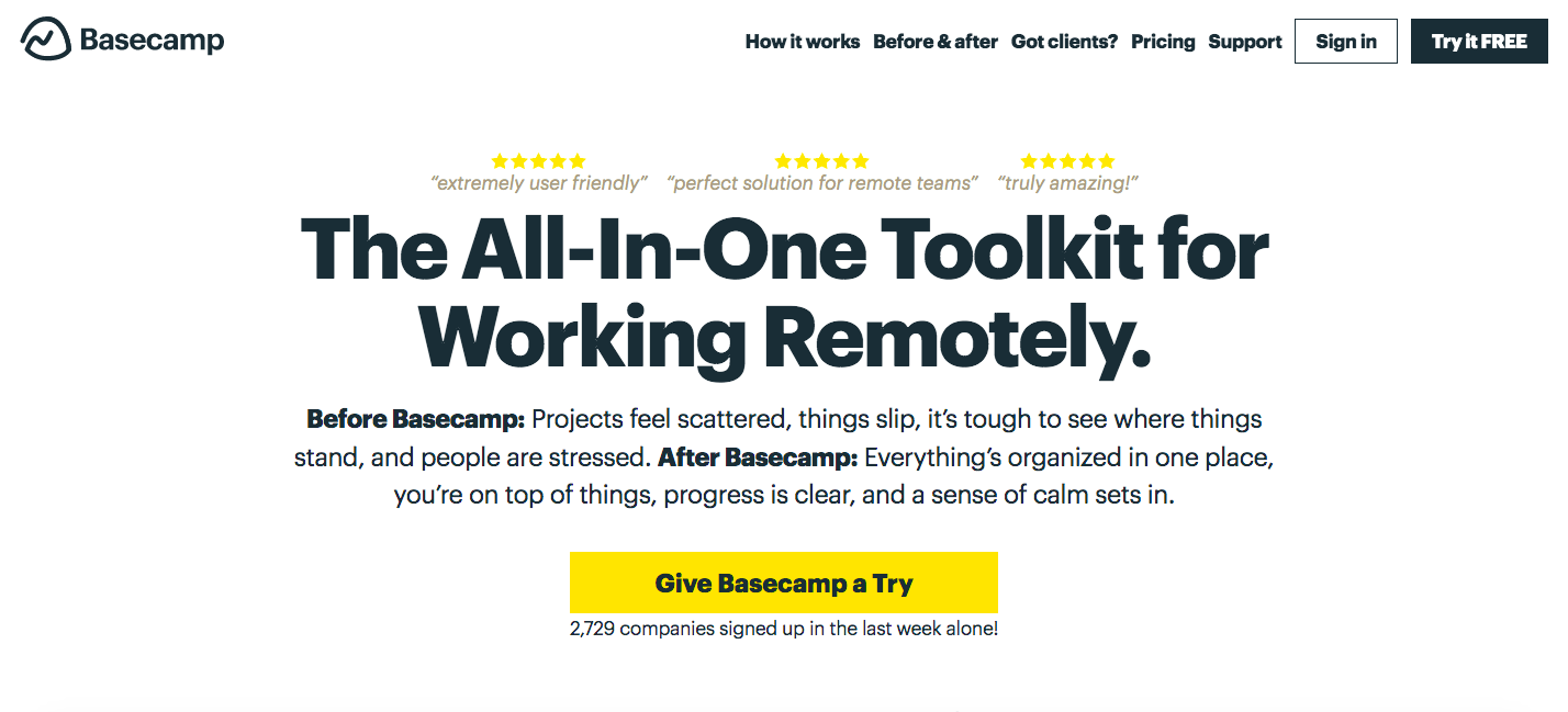
From the first moment on the Basecamp website, you can see the minimal and approachable design. ‘Give Basecamp a Try’ is tried-and-true CTA – try a free trial. Will you agree it sounds compelling?
37. My Perfect Resume
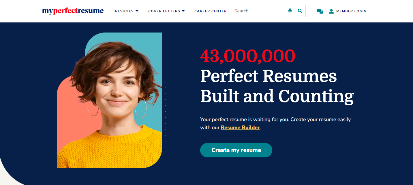
The “Create my resume” button is a tempting offer for those who do not have the time or inclination to create their resume themselves. The service emphasizes that your perfect resume is waiting for you and invites you to create your resume easily with My Perfect Resume.
38. Apple
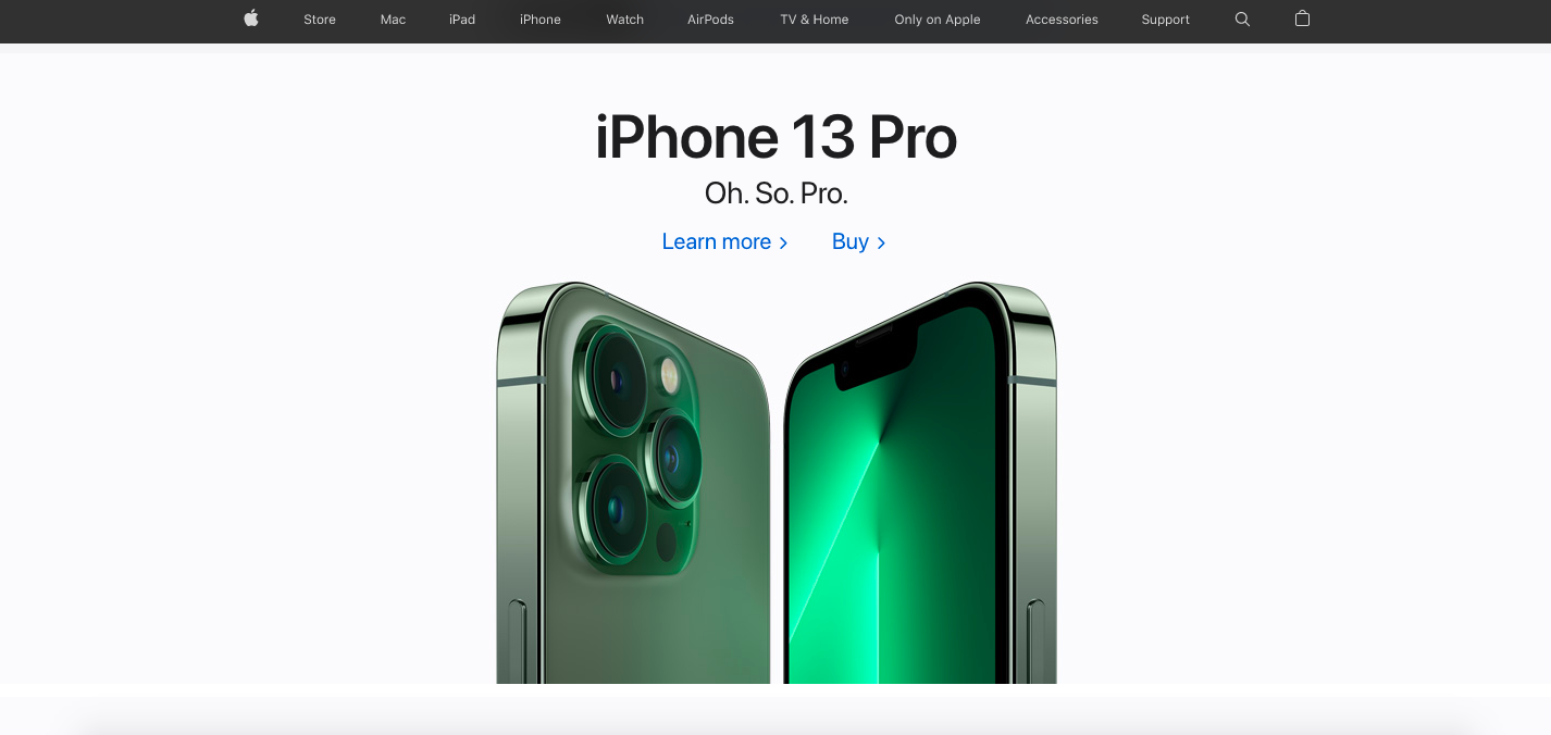
As a trendy brand, Apple does not need to talk much to move clients to action. Therefore, you see two simple CTAs – ‘Learn more’ and ‘Buy.’ Note that they are not buttons but are still identifiable because of the color.
39. HBO
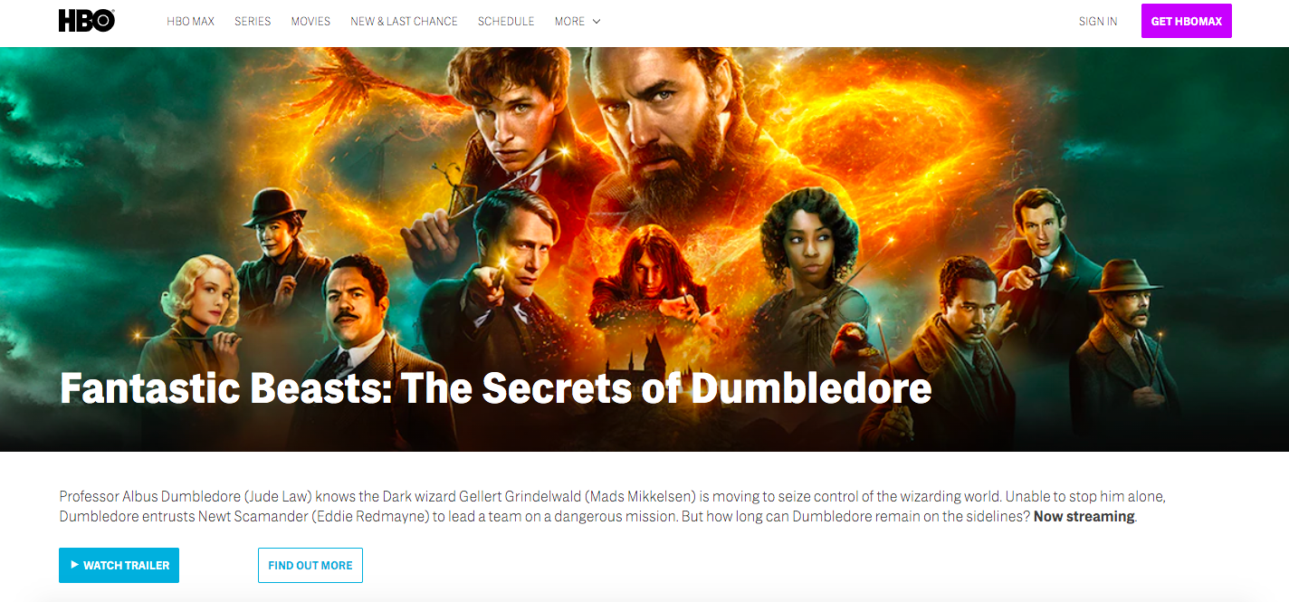
HBOmax is a video streaming platform, so a CTA button ‘Watch trailer’ is entirely predictable here. You can see a few more CTA buttons on the homepage, and they all are highlighted enough to get visitors to take the desired action.
40. ClickUp
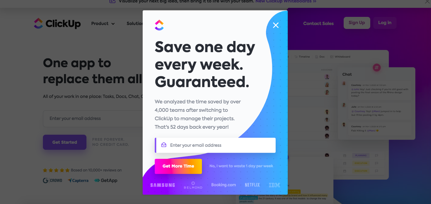
Right after you land on the ClickUp website, you can see a pop-up box. Here you will notice the “Get more time” CTA button instead of the traditional “Sign up to the newsletter” or similar. Moreover, there is a cheeky “No, I want to waste one day per week” line beside their call to action.
41. Wix
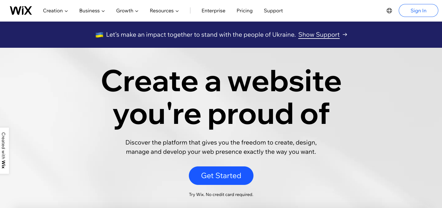
Wix.com’s homepage inspires you to create a website you will be proud of. The bright blue ‘Get started’ CTA button is designed to convert the leads and motivate viewers to open an account with Wix.
42. Zoom
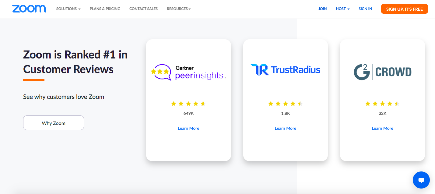
“Why Zoom” and “Sign up, it’s free” CTA buttons are created to make a final appeal to those who may not be Zoom’s customers yet. Such an approach drives users to sign up and learn why the product is ranked so high.
43. The Chef and the Dish

This website highlights the option to “Book Your Private Cooking Class” as the key element at the center of its homepage. When clicking this CTA button, you get to the page where you can search by date, country, dietary preference, and more.
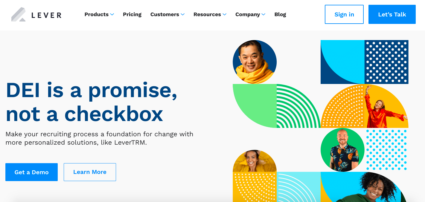
44. Lever
Lever’s use of “Let’s talk” in its CTA offers prospective clients the possibility to speak with a specialist, thereby giving them an excellent first impression of the service. Again, this sounds approachable and friendly.
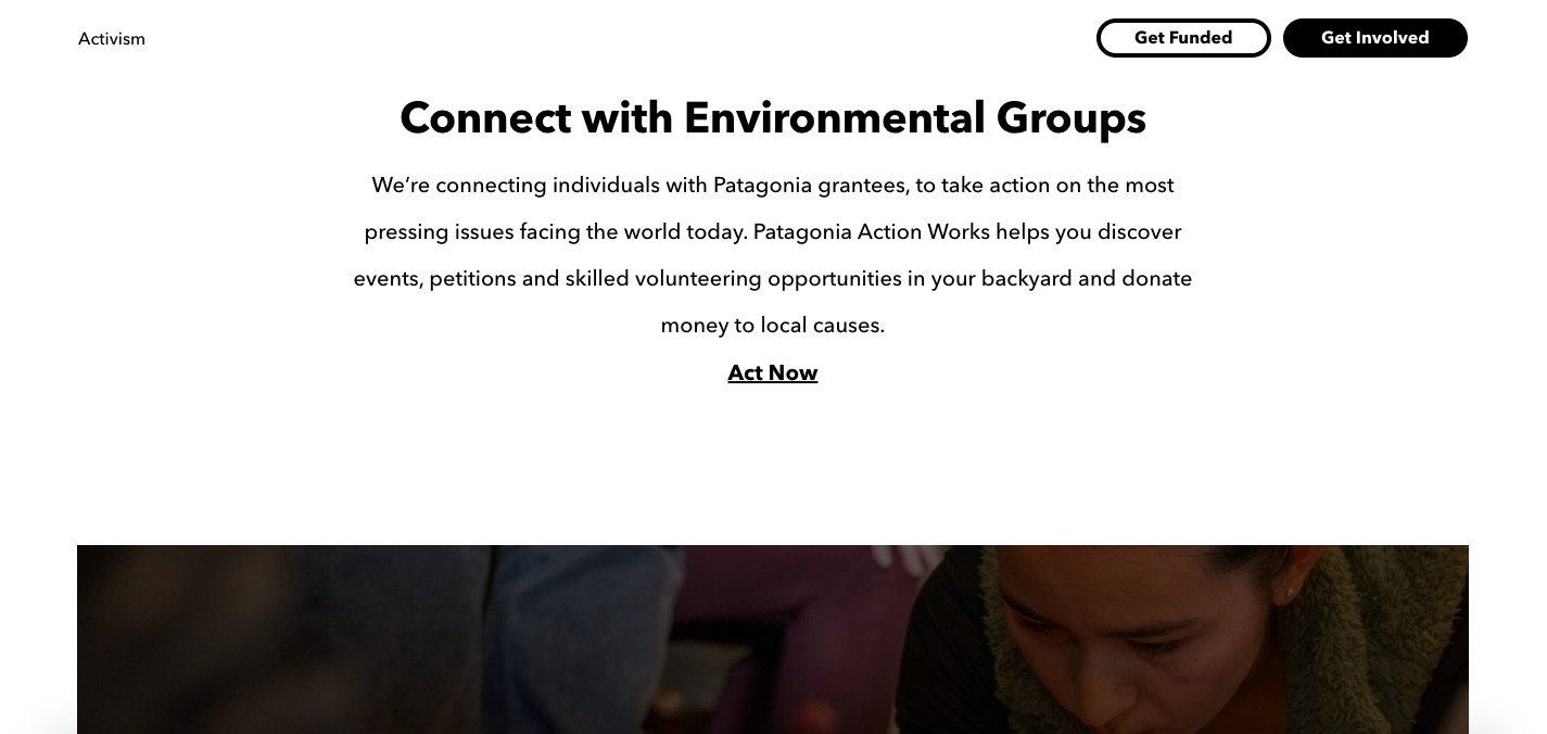
45. Patagonia
Patagonia encourages users to sign up for volunteer work on the Activism page and uses the ‘Act Now’ CTA. This is an excellent play on words since when acting now on the website, the visitors take action on issues facing the world today.
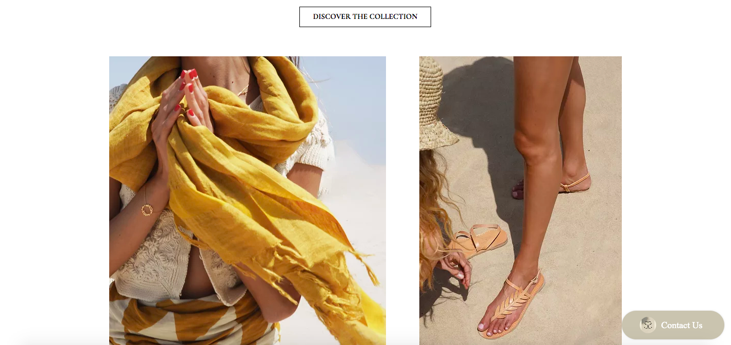
46. Greek Sandals
With the CTA “Discover the collection” and summer images across the website, you are welcome to grab some travel and summer vibes. In addition, the wording “Discover the collection” nicely connects the brand’s aesthetics and language.
47. Grammarly
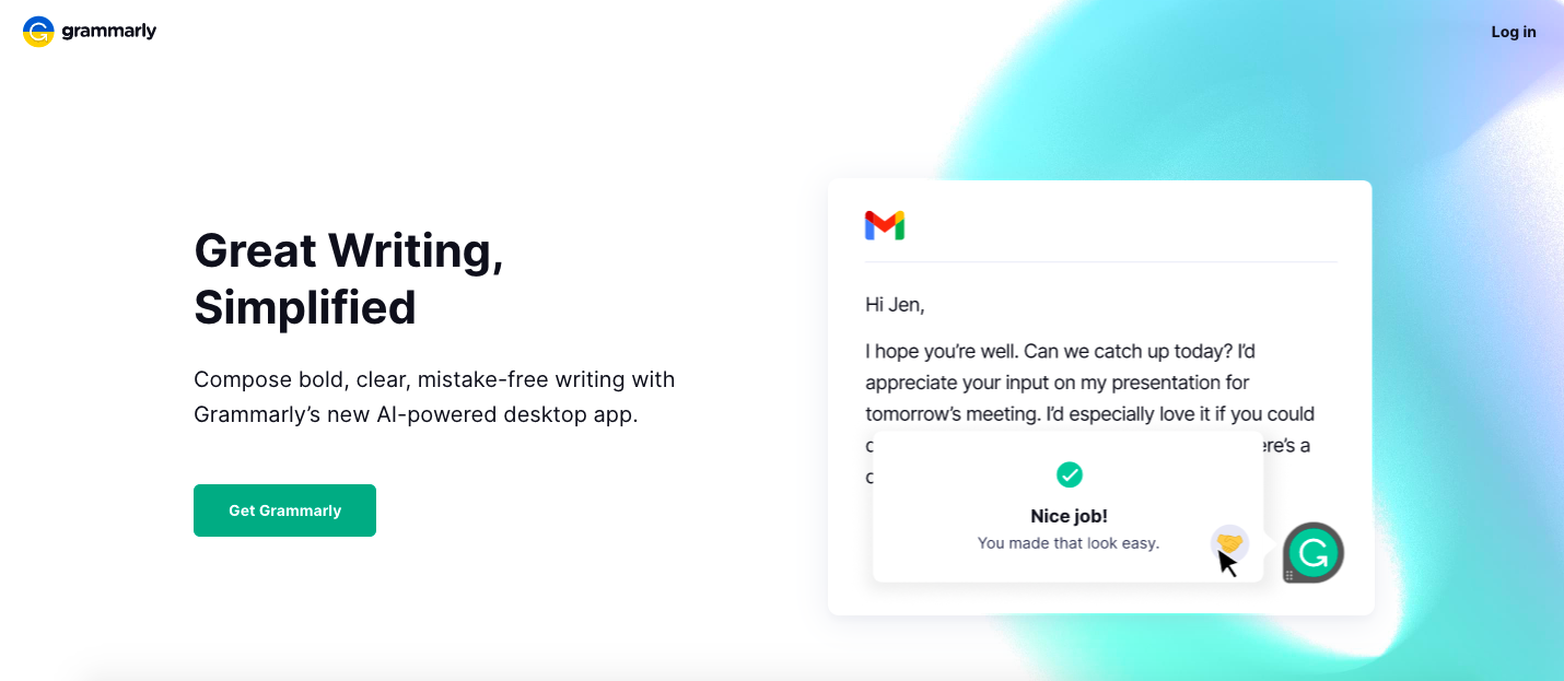
Grammarly’s CTA button ‘Get Grammarly’ is used instead of the more frequent option ‘Sign up.’ The button is an eye-catcher since it is placed on a white background. After clicking ‘Get Grammarly,’ you are transferred to the Sign-up window.
48. Everlane
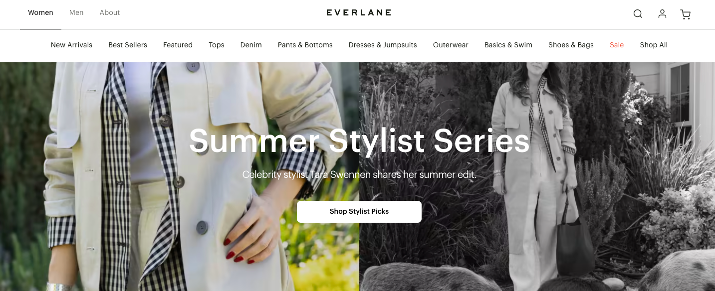
When you land on Everlane’s homepage, you will see the ‘Shop Stylist Picks’ CTA on the white background. After clicking the button, you will get to the page with product picks.
49. Trello
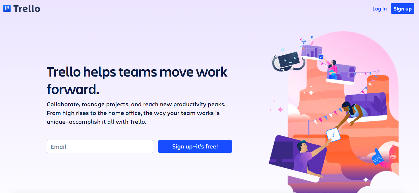
The website’s design has a light blue background, so Trello’s CTA stands out with contrasting colors. ‘Sign up – it’s free!’ The CTA button is quite clear and straightforward. It encourages the users to sign up and ensures it is free.
50. Huemor
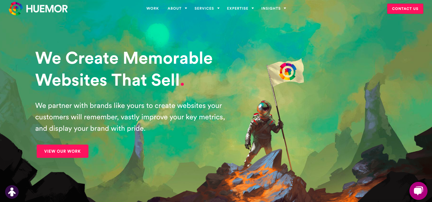
Huemor’s looks hand-painted, which makes the overall design rather creative. A few pink CTAs guide your attention, allowing you to find out more, whether it is by contacting the agency or viewing its work.
Conclusion
Ok, you have just seen CTA examples that can inspire you to create a call to action that turns your audience into buyers and customers. But, before you start, do not forget to study your audience well and define the specific actions you want them to take.
Your CTA should stand out, start with strong action words, create a sense of urgency, have social proof, and tell people why they should act. Then, incorporate these recommendations on your website, emails, and pop-up forms, and enjoy CTAs that convert.
Find the perfect agency to drive more click-throughs from your marketing campaigns. If you are a marketing agency, explore Agency Vista’s plans and start growing business with your perfect clients.
Grow with the #1 marketing agency network and top destination for businesses to hire
Sign up for Agency Vista, and see why over 51,437 marketing agencies trust us to grow their online presence and foster credible relationships with businesses. We’re free forever, and you can upgrade, downgrade, or cancel any time.
Get Started

Get started free
Setup in minutes
No credit card required
Agency Vista is the new way for brands to find and easily connect with marketing agencies. Explore 51,437 verified profiles and reviews to find the right agency for your business.
Follow us

Copyright © 2026 Agency Vista LLC. All rights reserved. Lovingly made in NYC.