August 4, 2022 - Shane Barker
The Psychology Behind Colors and Its Importance for Content Marketers
You just finished writing a 2,500-word blog post. Phew. You’re exhausted.
As you work through your quality assurance checklist, you may notice that you are missing a call-to-action (CTA) at the bottom of your post. You browse through your current iterations of CTA buttons and land on two options with the same copy: one is red, and one is blue.
Which one should you go with? Is one superior to the other? The answer: maybe. More on that later.
Color is a powerful tool that can increase the effectiveness of your marketing efforts and gain more engagement from potential customers.
The impact colors have on people has been studied extensively, and there’s a lot you can learn about how customers react to different colors based on their psychological meaning.
Understanding color psychology can give you a unique edge as a content marketer.
In this post, we’ll walk through some of the psychology behind colors to better understand how it impacts people’s perceptions and how to turn that into creating a deeper connection with your audience.
Let’s dive in.
What is Color Psychology?
First, let’s start with the basics.
Color psychology studies how colors influence human emotions, thoughts, and behavior. The field of color psychology has quickly become a focal point of marketing and public relations.
Color psychology fits into two categories: physiological effects and psychological effects. Physiological effects are those that occur in our bodies (such as blood pressure), and psychological effects are those that happen in our minds (such as emotions)
Color can create a mood or set a tone for your content, or even drive specific behaviors in your audience.
However, it isn’t that cut and dry. How we feel about color is often deeply personal and may be rooted in our experiences or cultures.
The Perception of Colors
While perceptions of color vary from person to person, some color effects have universal meanings.
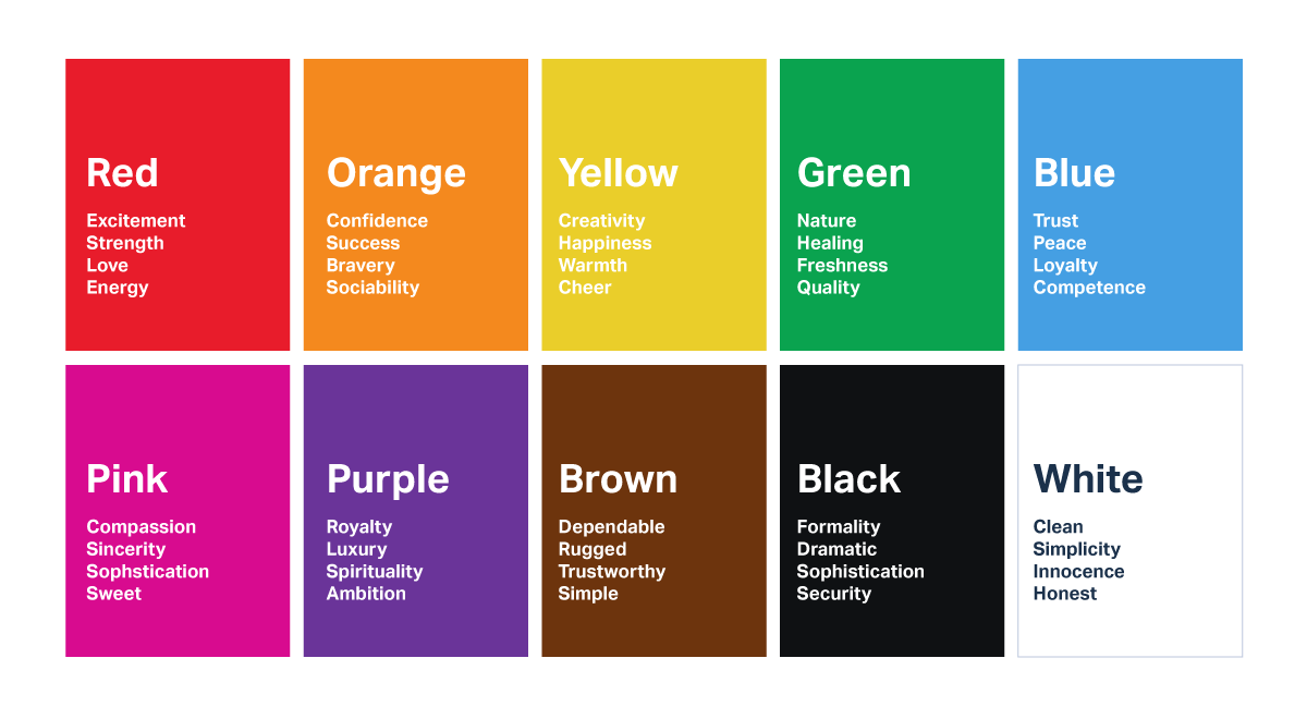
Understanding the meaning of each color is essential to using them effectively in your messaging.
This knowledge doesn’t just pertain to the colors you choose for branding and the headers of your webpage. It also includes colors in your CTAs, images, vector graphics, infographics, videos, and more.
Let’s take a look at some examples.
Red
Red elicits strong emotions, both positive and negative. It creates a sense of urgency, which can drive sales.
Let’s circle back to the CTA example.
Your CTA button is crucial for lead generation and, ultimately, for lead scoring, as it captures precious information from your potential leads. Your CTA should be clear, visible, and grab the attention of your visitors. Red can encourage impulsivity if you want to design an effective CTA. On the other hand, blue evokes a sense of calm.

Score more leads by using red over blue in your CTAs.
Orange
Orange is a warm, friendly color. It’s associated with feelings of joy, success, and enthusiasm.
People often see orange as a cheerful hue that sparks feelings of excitement.
Orange is also a color of confidence. Next time you include your author bio in a guest post, consider using image effects to add an orange background behind your headshot.
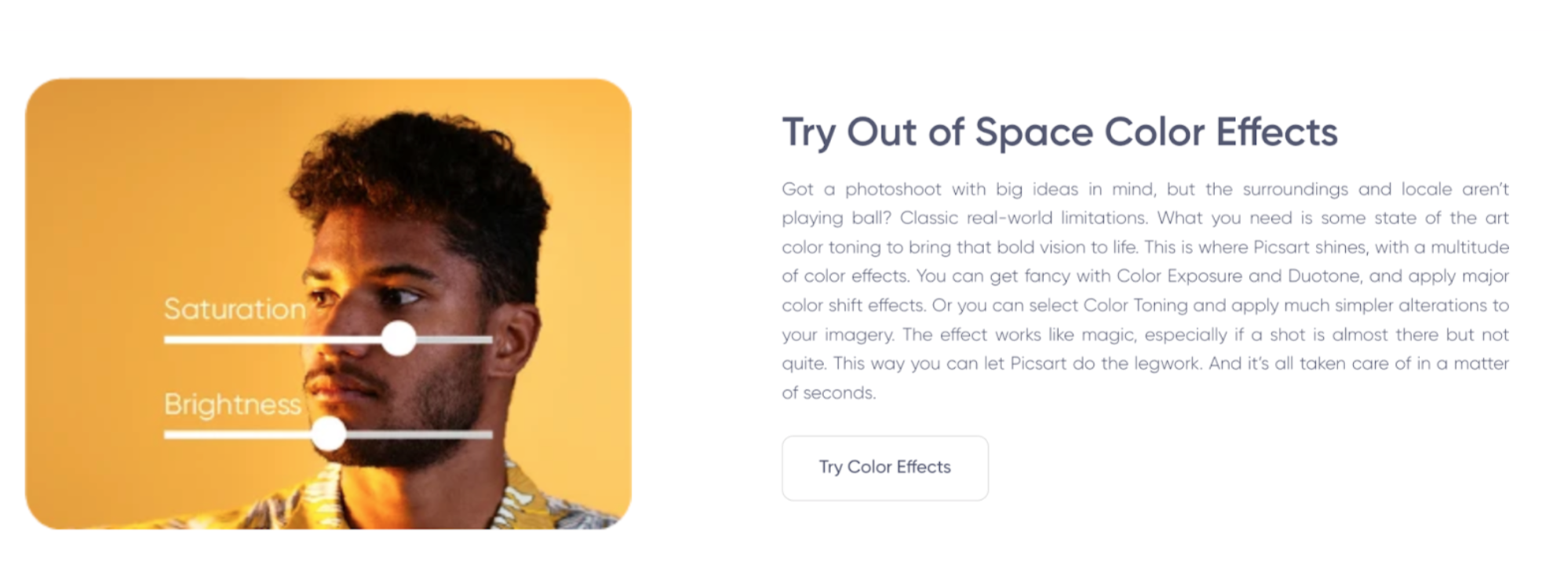
Orange will help exude confidence in your headshot, further driving home your expertise on the topic you just covered.
Yellow
Yellow is a cheery and upbeat color that invokes feelings of happiness and optimism — like the sun’s rays on a clear day.
Although people often associate yellow with happy emotions, too much yellow can cause anxiety and nervousness. Think of how a lemon tastes sour in excess — yellow should be used sparingly and in small doses.
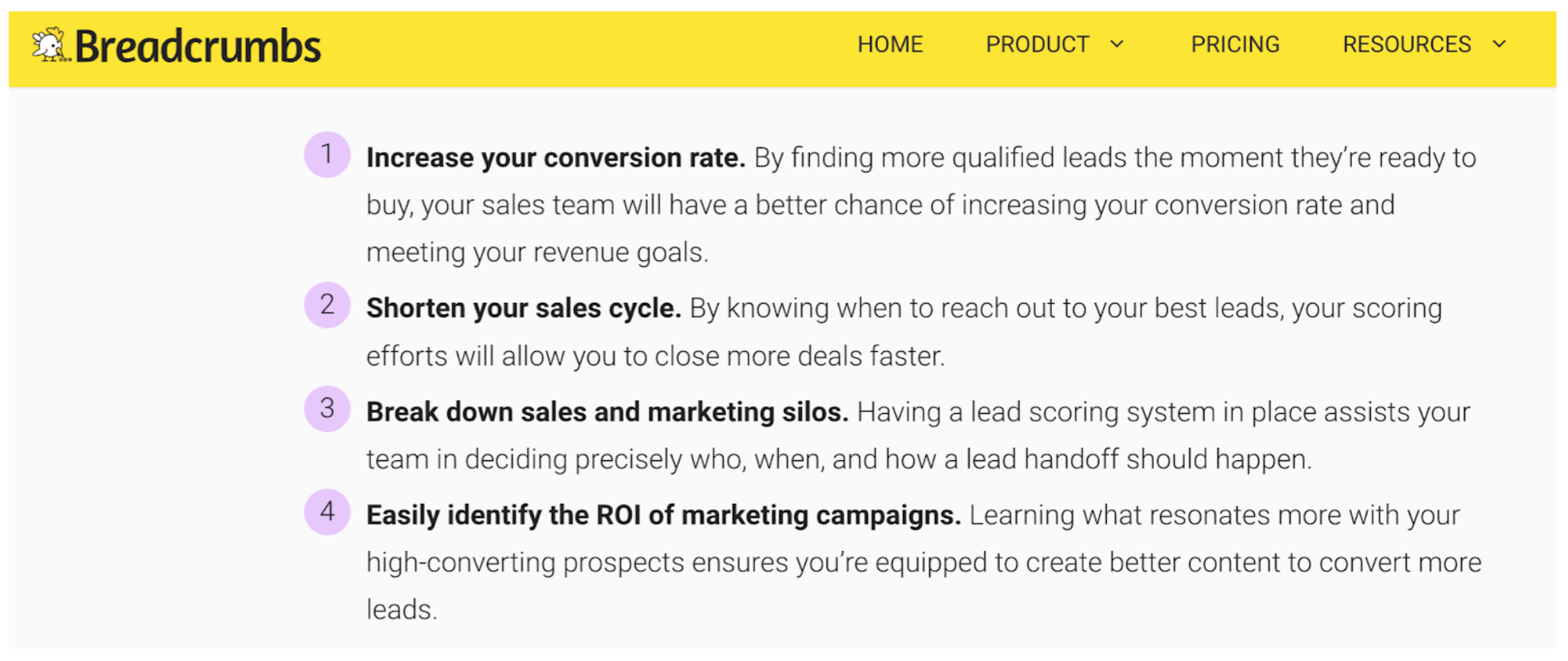
Breadcrumbs did an excellent job using yellow to spark a cheerful vibe on their blog but didn’t overdo it by incorporating other colors like purple and black.
Green
Green is a popular color, especially among health brands, organic foods, and sustainable energy companies. It is a calming color made up of shorter wavelengths, making it easier on the eyes.
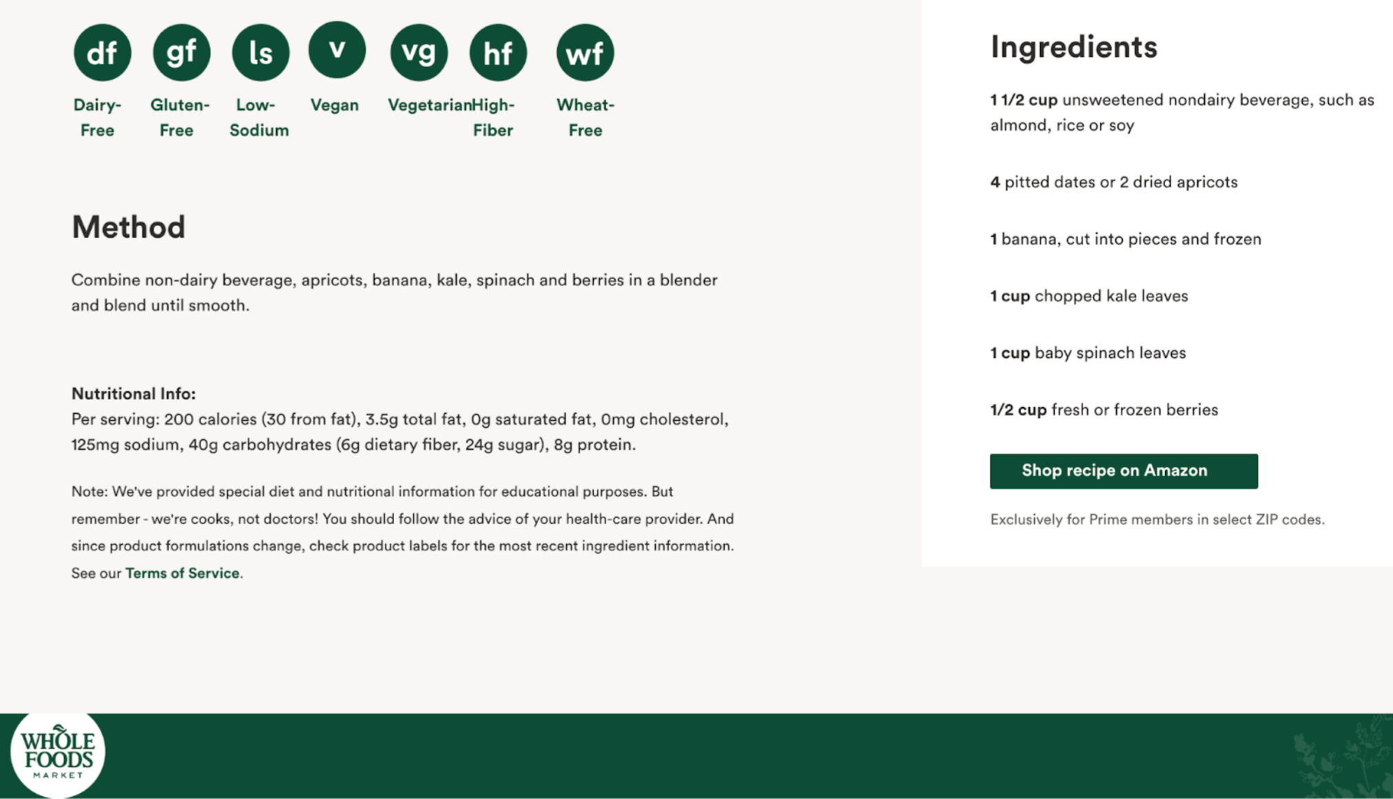
Whole Foods sprinkles green colors throughout this recipe for a smoothie. It drives home the healthy aspect of this recipe in addition to the organic food that Whole Foods supplies.
On the other side, green can also represent money, power, and greed. Have you ever heard the expression “green with envy”? This common saying is typically used to describe someone who has a strong desire for something that someone else has.
Blue
Blue is a calming color that inspires trust and reliability. Imagine a day when the sky is blue, or rain is falling against your window in the late afternoon.
uSERP incorporates shades of blue on their testimonials page to further invoke a feeling of dependability with their brand. The color further emphasizes the copy on the page that outlines their recognition as a top digital PR agency that works with worldwide brands.
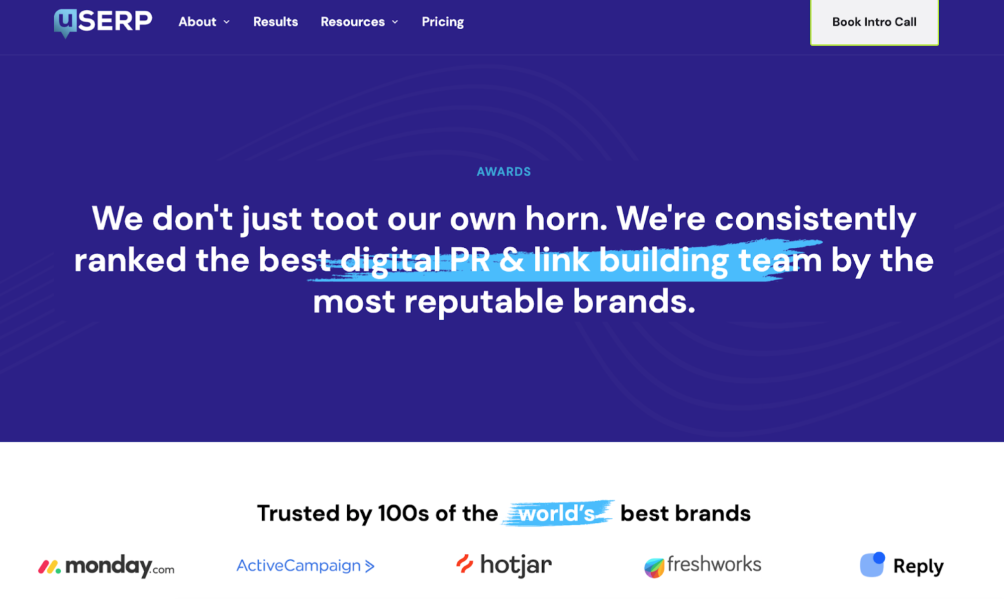
Blue is a popular color for brands across industries because people associate it with trust. But if you choose blue, your brand might blend in with the sea of blue-colored logos.
So choose a different color if you hope to stand out from the crowd.
Purple
Purple is the color of royalty, luxury, and creativity. It’s also a perfect complement to gold.
Greenlight, a fintech company that provides debit cards for kids, uses green for its logo. Green goes together with money (and aligns with its name), so it is a fitting color choice.
However, for much of their content, they apply images with a lot of purple and gold. Purple is associated with imagination and creativity — two things that children know best.
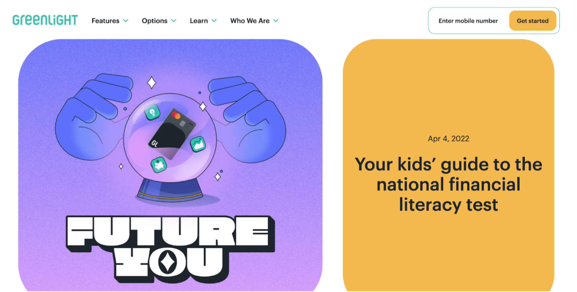
So what better way to get children, their target market, to engage with their content than by applying colors and imagery that are associated with fantasy and fun.
The Importance of Color for Content Marketing
We don’t usually think about it, but color plays a significant role in our lives. It can influence people’s emotions and willingness to buy a product or service.
Using color correctly, especially in marketing materials such as landing pages, can enhance consumer experiences and improve conversions.
Brand Messaging
Colors can help you create your brand’s unique name and visual identity.
Colors are essential in creating a brand that people can recognize, remember, and trust. They give a brand an emotional connection with its users, which is why choosing colors is crucial.
Colors help communicate the personality of a company or product.
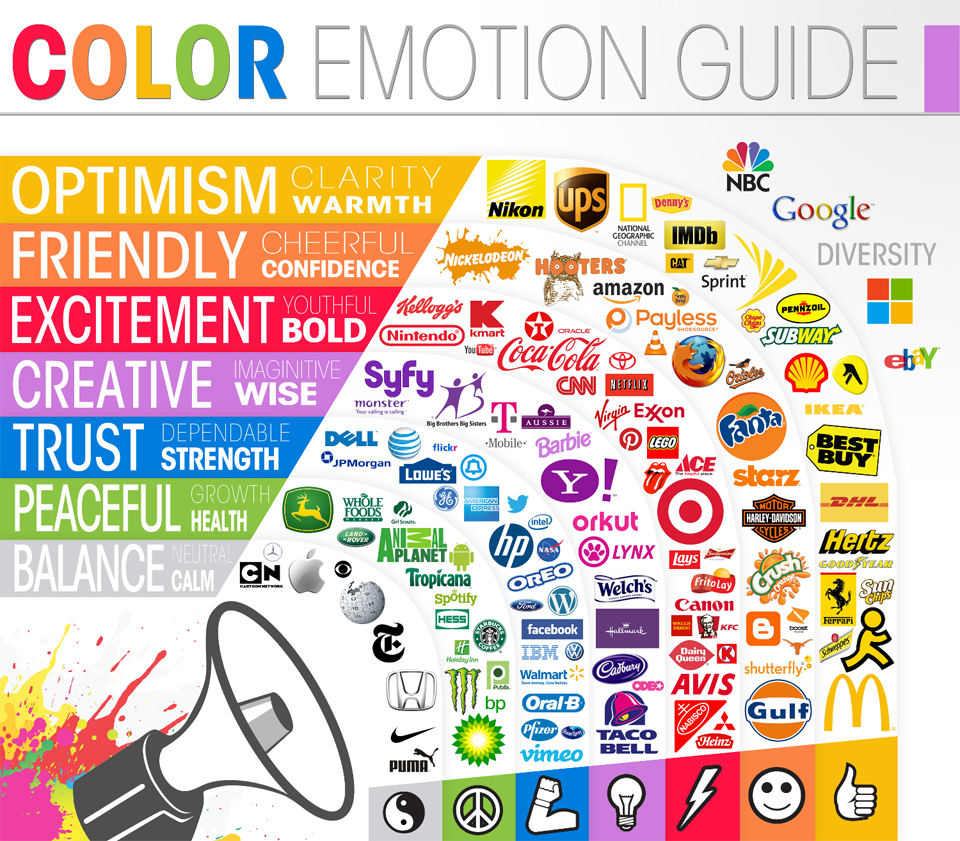
For example, Target uses red as its primary color because they want customers to feel comfortable shopping at their store — the red makes them feel warm and welcoming. Another reason people love wearing red during Christmas.
Colors should also reflect your company values. In addition to conveying personality traits like friendliness or aggressiveness, colors also send messages about what companies stand for regarding social and environmental issues.
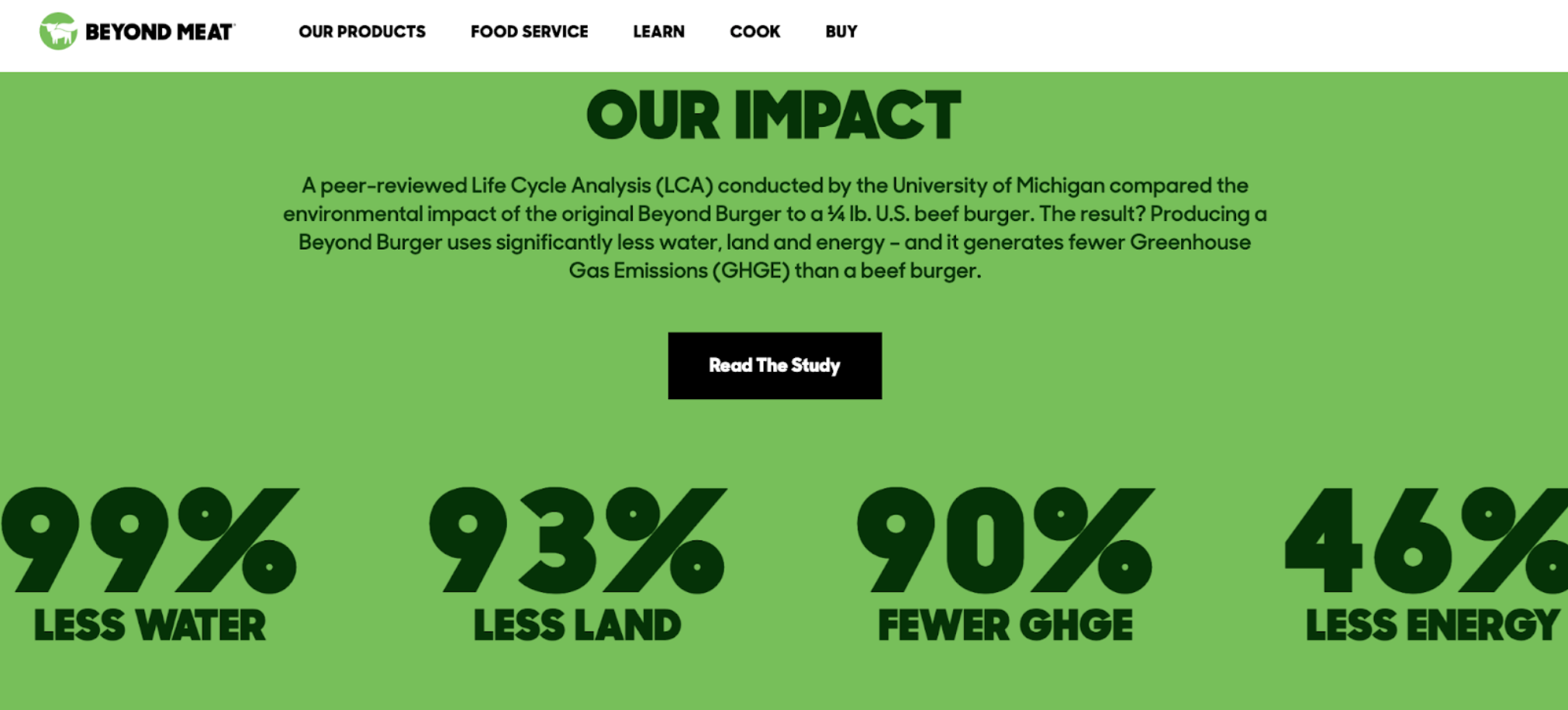
For example, vegan meat brands Beyond Meat and Impossible Foods use green in their logos to show their mission of reducing carbon footprints and limiting global warming by ditching meat from animals and eating plant-based alternatives.
However, green coloring isn’t the only thing that convinces consumers of their values. They also need to detail the specifics of their mission on their social pages or websites.
This shows how important it is for brands to not only use meaningful colors but also communicate these meanings clearly through additional marketing efforts so that consumers know what values are behind each choice made by these companies.
Decision Making
Most people are aware that color psychology is a science. But what many don’t know is how it can influence people’s decision-making, communicate brand values, and make content more readable, engaging, and enjoyable.
For example, if you want your readers to buy from you or click on your ads, using reds and oranges will help because those colors are associated with excitement and urgency.
On the other hand, if you want them to take their time learning about your product instead of buying it right away (or even deciding whether they want to do business with you), then using blues and purples will help create a sense of calmness and trust.
But don’t forget that color can’t do all the work for you.
When using a specific color with the intent to spark a particular emotion, you must also support it with words that help express those emotions. For example, Grammarly is a tool that can help you with grammar depending on the tone and the audience you are addressing.
Providing high-quality content that adds value or solves your customer’s pain points is still the key to a successful content marketing strategy — the meat and potatoes, if you will.
The garnish on top is understanding the ins-and-outs of color psychology and how to use it to enhance your content. That last thing you want to do is pick a color that looks nice to you, but isn’t well liked by the customer.
Wrapping up
Research shows that human beings tend to respond favorably to specific colors.
So, use this information to your advantage when choosing colors for designing logos, websites, and other marketing content.
But it’s critical to remember that colors are just one piece of the puzzle.
With so many other factors to consider like keyword research, copy, and search engine optimization, you can’t just rely on colors in content marketing alone. But they’re still an important tool to keep in your toolbox.
Are you ready to get creative? Start applying some of these findings to your content strategy to help improve engagement, score more leads, and drive long-term growth.
About the author
Shane Barker

Shane Barker is a digital marketing consultant who specializes in influencer marketing, content marketing, and SEO. He is also the co-founder and CEO of Content Solutions, a digital marketing agency. He has consulted with Fortune 500 companies, influencers with digital products, and a number of A-List celebrities.
Grow with the #1 marketing agency network and top destination for businesses to hire
Sign up for Agency Vista, and see why over 51,018 marketing agencies trust us to grow their online presence and foster credible relationships with businesses. We’re free forever, and you can upgrade, downgrade, or cancel any time.
Get Started
Get started free
Setup in minutes
No credit card required

Agency Vista is the new way for brands to find and easily connect with marketing agencies. Explore 51,018 verified profiles and reviews to find the right agency for your business.
Copyright © 2026 Agency Vista LLC. All rights reserved. Lovingly made in NYC.
